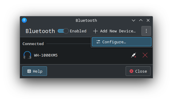
I don’t ever see a second row of information, yet they prevent me seeing almost 2 x the amount of devices I alternatively would be able to. It’s quite an annoyance when frequently pairing devices where many Bluetooth devices are broadcasting.
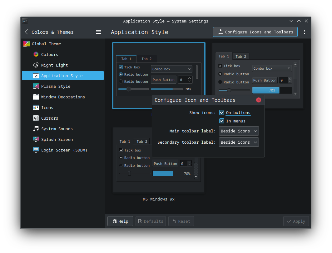
The inconsistencies between

and
would be another matter, because they’re a product of systemsettings and its KCMs not respecting kcm_style more generally, alongside things like erroneously displaying icons in toolbars: