Be honest, what’s “Favorites” mean to you? It’s the place where you send stuff to die. Not everything, just the important stuff that’s not needed at the moment. You’ll clean it up later just not right now.
I realized my “Favorites” over so many years are born and managed from one place and one place only. My Desktop.
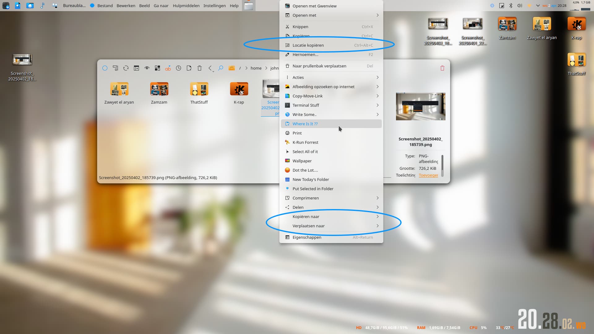
If it’s on the Desktop, it’s the first thing seen on log in. If it’s on the Desktop, the shortcut Ctrl+D (the universal shortcut) will pull those “Favorites” up faster than any other shortcut known to man (or life throughout the universe).
It’s the perfect place to literally categorize not just webpages or apps but absolutely anything imaginable. If it can be reached from a computer, we can go through the Desktop. From webpages, applications, files, ssh-connections, etc, etc, etc. The Desktop is the most underrated “Favorites Manager” to ever exist.
The Desktop can literally be called “Favorites Manager” and it would make more sense (I’m not advocating for a name change). Think about the items on your Desktop, if it ain’t your favorite it’s high-priority otherwise it’s cleaned out. This infamous Favorites Manager is cleaner than any other.
I’m asking for some tips and tricks on how to achieve some slightly better (optional) management.
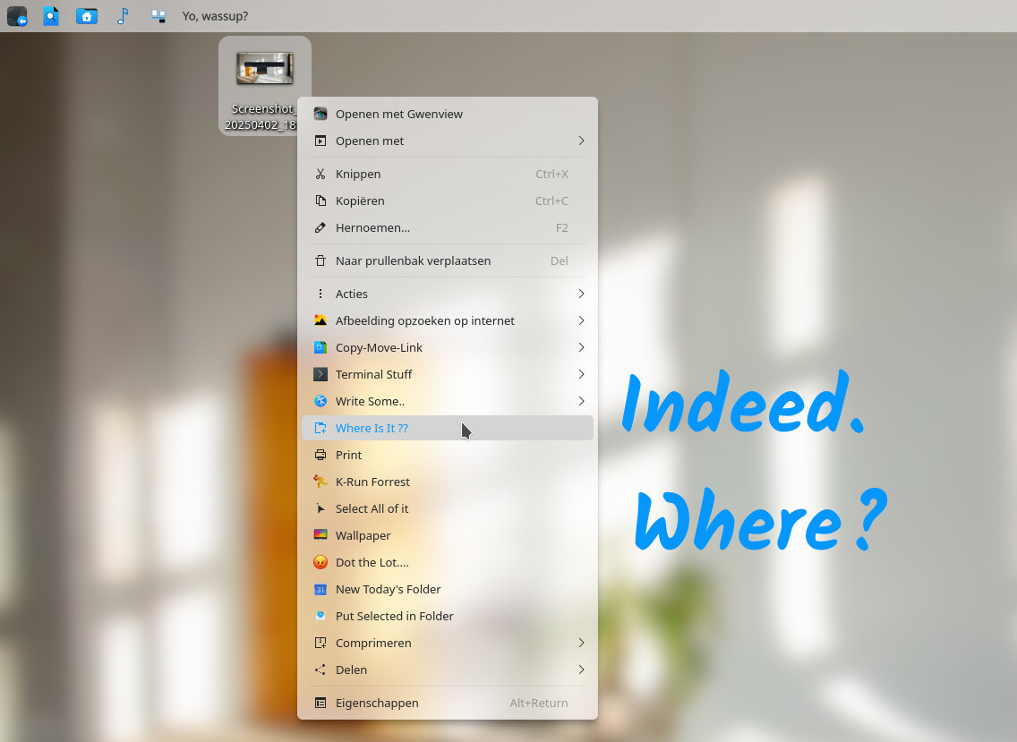
At the moment, from the Desktop, you can dig through folders without having to open a file manager. But, All text goes under the icon and that’s not good for long titles. It’s also not good for vertical spacing. Can we align text to the right of the icon and support even wider text? If there isn’t a setting for this, is there a widget or a configuration to edit?
The perfect Desktop (plugin or widget?) would support the following.
- Listing behavior (4K and higher displays can hold maybe every favorite a user wants)
- Grouping (folder) settings (should this folder already be open (expanded) or closed like normal?)
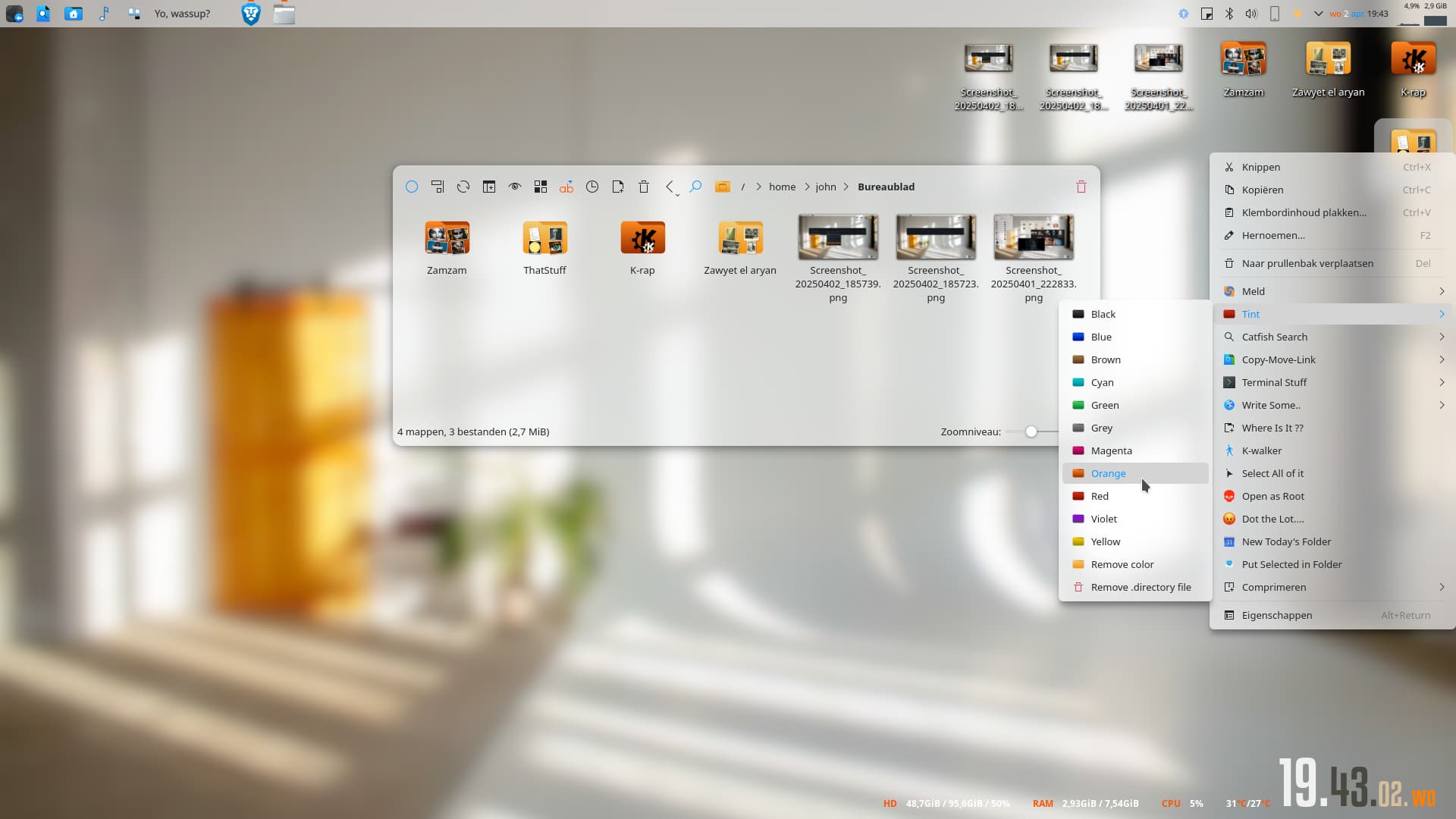
- Grouping (folder) colors (red can mean higher priority, blue is project A, green is hobby B, etc)
- Multi-select and Open/launch-All options
As always, thank you to all whom make KDE and Plasma possible and better today than it was yesterday.
Feedback?