I don’t think the specific theme matters, but it might if we need to modify the qml or background svg of digital clock. I’m using the Glassy theme at the moment, but this is a problem I have with every theme I’ve installed. Including the default ones.
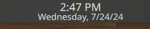
In the image above, you can see the bottom of the panel is pretty much in direct contact with the characters in the digital clock widget.
Goal: Add some padding or space between the bottom of the panel and the digital clock.
Potential Solutions & Challenges:
- Modify the background of the svg. Not sure if this would work, because my attempts were unsuccessful.
- Modify the height or padding for the digitalclock widget qml. All of my attempts were unsuccessful. I pretty much changed every number relating to height or anything related, but nothing worked. My guess is that I was working on the wrong file.
- Modify the height or padding for the entire panel for all panels. I don’t know how to do this because I was unsuccessful in finding where the code for the plasma panels. But I didn’t spend too much time on this potential solution because I was spending too much time on this small design problem.
Relevant Directories:
- /usr/share/plasma/desktoptheme/
- /usr/share/plasma/look-and-feel/
- /home/enriquetmt/Local/share/plasma/desktoptheme/Glassy/
- /home/enriquetmt/Local/share/plasma/look-and-feel/Glassy/
- Maybe: /home/enriquetmt/Local/share/plasma/desktoptheme/Glassy/widgets/
- I tried messign with: /home/enriquetmt/Local/share/plasma/plasmoids/org.kde.plasma.splitdigitalclock/contents/ui/DigitalClock.qml
Help Request: I’d like to know would like any kind of help with any of the proposed solutions. I’m some what new to linux and customizing themes so any guidance would help. And where do people even learn how to create custom themes though? Does everyone just mess with the files till they find what they’re looking for? Or does KDE docs on code for plasma themes?
Thank You!
the relavant file is
/usr/share/plasma/plasmoids/org.kde.plasma.digitalclock/contents/ui/DigitalClock.qml
and for changes made to be reflected you need to relog or at least restart your plasma session.
i know for instance you can add a \n (new line) character to the the format and it will insert the new line at that point
near line 620 i’ve changed
result += " " + amPm;
to
result += "\n" + amPm;
so that a new line appears between the time and the “am/pm” text.
maybe you can use that elsewhere to achieve what you desire.
In case anyone else chimes in, for me, it was in line 676. I made the change below, but found no change in the spacing between the bottom of the digital clock and the bottom of the panel.
        // add "AM/PM" either if the setting is the default and locale uses it OR if the user unchecked "use 24h format"
        if ((main.use24hFormat == Qt.PartiallyChecked && !uses24hFormatByDefault) || main.use24hFormat == Qt.Unchecked) {
            result += "\n" + amPm.toLowerCase();
        }
It wasn’t exactly as you formatted it in your post, but it was the only thing in the qml file that had “result += "”
it may not affect the formatting as long as you are using a horizontal panel… my panel is vertical so the clock formatting tries to shrink the time text to unreadable size unless i break it with the new line.
if your panel is not forcing the size shrinking, the new line might be ignored or just irrelevant.
you can also play with the custom format under the clock configuration to see if you can force it use the new line character by padding out your clock items with spaces in between
you can also try putting the new line character AFTER the amPm text.
it’s just a hack in any case and only gives you some indirect influence into how the clock widget formats the display
to really control it you would need to rewrite the .qml to do your own formatting.
1 Like
I think the issue here is just that the two lines don’t fit in the panel height, as a result the content itself grows past the invisible padding at the bottom, here’s an example that illustrates this:
One workaround is to make the font size smaller:
Another workaround could be setting Plasmoid.constraintHints: Plasmoid.CanFillArea that allows the widget to fill the panel thickness so it can fit a bigger font size:
The images are of this widget of mine, the line to toggle that Fill is here:
// main.qml
PlasmoidItem {
    property bool bgFillPanel: true
    Plasmoid.constraintHints: bgFillPanel ? Plasmoid.CanFillArea : Plasmoid.NoHint
// more widget code...
}
More on widget properties Widget Properties | Developer
might be easier to just try a different font
i went thru several before i found one that fit my needs.
Documenting what I tried and the results.
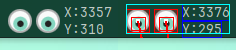
I gave the \n after and on both sides to see what would happen. Note that this is referring to horizontal panes. And this specific pane is on the top side of the screen.
If we remember from before, "\n" + amPm didn’t do anything for a horizontal pane at least.
This is what ‘“\n” + amPm + “\n”’ looks like:

The time stopped rendering or got pushed off screen because of the height constraints? (Making a guess). Leaving behind “PM”
Apparently new users at the moment can only post one image in a post so I will add the second part as a reply.
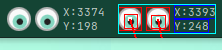
This is what ‘“” + amPm + “\n”’ looks like:

The time got pushed up. The new line seems to be applied between the time and date.
Thanks to what you suggested, I realized I was working on the correct file since we saw something actually happening. The edits I made before seemed to have no effect, so I was pretty disorganized with the troubleshooting.
But we were able to find a solution.
The line I want us to focus on is the third line. In my DigitalClock.qml file, it was line 135.
            PropertyChanges {
                target: contentItem

                height: timeLabel.height + (main.showDate || timezoneLabel.visible ? 0.8 * timeLabel.height : 0)
                width: Math.max(timeLabel.width + (main.showDate ? timezoneLabel.paintedWidth : 0),
                                timezoneLabel.paintedWidth, dateLabel.paintedWidth) + PlasmaCore.Units.smallSpacing * 2
            }
I changed just the 0.8 to 1. For my screen, it causes the problem I mentioned in my post. By putting it to 1, it set it to a “normal” setting. Though, if someone else finds a similar problem, you may want to try with 1.1 or 1.2.
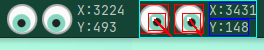
This is what it looks like for me.
height: timeLabel.height + (main.showDate || timezoneLabel.visible ? 1 * timeLabel.height : 0)

I also changed the height and made it a little smaller. But as you can see, the “y” on Saturday is not touching the bottom of the panel.
looks good, hope you like it.
the only thing i would suggest is to put the space back into the time format so it reads as " " and not ""… this will keep your time numbers and the amPm form bumping uglies.