Welcome to a new issue of "This Week in KDE Apps"! Every week (or at least we try to) we cover as much as possible of what's happening in the world of KDE apps.
This is a companion discussion topic for the original entry at https://blogs.kde.org/2025/06/29/this-week-in-kde-apps
12 Likes
I don’t know what the results of these changes are in the end. Hopefully they’re good.
I’m just afraid of attempts to make Dolphin look and feel like these new QtQuick/QML/Kirigami apps – with all that wasted space etc. Dolphin is an awesome file browser right now, as it is. Please, don’t make it “convergent.”
1 Like
Well, it is already somewhat convergent (without quotation marks). Dolphin has had a separate phone user interface for about 9 month now: Add phone UI (!826) · Merge requests · System / Dolphin · GitLab
2 Likes
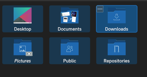
It’s just easier to click on them now[1] and more visually in-line with rest of KDE stuff. For example, plasma desktop icons
We want to make the selections more uniform looking across our applications, so Dolphin was a good place to start.
1: Behavior wise nothing should really change. (and if it did, it’s likely a bug). Previously the click area was sort of dependent on the icon and text size, now it tries to be always the same, so it’s easier to click on things.
edit: And of course, as feedback will likely pour in, we’ll see if there’s more improvements to be done.  Just had to start somewhere.
1 Like
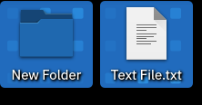
hhmm, but I use that space between folders and files for doing stuff.
- double click in it when I want to go “up”.
- select files/folders and drag to a space to trigger the popup menu with “Move to New Folder”, “Copy Here” etc.
- right click in it to open context menu to make a new file or folder, or whatever.
how is one to perform these tasks if there isn’t any space, just a solid grid of files?
yes, you clicked on the visible things and that selected the visible things.
how is one to avoid right clicking on them, when you want to create a file?
You click between them as always. There’s plenty of space. You may have to resize window.
you could fit a whole extra column in there. try it on images at a large zoom on a small screen perhaps. anyway its all good, everytime something like this rolls out, I learn a bit more git and c++. lol. very motivating.
Don’t knock it til you’ve tried it!
That being said, there being less space to press the view background is indeed the only good argument against this change AFAIK. However, we have made sure there is still enough space to press the view background. We hardly sacrificed any information density for this. For most window sizes there is literally no difference to the previous information density.
1 Like
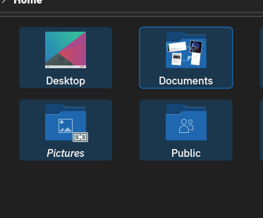
The implementation is extremely nice and in all probabilty I’ll pretty instantly forget it was ever any other way. However it’s good to hear the use of free space was considered during the development. I think perhaps I was spooked by the image of the Desktop icons, those having much less free space between than Dolphins view, which is of less concern as there is generally lots of room on the desktop.
1 Like