I absolutely love this! I think this is the best thing to do tbh. I personally prefer stability, performance improvements, UI polishing, code refactoring and bug fixes over new features. Because in the long run I think that’s what really makes a great DE even more amazing… the fine tuning. Otherwise you’ll end up with a ton of features but an exponentially large number of bugs to go with it. Please more of this, more often.
I have been reading This Week in KDE/Plasma for the last 6-7 years regularly and I’ve a suggestion.
I keep reading about these awesome new features, improvements and fixes every week, but since these things become available to me (and other regular users) only after the next stable release in a few months time, it’s not possible to immediately experience these changes. We must wait for the next stable release, which is understandable.
But the problem is that, when the time finally arrives for the actual release, I don’t remember most of these changes that I read months prior. While the release notes for the major releases do highlight some of the important changes (example 6.4.0), a lot more ground is covered by @ngraham in This Week in Plasma. Moreover, not much is highlighted in point releases (example 6.4.4), and reading the full changelog (example 6.4.4) isn’t really an appealing option since it contains an exhaustive list of commit messages and not a curated list of important changes, like done in This Week in Plasma.
@ngraham, is it possible to produce the This Week in Plasma texts in such a manner that, a script could be run to gather all the items which are going to land in a particular release?Then the release notes could have a section titled something like “Changes you read in This Week in Plasma” and just list those items gathered by the script. The rest of the release notes can include other changes which were not mentioned in This Week in Plasma. That way, just before I upgrade, I can go through that section to refresh my memory about the changes I had been reading which were mentioned in the past weeks leading up to the release, and right after the upgrade I can experience all the awesome improvements by checking them out myself. That would be very satisfying!
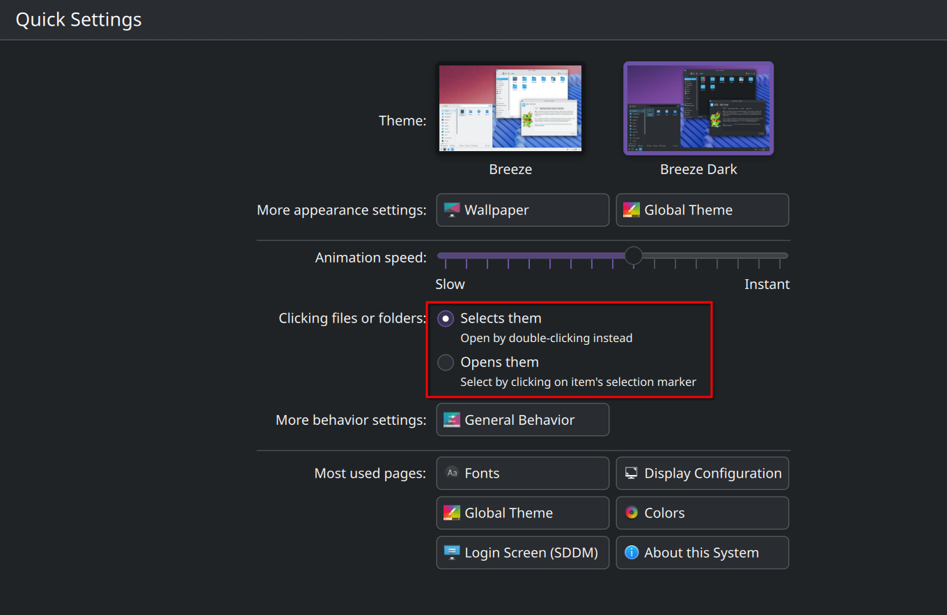
Are there any plans to switch the icons in System Settings to a monochrome style, similar to what has already been done in Discover? I think this would improve overall visual consistency across the system.
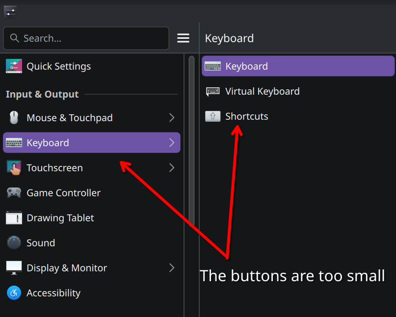
In addition, this is more of a personal nitpick, but I would really like to see slightly larger fonts and icons in System Settings. Since there are so many options, it’s quite easy to get lost, and the overall readability would benefit from this adjustment. In many sections, the font sizes are inconsistent and often too small — especially in submenus — even when using an increased system font size and fractional scaling.
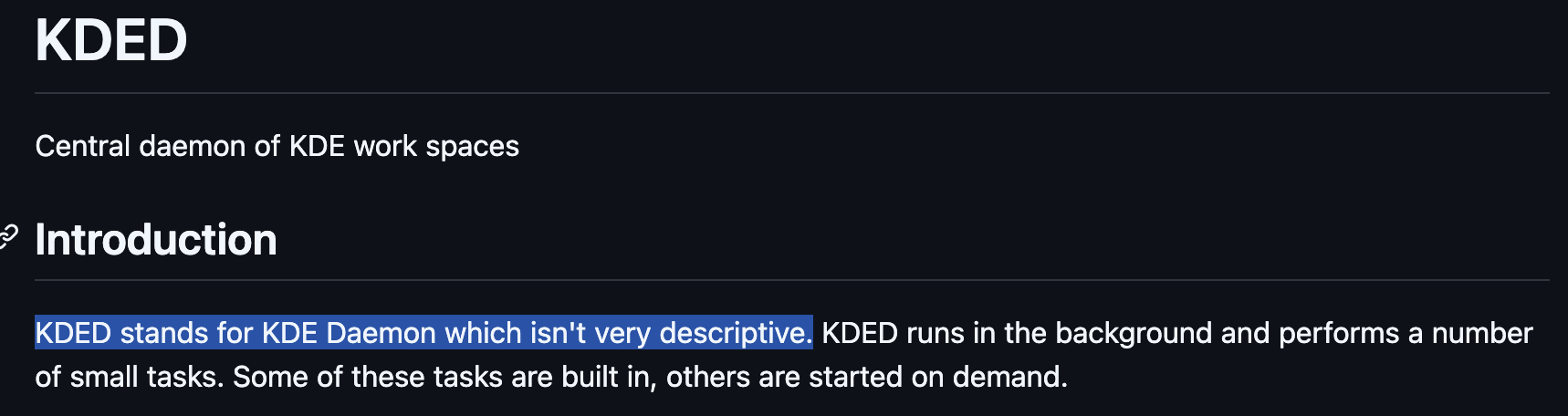
You might want to consider changing the “KDED” in the device notification to something that means something to the average user, like “Devices” or even just “System”. Ironically, the readme in the Git repo for KDED is self-aware that “KDED” isn’t descriptive.
It sounds potentially feasible. The blog posts are just markdown files these days, so pretty easy to machine-parse.
Someone would need to do the work to make this happen, though. But I imagine the promo team would be pretty happy to have a first draft of the release announcement pre-generated! It would also be nice to get the bug-fix release announcements into a nicer state.
I think this needs some clarification. Almost everything uses the general font, with only subtitles using the small font and headings using a multiple of the general font, so it’s not clear to me where the inconsistency would come from.
Right! This is definitely a bug and not an intentional design choice.
I think he prefers to have some lines on the most important changes, like @ngraham provides ahead of time. But I do agree it may be redundant, not with the full changelog rather with the announcement page: Plasma 6.4 - Comunità KDE . Nate himself talks about it:
You guys broke Dolphin. Did the update only to find Icons at least 15% further apart making me have to redo my default Dolphin window size, and eat more screen than necessary.
Jut went through everything in the post again, and I do not see anything that would cause the behavior. I do know there was a Dolphin update cause I saw it in the list of updates. I will just have to create a bug report. Thanks
You can with the right icon pack. Gruvbox Plus contains what you want. It is a colour icons pack, but extensively uses monochrome symbolic for the sidebar. I really like it. SylEleuth has worked hard on it and did a great job.
Finally, a change I have missed. Showing what USB device was plugged in , by name! I have requested this features years ago and got ignored, to the point I have done it myself (Link). Kudos EU!
Unfortunately, I’m not a graphic designer, but I’ll try to explain what I mean. The issue I’m experiencing is with the visual perception of fonts and interface buttons. Even with fractional scaling increased — in my case to 150% — the text and buttons appear smaller than expected, especially when compared to other desktop environments like GNOME…
I understand that subtitles are supposed to use a smaller font, but in practice they often feel too small, to the point where they become uncomfortable to read. That’s why it creates an impression of inconsistency: the general font looks fine, but whenever the subtitle font is used, it feels unbalanced and negatively impacts readability.