This Week in Plasma: Artistry and accessibility - KDE Blogs

Plasma developers are returning from their holidays and have provided us all with loads of goodies! Yep, this is a big one, especially in terms of the juicy user-facing changes in the areas of accessibility and support for digital artists. There's lots more as well too!


This is a companion discussion topic for the original entry at https://blogs.kde.org/2025/01/04/this-week-in-plasma-artistry-and-accessibility
11 Likes

Excellent! Is that the new plasma 6.3 wallpaper?

1 Like

Regarding accessibility, there are some useful comments here :

https://www.reddit.com/r/kde/comments/1hbr5bo/kde_launcher_icons/

2 Likes

@Canoe, if youā€™re of their mind, Can I force KDE applications to use Breeze outline icons rather than colourful ones, even when large? - #7 by rokejulianlockhart [1] may be of interest, for it requests separate symbolic and colourful icon themes.


  1. reddit.com/r/kde/comments/1hbr5bo/comment/m5cgk81 ā†©ļøŽ

1 Like

Thanks @rokejulianlockhart , may I ask, are you visually impaired? I think one of the key areas people miss with a11y is that itā€™s not black and white (pun intended) :slight_smile:

For those of us who are in that middle ground where we have low vision (not blind, but not fully able to see either), is that monochrome symbolic icons can actually make things cognitively worse at small sizes, - such as launcher menus and system trays.

I can still differentiate using colour, texture and depth, flat and grey is just a blurry mess at small sizes. Anecdotally, Iā€™ve had reports from people with normal vision that they use colour and texture to differentiate too. With the hard-coded symbolic icons, I have to actively try and read what that icon is, rather than going, ā€œoh, thatā€™s a blue icon, itā€™s x!ā€ - cognitively, that recognition of colour takes milliseconds. Having to scan and work out what icon is what, based on the text that relates to them, takes seconds, many seconds. It all adds up.

Appreciate the incredible work that @ngraham and the VDG group do. All Iā€™d ask, is that a11y be something we look at as more than just a binary situation. People have varying degrees of vision, and low vision, and often that variance is temperamental. Thankfully I can work around this by using other icon themes for now, and the application menu, rather than the launcher. But hardcoding icons with no ability to switch, does affect your users. Sometimes thatā€™s a net negative.

3 Likes

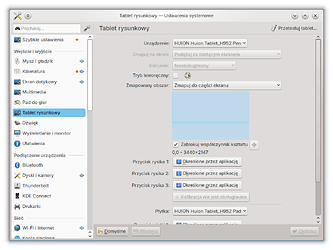
Oh, good to see some improvements in this field :blush:! Iā€™ve just received a graphics tablet this Christmas (to help me with making some lo-res textures for modding a 2000 game). I use an ultrawide screen, so I wanted to have my new tablet mapped to a part of the screen (so the opposite of what is new), but the settings seem kinda broken, the widget used to assign the parts to be used doesnā€™t work at all. Nice too see it working as intended in your screenshots.

2 Likes

Thatā€™s me, for example. I find colorful skeuomorphic icons way easier to differentiate than black-and-white flat ones. Way faster, in the first place. Especially if I donā€™t know the context (app, menu, etc.) very well.

Yet still both are definitely better than text only. Using new GIMP 3.0 RC2 is extremely irritating for me, close to unusable, because they removed icons from their vast and numerous menus. I hope KDE doesnā€™t go that way.

1 Like

Really good job.

Tried KDE Neon on a tablet computer recently with built in Wacom and touchscreen, and it worked really well! Only Gwenview was working poorly with a touch screen.

However, a setting to make the on-screen-keyboard smaller would be good for laptops with lower resolution. Where would be the best place to make such change requests?

1 Like

@Canoe, (you may), but Iā€™m not. I might be psychologically, though, for Iā€™m one of the seemingly very few people in the whole world that actually finds text easier to parse than iconography!

Luckily, this means I experience many of the same problems that those with visual impairment do when trying to change their preferences to fit whatā€™s easiest for them (as it applies to icon/text label consistency between applications) because too many sidebars and toolbars (etcetera) hardcode:

  1. Symbolic (or colourful) icons; [1]
  2. Icons without a text fallback, or:
  3. Text without the option to replace or accompany that text with relevant iconography.

With the recent removal of the size override from kcm_icons being an explicit acknowledgement that this situation is dire, weā€™ve all got to put the work in, because itā€™s cut out for us.


  1. Symbolic Kickoff category icons in Plasma 6.2 have gathered some complaints (#142) Ā· Issues Ā· Plasma / Plasma Desktop Ā· GitLab ā†©ļøŽ

1 Like

On the subject of the symbolic vs colorful icons, I brought it up internally for us to discuss: Symbolic Kickoff category icons in Plasma 6.2 have gathered some complaints (#142) Ā· Issues Ā· Plasma / Plasma Desktop Ā· GitLab

4 Likes

:smiley: very punny

Iā€™m with you on this, for the opposite reason. I love the monochrome icons because itā€™s easy to control the contrast of them and my eyes give me the uncommon need for low contrast. I wish I could have the symbolic icons all over the place.

Itā€™s a tough job for a dev to please us all.

2 Likes

Take the accessibility argument really seriously and rethink symbolic icons in general.

I feel like the recent influx of complaints may have given the impression that the symbolic icons are only ever bad for a11y. Sometimes theyā€™re really great!

There are people who need to control contrast, reduce colour, avoid specific colours, see shapes better than colour,etc etc. Symbolic icons are really nice in those cases, I thought maybe I should shed some light on that.

I repeatedly see you throwing extra effort into a11y and itā€™s really appreciated by us all.

3 Likes

Hey, we recently had a discussion about a change to the Breeze dark theme and how high contrast should be. There I explained that from the studies I have read, higher contrast is on average better for everyone even to the extreme (i.e. pure black text on white background or pure white text on black background). Exceptions to this would be people who have problems with glaring brightness and similarly halation (halation - Wiktionary, the free dictionary).

Do you fall into one of those camps? Otherwise I would be interested to learn the name of a condition we might need to be aware of.

3 Likes

@Drogoslaw, @pallaswept, and @Canoe, does Symbolic Kickoff category icons in Plasma 6.2 have gathered some complaints (#142) Ā· Issues Ā· Plasma / Plasma Desktop Ā· GitLab incorporate your disparate grievances at all well?

1 Like

I guess the lesson here is that thereā€™s no such thing as ā€œbetter for accessibilityā€ because people have different needs. Something thatā€™s good for one personā€™s accessibly may harm anotherā€™s. Seems like it supports the idea of making anything that falls under this umbrella configurable.

3 Likes

Itā€™s funny, itā€™s long been a point of interest for me that the need for high contrast was well accounted for (eg going back to DOS-based MS Windows there was always a ā€˜High Contrastā€™ colour scheme), yet the need for low contrast is almost unknown.

From what I can gather, this is largely a matter of ā€˜high contrast helps with eye problems, low contrast helps with brain problemsā€™. Since eye problems are common, if youā€™re talking about contrast in a11y, youā€™re probably aiming for higher contrastā€¦

Itā€™s even difficult to search for research about high contrast sensitivity, because the terms are identical, just the roles reversed :face_with_head_bandage: There is research out there though, most of it falls under text legibility vs fatigue (see: gruvbox. how I love gruvbox.) and migraine.

Since my migraines are always preceded (caused? they canā€™t decide) by this problem, and itā€™s very common among migraine sufferers, my Doctors just call it a migraine symptom, although I often suffer the eyesight problems without the migraine. Sorry I canā€™t give you a more precise name and diagnosis, I wish my doctors could give me one!

It does increase visibility in the traditional, optical sense, but in my case, thatā€™d be bad. When my nervous system decides Iā€™ve had enough good days, I experience excessive persistence of vision. My issue is not that I canā€™t see, itā€™s that Iā€™m seeing too much. Iā€™m still seeing all the things I looked at a long time ago.

Low contrast UI means that I get a kind of blurry cloud behind everything, which sucks, but high contrast means I get a bunch of lines and shapes and blobs behind everything, which fries my brain trying to do shape recognition on non-shapesā€¦ I could go into detail on this but I donā€™t want to bore you.

I did find one relevant link for you regarding this, perhaps their sources might be useful to you:
https://www.w3.org/WAI/WCAG21/Understanding/contrast-minimum.html

Some people with cognitive disabilities require color combinations or hues that have low contrast, and therefore we allow and encourage authors to provide mechanisms to adjust the foreground and background colors of the content.

My health problems are neurological but not cognitive (perhaps surprisingly hahah), butā€¦ you get the ideaā€¦

Maybe useful food for thought: Firefoxā€™s userContent/userChrome.css support is an absolute Godsend, I couldnā€™t use the internet without it. Atop any given icon, a combo of opacity, tint, hue rotation, inversion, and greyscaling, takes care of just about everyoneā€™s needs. Add an ā€˜outlineā€™ style icon theme (like breeze symbolic) and I think thatā€™s the whole gamut taken care of.
Even if it has low ease of use, but near-infinite flexibility, that is a fine approach, for those who really need it. Weā€™re just glad we have a solution, even if it is hard to apply.

Hope that helps, and thanks to you, too, for your work on this.
2 Likes

Thank you for the detailed response!

Okay, so I wasnā€™t advising everyone wrongly then. :innocent:

I think this is interesting. So I guess it might not be too wrong to simplify this in communication as a sort of sensory overload situation which some users have. The most extreme condition in this regard might be ME/CFS (Myalgic encephalomyelitis/chronic fatigue syndrome - Wikipedia) which forces some people to lie down in a dark and quiet room all day. There are probably some people who would therefore prefer a computer usage that is close to that experience i.e. low brightness, low contrast, no animations, no sounds. Of course that canā€™t be the default, but any configuration options in that direction might make sense.

Yes, seems like there is no such thing as over-configurability when it comes to basic readability of the user interface like fonts and icons.

It does. You are welcome! If anything else seems relevant to you or comes to mind later, please feel welcome to reach out again!

3 Likes

Yes, landed in the git repo a day ago!

Well, that too, but what I meant to say wasā€¦ I mean, taking into consideration that implementing something so flexible might be difficult, it seems reasonable for developers to take any short cuts which might make it easier to implement.

Youā€™re bang-on the money. Iā€™m negative for ME but Iā€™ve been tested more than once, youā€™ve got the right idea. All my displays are on minimum brightness, low contrast mods everywhere, no(or very fast) animations, reduced motion options on everywhere, and a modified sound theme. Youā€™ve got it 100% right. And yes, it would make a terrible default :smiley:

I started to list a bunch of similar changes I make, just to demonstrate, but deleted it when I realised how insanely long that list really was going to be (likeā€¦ Wow.). I feel that I should say: KDE already does handle stuff like this incredibly well.

Thanks! Iā€™ll look for it now :slight_smile: