Welcome to a new issue of "This Week in Plasma"! Every week we cover as much as possible of what's happening in the world of KDE Plasma and its associated apps like Discover, System Monitor, and more.
Eh… one thing that constantly bugs me about KDE Plasma (especially in the blog posts screenshots) - default system (contour) icons. Would it be possible to make them “softer”? Something like icons offered by Edna Light (edit: I’m also limited to posting links so instead of nice link: www.pling.com/p/1529191/ )?
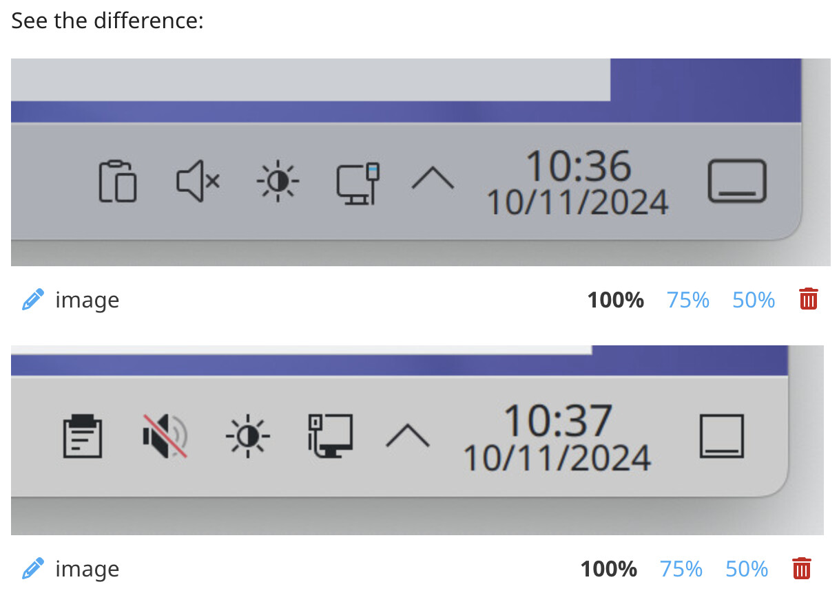
See the difference:
(there were two images for comparison bus a new user on discuss, because it uses yet another credentials I’m limited to single image embed so here’s the screenshot of the previous embeds )
The challenge here is that icon style preferences are extremely subjective. Yes, there’s broad consensus that Breeze icons could use an overhaul (hence the project to do so), but how?
More roundness? How much? Someone will complain about that.
“These icons look like toys now, where are the adults?”
Thicker strokes? Someone will complain about that too.
“They look so heavy! Where did that nice breezy aesthetic go?”
Stop strictly following the color scheme’s text color to reduce contrast, at the expense of reducing color consistency between text and icons and reducing readability for people who need that contrast? Needless to say, someone (in this case probably a lot of someones) will complain about that too.
Ultimately this is why we have an icon theming system. It’s truly impossible to please everyone. Ideally the new icon theme will please more people, but there will always be a long tail of people dissatisfied with the default theme and want to replace it with something else. There’s no way to prevent that.
It just means that Spectacle leaves the KDE Gear release schedule and adopts Plasma’s release schedule. So there will be Spectacle 6.4.0, 6.5.0, etc. It remains a standalone app, like other apps on the Plasma release schedule such as Discover and System Settings.
This was done to sync up Spectacle with the major software libraries it depends on (KPipeWire and KWin) which also use the Plasma release schedule. Not matching has been a source of bugs in the past.
Oh I don’t mean the icon theme, I’m just using breeze, and my colours from System Settings apply there.
It just now occurred to me, my plasma theme is Breeze AlphaBlack, and I’m using the AlphaBlack Control widget with it, that allows a custom colour, too. So that’s another option for ‘just the panel’ softening of colour. But I tested it with vanilla breeze plasma theme and it does get my colours applied too.
Breeze does a pretty outstanding job honestly. Anyone who’s tried other icon themes or, bless their hearts, tried to make one, knows that it can go wrong 1000 ways. Even the best alternatives all seem to be based on breeze.
Anyway back on topic, I’m hyped for 6.3. For those of us interested in testing it, let’s say we had to roll back to 6.2.5 for some reason, is it expected that our config would probably be OK? Or is that more of a “you’ll probably have to restore from that backup you took” kind of thing?
I mean, it’s testing, I expect nothing, and obviously you can’t make promises at this point, but… I’m just trying to get a rough idea of how risky it is.
One of the non-written conventions in Free Software is that those who do, decide.
You will not be able to go in and impose your criteria on people who have been contributing day in and day out for years on day one, no. obviously. But by helping out, you will be in a better position to make the change you think should come about.
I know, I do maintain couple, of projects and contribute to others, but mostly code… with KDE I mostly donate (and test stuff) as C-land not my forte (I mostly work in backend)
This was my question - each project has it’s goals, aims and (design) principles. One could suggest something and get immediate feedback. You initially replied with “get involved” link but if the maintainers have certain vision what to do, even if I came with whole set of (probably very subjective) “better” (quote can’t even start to to convey how impossible is to define that term) then it would most likely be rejected.
Hence initiall inquiry about general outlook I noticed for some time migration from colourful to monochrome icons (very welcomed) and also sticking with “square” motif which would suggest that it’s the preferred Look & Feel / design choice
Another thing you should consider is that most aspects of your desktop can be modified. If you don’t like your icons, install a new set from a trusted source or design your own.
Digital freedom comes at the cost of users taking responsibility for their own software. Always delegating on to others is how we got into the current proprietary pickle in the first place.
I feel like I offended you… (?!) that was not my intention
I’m aware of that and I have already customised the desktop to suite my needs…
Bouncing this off: collaborative, public project could also use input/suggestions from the users especially if they to absolutely love the software and want it to be used more and more. And having better default experience is one way of achieving that…
KWin is now smarter about choosing a default scale factor for devices with small screens; now it won’t choose a scale factor too high to be practical. (Vlad Zahorodnii, 6.3.0. Link)
KWin’s automatic scale factor chooser now chooses a scale factor that’s rounded to the nearest 5%, no longer to the nearest 25%. (Xaver Hugl, 6.3.0. Link)
Landed a huge overhaul of how fractional scale factors are handled in KWin. Now it makes an effort to always snap things to the screen’s pixel grid, greatly reducing blurriness and visual gaps everywhere. I’ve been using these patches with a 175% scale factor for a week, and everything looks just fantastic! (Vlad Zahorodnii and Xaver Hugl, 6.3.0. Link)
should help a lot of folks have a much better first-run experience in Plasma, regardless of their screen’s characteristics. Folks spending less time tweaking display settings in those first few minutes of use should lead to more of that time being available to appreciate the design and features that are now available to them.