Welcome to a new issue of “This Week in Plasma”! Every week we cover the highlights of what’s happening in the world of KDE Plasma and its associated apps like Discover, System Monitor, and more.
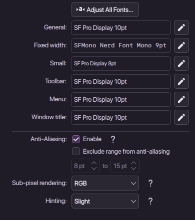
Can somebody tell me more about what is displayed in a weird way when a font with “Display” is selected.
I have been using “SF Pro Display” in this configuration for years and never noticed anything odd.
A display typeface is a typeface that is intended for use in display type (display copy) at large sizes for titles, headings, pull quotes, and other eye-catching elements, rather than for extended passages of body text.[1]
A particular display typeface may of course look and function well as a regular typeface as well. But generally, they’re not intended for that and may break alignment/spacing etc and look broken, which makes it look like an application bug (and we get the bug reports in the end).
You’re free to use whatever typeface you want. We just tell you that you might get weird results in some places, and recommend you consider something else, we don’t force you to actually use something else.