Too large and intrusive shortcut icons in Dolphin

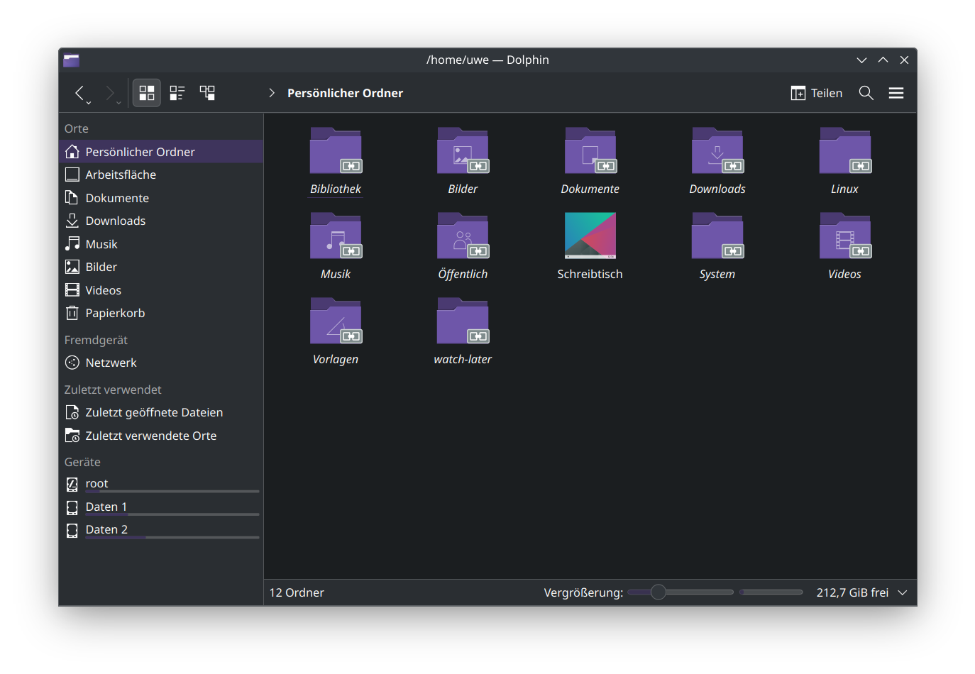
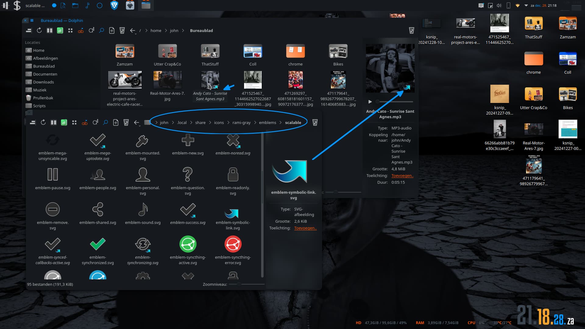
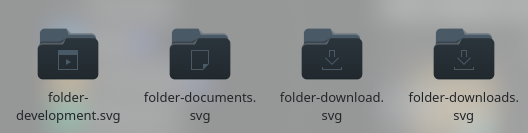
As you can see in the screenshot, the link symbols of the folder icons in Dolphin are very unsightly and far too obtrusive. This is particularly evident in dark mode due to the color inversion.

My request to the developers: Is it possible to make these link markers a little more subtle in the future so that they still look attractive in dark mode? I know that this is a high-level complaint, but this sight hurts the eyes…

Happy and peaceful Christmas to you all!

You will want to find an icon theme that includes these overlay icons, or steal them from ones that do.

here is a Kora theme:

And here is Fluent

Some other themes seem to use these as well.

1 Like

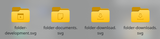
First of all, thank you for your quick reply. But I wanted to give the Breeze developers a shout out for improving the whole thing in their own icon theme. I actually like the Breeze theme…

1 Like

i just noticed if you turn on image previews and hover over a folder, the link symbol goes away as it cycles thru previews of the content.

eventually it cycles back around to the first thumbnail which has the link symbol again.

not sure how this helps, just an observation.

This element is ‘emblem-symbolic-link.svg’.

There’s a huge problem with ‘subtle’ however:

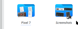
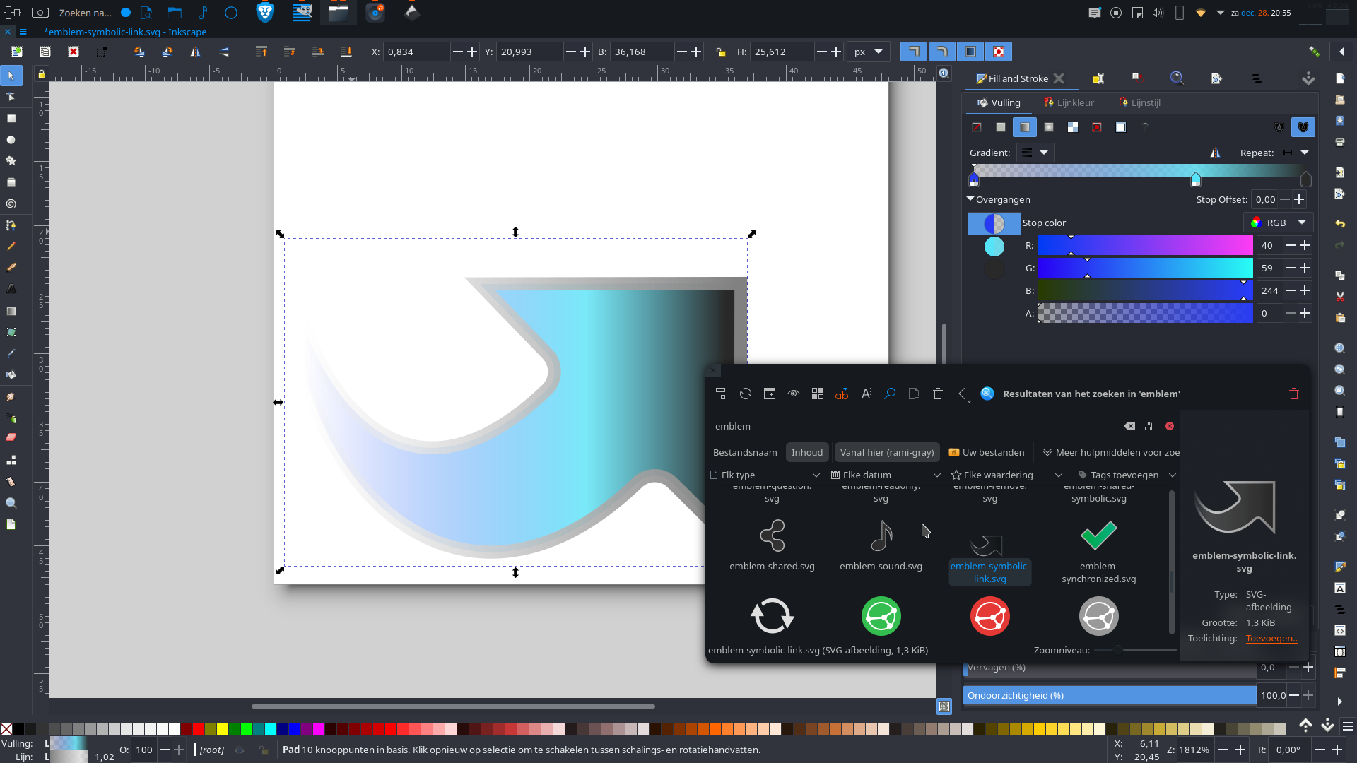
in folder view, it’s almost invisible sometimes - though I would much prefer this style of arrow to the bold chain link of Breeze… especially if it was more suitable for more variations in light-dark colouring (maybe even as a light disk with a dark arrow, or dark disk with light arrow).

1 Like

I like that much better. I have folder previews disabled anyway, so it wouldn’t affect visibility.

How do you enable this in Breeze?

You don’t - take a look at “curved-colors” icon packs, also “Rami Gray”.

Otherwise try to hack in the shortcut overlays.

That one’s from Rami Grey, here without the green ‘music’ icon for the folder:

1 Like

I checked that Rami theme. Yeah, it contains a couple of dark-ish svg’s. But that symbolic one is fairly easy to change.

Edit ( random psy color):

Folder:

Or replace it altogether of course:

2 Likes

Also using Kate editor to edit the svg (setting the colour in KColorChooser);

I have also replaced the icon in quite a few folders with this one (I copied the text from Kate).

emblem-symbolic-link.svg (open with kate)

<svg style="clip-rule:evenodd;fill-rule:evenodd;stroke-linecap:round;stroke-miterlimit:10" viewBox="0 0 48 48" xmlns="http://www.w3.org/2000/svg">
 <path d="m1.508 25.305c0.068 1.796 0.301 3.547 0.681 5.219 2.905 12.772 14.399 20.932 26.219 9.538 0.768-0.735 1.983-0.722 2.736 0.029 1.978 1.953 5.321 5.287 5.321 5.287l0.027-20.87-20.409 0.031s3.364 3.481 5.294 5.478c0.368 0.38 0.567 0.892 0.554 1.422-0.014 0.529-0.239 1.03-0.626 1.391-10.768 10.301-17.448 0.894-19.797-7.525z" style="fill-rule:nonzero;fill:url(#_Linear1);stroke-width:1.02px;stroke:url(#_Linear2)"/>
 <defs>
  <linearGradient id="_Linear1" x2="1" gradientTransform="matrix(32.9415,0,0,32.9415,2.3392,26.2217)" gradientUnits="userSpaceOnUse">
   <stop style="stop-color:rgb(230,230,70);stop-opacity:0" offset="0"/>
   <stop style="stop-color:rgb(106,234,234);stop-opacity:.780392" offset=".22"/>
   <stop style="stop-color:rgb(104,228,228)" offset="1"/>
  </linearGradient>
  <linearGradient id="_Linear2" x2="1" gradientTransform="matrix(-33.8038,4.13977e-15,-4.13977e-15,-33.8038,36.1584,24.9408)" gradientUnits="userSpaceOnUse">
   <stop style="stop-color:rgb(29,29,29)" offset="0"/>
   <stop style="stop-color:rgb(238,139,139);stop-opacity:.780392" offset=".78"/>
   <stop style="stop-color:rgb(106,234,234);stop-opacity:0" offset="1"/>
  </linearGradient>
 </defs>
</svg>

So now I can choose other themes without a defined shortcut overlay…

Here is Breeze-round-chameleon-dark:

1 Like

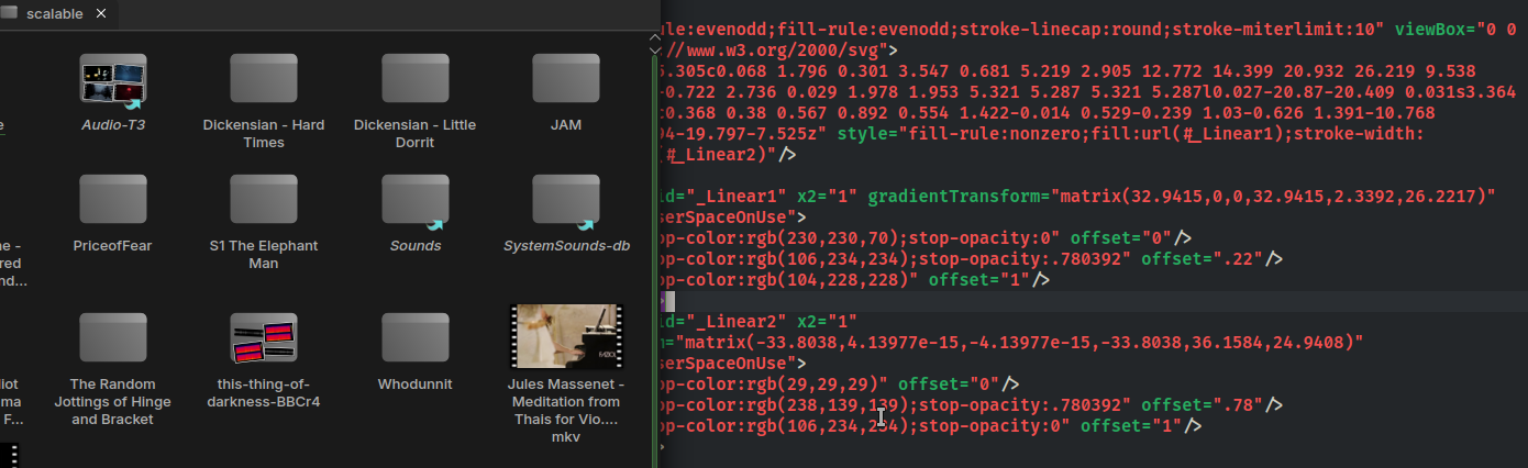
O yeah, you can use that stuff pretty much in any set. That is, those “old school” sets used to use a ton of sized icons for the same thing. More modern ones take a more scalable approach. Btw, concerning that Breeze RC set. There’s a custom color script with which you could make your own colored breeze icons. Nowadays, with the introduction of the custom highlight/wallpaper color stuff it’s a pain to use it. But with a bit of adaptions you can use it for breeze RC. Make anything you want.
So, back then you could make regular breeze stuff like:


You still can but…
But with the RC ( provided you adapt the script) you can…


A bit like the papirus icon maker gui tool, but text only.
That makes the icons independent from the chosen highlight.
Just sayin’.

1 Like