UI idea: Column-titled window decorations

So the argument against client-side decorations (CSD) is mainly that we trust the compositor to do a better job at providing basic window management functionality than the app would, plus we’re skeptical about the app plastering the title bar with buttons and tabs that take away from a consistent place to click, grab, and move it. Like so often, Nate wrote the canonical blog post about concerns that keep the KDE community more attached to traditional server-side window decorations (provided by KWin).

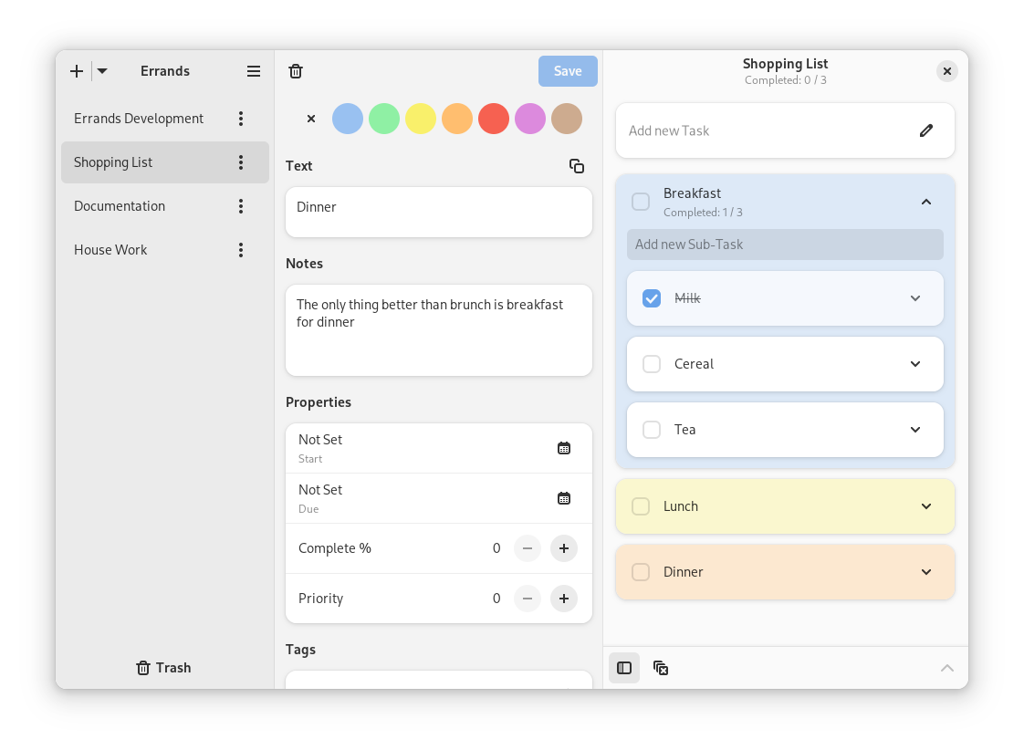
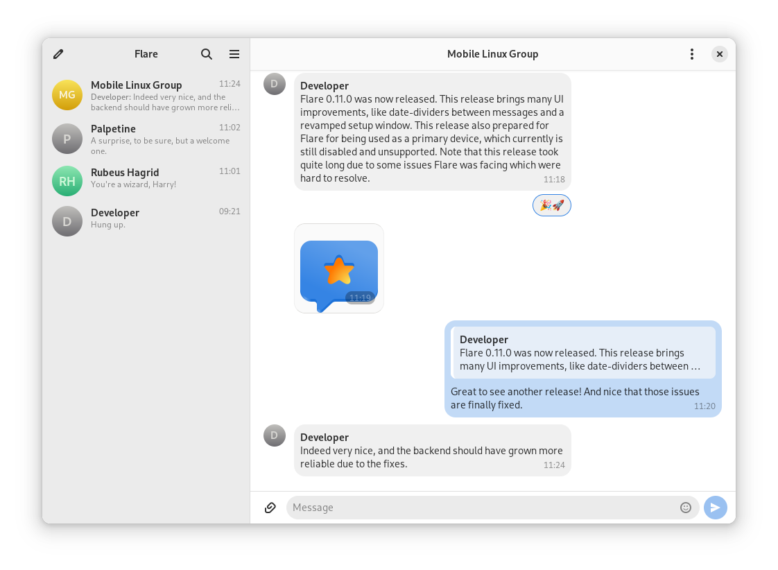
Y’all are also obviously aware of GNOME apps being all in on CSD, which combined with libadwaita dominance leads to arguably beautiful user interfaces such as these screenshots of Errands or Flare. Meanwhile, Kirigami is lost in the nowhereland between drawing page titles, but then not fully committing to it. As a result, we get apps with a window decoration that doesn’t just avoid providing interactive controls for app functionality, but also duplicates the same titles that are already taking up a lot of space in the app’s main surface.

Here’s a current screenshot of System Settings (Plasma 6.0) to demonstrate. I picked a wide view to include three Kirigami pages instead of just two, hopefully capturing Kirigami’s page stack design language well:

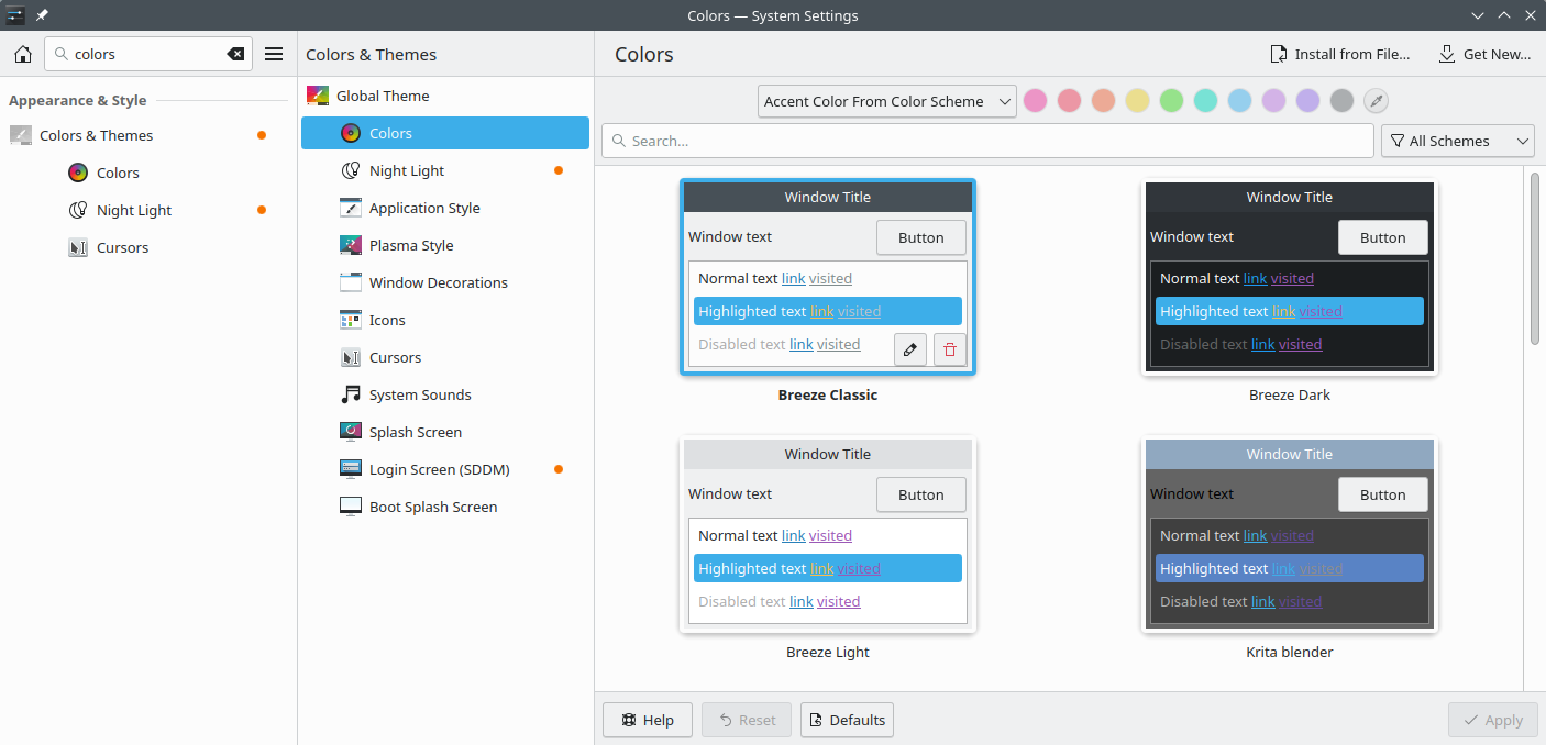
You see where this is going. Out of three pages, two are using the default large Kirigami titles. The leftmost and rightmost page are additionally using controls in the toolbar. Use of space isn’t particularly efficient, especially when we consider that this app gets used on low-res devices like the Steam Deck which don’t have a lot of vertical space to begin with.

I’d like to suggest a new Wayland extension that (optionally) lets the app communicate columns of titled pages to the Wayland server. Each column declares a title, location and width within the window, and maybe some extra metadata like preferred column header background color. If the server supports this extension and agrees, it will draw the declared page titles in the window decoration, depending on theme. Apps, and Kirigami in particular, can then optimize their own use of space by using the space for actual content.

Here’s an amateur GIMP mockup to convey the idea:

Note how the middle column can now use the entire height of the window view, and the rightmost page is able to fit in an extra control (here: search bar. but could be anything, depending on the page) that would have otherwise had to replace the page title. Now we get both, and the long vertical grid view gets more space for showing actual themes.

I can’t think of any real negatives. No clickable space is lost. The compositor retains full control over whether and how these column titles get rendered. Apps make much better use of the potential wide space in the window title, leaving more room for other content. We can expose this in Kirigami as runtime optimization upgrade, making use of it if supported and leaving everything as is (or switching to evil CSD mode!) if the compositor says no.

Any reason why this may not be a viable idea? Shoot some holes in my proposal please. Thanks!

3 Likes

One problem is that column titles are now randomly scattered on a solid background. There are no anchors for the eye to find them.

So either you extend frames into the title bar, or left-align texts so at least they are close to frames.

Then I don’t think it’s much improvement over systemsettings just setting its title to “System Settings > Colors & Themes > Colors”.

Another problem: systemsettings is a somewhat convergent app, so what if the left-most column is hidden? What to do with the “System Settings” text?

Then what if it’s “more” convergent, and only the right-most column is visible?

Fair. I’m sort of hoping that someone who is better at graphic design than I am will run with the concept and make it look proper nice. Divider lines, title alignment (maybe also present in the Watland protocol) and visual distinction between main app title vs. columns are all things that the window theme might consider.

I do feel that these are issues that can be tackled with some refinement of the basic concept, and that richer per-column metadata will allow the window theme to draw a better-looking decoration than if the app simply sets the title to “System Settings > Colors & Themes > Colors”.

Base option for whenever the compositor feels like it’s not great to columnize the title: the title bar falls back to its original state with a single title, and the app (i.e. Kirigami) reacts accordingly.

There may be other ways to keep the columnar presentation, such as colocating the missing app title into the column where it fits best (perhaps declared by the app). Or authoring the protocol spec in a way that one column is always reserved for the main app title, and if that column isn’t shown, one of the visible columns has to show its title inside the window (but the other decoration titles can stay).

This is a design issue that e.g. GNOME apps also have to deal with, it seems reasonable to define the semantics such that it’s mandatory for the app to have it visible somewhere.

seems to me that this is going far out of the way to solve a problem that is better solved in how the toolbars are used within the app itself (XY problem)

for instance, i would be fine with the settings page looking just like your mockup but with just the regular title bar.

i see no value added to the giant header in the toolbar declaring “Colors & Themes” or “Colors” since i’ve already selected those things from panel just to the left and i’m and adult who knows what i’m doing.

perhaps all we need is a toggle in settings somewhere that allows you to turn off these giant declarative titles in sub panels to save screen real estate and leave it at that.

i mean “Colors” … :expressionless: … yes, i know they are colors, ffs that’s why i’m here.

I think a better approach would be just have a standard API in Qt/Wayland for drawing client-side decoration buttons (only the buttons, the server should render the shadow etc.) using the selected server-side window decoration buttons (in a similar way to how applet-window-buttons works) . Is there such a thing in the Qt/Wayland protocols already?

To start, I want first to experiment with this in a future version of the Klassy application style, where I am going to see if I can draw any window decoration button in the application style’s mdi/dock/tabs etc. window buttons first. I think that I will probably need an extension to the KDecoration2 API to do this properly, so that KDecoration2 can accept a custom palette. (though I see there is a Wayland protocol kde-server-decoration-palette but I don’t think that will work).

1 Like

I’d also like titlebar tab support so a version of Firefox/Chromium/any modern browser (with tabs on top, accessible from the top screen edge i.e. Fitt’s Law) could be created in Qt. It is well beyond time that this is available.

Whether this would be done with client side/server side/“dynamic” window decorations is a different question. Probably client side is easiest (custom titlebar only, not custom shadow) since Firefox and other browsers also draw custom buttons beside their tabs.

which one of the three titles wil be the one visible in an app or window selector? (Alt-Tab like)

For consistency with other windows that don’t specify column metadata, I think there should not be any change to task bar or window switcher labels. Note that on an API level, column metadata wouldn’t replace the existing information but merely add to it, so the compositor & desktop shell can decide to use or ignore it where it makes sense.

It’s an interesting idea, and I think you’re onto something with regards to articulating a problem. The duplicated title/header texts is something we get a fair number of complaints about. Even if this isn’t the best way to fix it, I think it’s important to take the problem seriously.

I might recommend that you try a mockup with the Breeze Light style that visually blends the titlebar with any toolbars below it. In the “After” image, the second column will have lots its toolbar and broken the illusion of a single chonky header area.

It’s the mobile paradigm leaking into desktop. I think a good first step would be removing the active page header from the view interface area, leaving only the title bar header.

If youre going to communicate title position, you might as well communicate divider position as well. Could keep adding functionality from there until you get titlebars that can do something besides take up pixels.

Yeah I don’t get this addiction to headings KDE has all over the place. Headings in the titlebar, headings in the columns, headings in every plasma menu etc. And they’re oversized too. All this to tell me that the thing I’m looking at is what I think it is.