First I want to thank this community for having what is my all-time favorite editor since it was released! I’ve checked out many, some with big $'s behind it but never as intuitive and easy to use as Kate.
I’ve never needed to wear glasses but as I’m getting up in age, as so many of us old timers ultimately does, vision is not as sharp as it used to be. Specifically shades are less distinct. Some people design sites where the copy* is in some shade of gray to be more aesthetic. Unfortunately for many of us that makes it that much harder to read and puts our attention on making out the letters instead of reading the words.
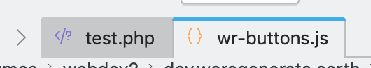
What would be really helpful in Kate specifically is the ability to adjust the background of the in-active tabs. I cannot just glimpse at them to find the one I’m looking for as the background is so dark.
This is of course true across the whole KDE suite, but I’m specifically running into it in Kate.
Thanks,
*copy, is what written words are called in advertising. It is the language used by copywriters and where the term copyright (as in who have the rights to the copy) comes from.
Can you share a screenshot how it looks on your mac? Not sure if this is a mac or kate issue. (Even if this a mac issue, there could be a fix in kate, just wanna know if it looks different to a linux kate).
You can change the window color scheme by going to Settings > Window Color Scheme. The options here are those that you’ll find in System Settings > Colors and Themes > Colors. There you can click Get New to try and find a scheme that works for you, or you can click the pencil icon on an existing color scheme, edit it, and save it as a new scheme to use in Kate.
You might also consider having a look at the settings in System Settings > Text & Fonts > Fonts. You may find a font with serifs more legible, and you can adjust font sizes there too.
Thanks!
Yes, I tried that but none seems to be changing the bg color of the tabs, at least of the ones I was willing to live with. They appeared to not be included in the scheme. (I’d love to have missed it, and maybe I can with new, so I’ll check again.)