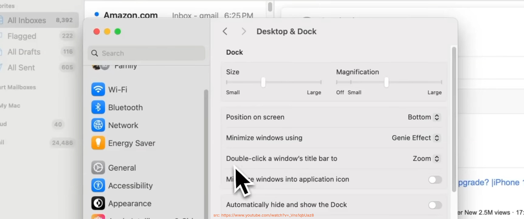
The shadow strength for windows are too saturated/powerful for the UI. It is inconsistent with overall flat design of Breeze and Plasma. The lower value is practiced at Windows 11 and Mac OS and even in web UIs, for example pop-up shadows of Gitlab/Github and KDE Discuss.
Aside from changing value, there is a tiny but important viability issue. When we set the strength lower, it causes a visibility issue that upper border is not sharp and discrete. The titlebar upper shadow is a lot and it should be minimal. See below screenshots and refer to first Mac OS screenshot.
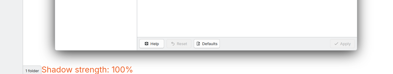
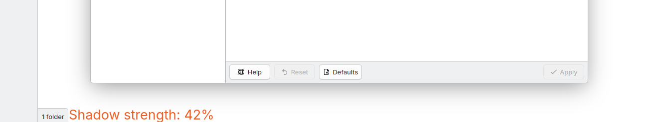
I don’t understand the point here as we have all the options to adjust size (from “None” to “Very Large”), strength (from 10% to 100%), and color???
For instance, someone could suggest making Breeze shadow higher so that one could set it to 150% as it’s not possible at the moment, but it is currently perfectly possible to lower it to 40, 50, 60 or 70 percent as suggested.
Nate Graham: When this topic comes up, I find that it usually goes better if we narrow down on specifics. The more general the critiques remain, the less actionable anything is. We end up dividing into camps saying “make it more modern somehow!” and “it’s fine the way it is!” and this doesn’t go anywhere.
Understood. I fully support trying to make the defaults according to the preferences of active and potential users’ majority.
As a user who recently switched to using dark themes permanently, however, the current maximum shadow strength doesn’t look strong enough IMHO.
Maybe developers might like to consider this as well when setting a lower default value.
Thanks,
This is actually primarily a light theme issue. Because outline and shadow are same color (both grey-black). Dark themes because have white outline, they have lower contrast problem.
The situation that you currently facing is because of Breeze in this year release got darker, so shadows even in their full potential (maximum strenght), are not much visible.
Yeah I do hate outlines too, but this what everybody playing the game is doing (Mac, Win, Gnome). It makes “contrast”.
You can use or even make custom color scheme from default Breeze Dark by setting Header and Windows values to less dark so shadows become more visible.
Actually, yeah, i support this too. It would go a long way to helping the modern look Plasma is trying to push for. It’d fit better with the rounded window corners too, in my opinion
My first post on this forum was exactly to find a solution for this shadow-stuff, before I even switched to Linux. Thankfully settings are available and I could use something that fits my needs. I’m using a dark theme by the way. But my issue was not the dark-theme itself, but that shadow is drawing above other windows when 2 windows are border on border which feels like switching the overlap from left to right to left to right (when switching focus).
So I would still use the default shadow if the border-on-border-shadow would be behind all “bordered” windows. But a reduction in size and strength also solves this issue and that’s why I agree here.
FWIW, Breeze and Plasma don’t actually aspire to have a truly flat design. You’ll still see markers of depth and shadowing in various places, and this intentional.
One of those annoying things about developers is that if you justify a change using imprecise language or incorrect assertions, they’ll pick apart your reasoning without actually considering the change itself — as I’m doing right here! Sorry about that.
It feels very frustrating when it happens, but there’s a method to our madness. We insist on precision especially when justifying proposed changes, because the “why” is critically important to making sure the end result isn’t a mess. Changes that support one another become harmonious and turn into something greater than the sum of its parts; changes that are not well-justified often feel disjointed, like the end result was randomly jumbled together..
In that respect, “because it looks better” is often a good enough justification for a visual change. This is harder to refute because aesthetics have a strong subjective component, and if it really does look better to most people who look at it, them it won’t be controversial. But if you’re going to allege inconsistency, that needs to be an accurate claim.
Sorry If I’ve used bad language. My language was that much terrible that you didn’t mention change itself! Words are truly important and inspiring, and this what it seems that I’ve failed… . The language was actually same of KDE’s amazing contributor - Vlad Zahorodnii (source), But who says and where is more important.
I showed examples with screenshots…
You can learn a lot in designing world just by observation. I spend hours seeing designers in spaces like Dribbble and Behance to learn those pedantic and redundant trends and “conventions” as a part-time designer in past and This is what I felt that could change better, like bottom window roundness.
I love KDE’s features which are miles away from other DEs and WMs. I don’t think If I ever find a feature like window rules in others, but I also disturb that me, Nate and lot of people start Linux with Gnome because looks more “beautiful”(?) and then we discovered KDE that some things are more important than that appearance.
This was a suggestion and implementation needs a lot iteration of course.
Anyway, KDE plasma styling is moving in promising directions. Ocean design system including icons and Union engine are in way and we’re looking forward!
Basically I’m not sure what the window shadow would be inconsistent with.
If it’s inconsistent with what other platforms do, that’s not a strong argument, because lots of our things are inconsistent with what other platforms do — intentionally.
Which is why I was suggesting that a stronger argument would be to suggest that a softer (and maybe larger?) shadow would be more attractive than the current somewhat small and hard shadow. I think I would even agree with that!