UI/UX: Add better, little animations to things all throughout plasma

I feel like KDE and Plasma overall could benefit for more of those little but polished animations (see all the iOS 26 little things - not the UI, the animations are what I am talking about) that make the device feel smooth, truly modern and polished and especially “fun” to use. I have many suggestions that I can make. I should note that in modern UI/UX we need to find the equilibrium between “being fun/smooth feeling” but also not make them too distracting. Of course people should be able to just turn animations off or have a “reduced animations” setting if they find them distracting. But most new users would actually find them fun.

With Android’s new Material Expressive, and the new iOS 26 “Liquid Glass Animations”, and even macOS and Win11, all modern OSs are focusing heavily on good animations because any modern UI should be fun to use and feel as fluid as possible, especially since hardware is no longer a limiting factor.

I know that many developers hate doing animations, but they improve the user experience by A LOT. Animations, when done right (!!) can make the device “feel smoother” than it really is.

I don’t know how easy/hard it is to create small animations in Qt or KDE apps overall, but it would be a cool idea to create an animation framework for KDE, or improve it, if one exists already, where devs could just import it and easily add tiny animations to stuff. Being a framework would also probably make them easy to turn off with a toggle in system settings. GNOME has something similar to this with Libadwaita animations framework.

KDE already has some pretty cool little animations and transitions on many things, but many of others things feel too static and stale for modern times. For example, when switching pages in system settings, there could be a slide or fade animation to show the new pages and/or additional settings columns.

Checkboxes and radio buttons could be slightly more fun: when clicked, they could bounce a tiny bit.

When reaching the top or bottom of scrolling pages/list/whatever it could have a spring animation to show the overscroll. Some KDE apps have this but only on touchscreens and only on some places (lack of animation consistency).

The volume and brightness OSDs could have a smooth animation on the bar moving up or down (currently it just “teleports” to the new % value), its these little touches that make a big difference. Would also be cool for it to “shake/spring” if already at max/min and we tried to still set it higher or lower. Plasma overall could have more of these little fun animations that make the OS feel much more responsive and modern.

The icons on the taskbar could bouce in and out when clicked (check for example how Windows 11 animates their taskbar icons). This also includes the animation that they icons do (those icons close to the clock at the right side) when a new icon appears/disappears, they bouce to the side to give space to the new icon that appears with a zoom-in effect.

The default Plasma animations for opening/closing windows and other things could benefit from a more modern rework.

A better “welcome” animation when reaching the desktop or unlocking (check how phones and tables do it, and macOS too, a slight zoom in on the whole screen). Maybe a similar animation when turning off/locking/sleeping. Currently there is no lock/sleep animation, screen just instantly goes off or the lockscreen instantly appears.

The new SDDM fork KDE team is working on, could also have these tips in consideration for transitions between plymouth - lockscreen - desktop.

The KDE extra animation “Geometry Change” (system settings > effects > “get more” > “Geometry Change”) should just be part of Plasma by default.

And much more…

I have a good eye for UI/UX (I am a UI/UX designer and web developer as a full time job) and I can see many things where KDE could improve but I don’t know how to code in Qt or anything from KDE. But I can help by giving tips or ideas if anyone needs them, or at least one more opinion on things.
5 Likes

I never thought I’d see “Windows 11” and “good animations” in the same sentence.

Agreed though, I love good animations and I feel like KDE could use more.

I am specifically speaking about the taskbar animations and their icons. Windows has a lot of problems but their new 11 taskbar animations are actually pretty well made and we could use it as inspiration.

1 Like

Both macOS and Windows have good taskbar animations that could be used for inspiration. I like the zoom effect on the macOS dock and the bouncing is also pretty cool even though we have that for the cursor on KDE.

1 Like

I for one find flashy UX to be a waste of time and resources, both for the developer and end user. It doesn’t really make it more stable or reliable. Just adds more potential layer of bugs because of the code complexity.

2 Likes

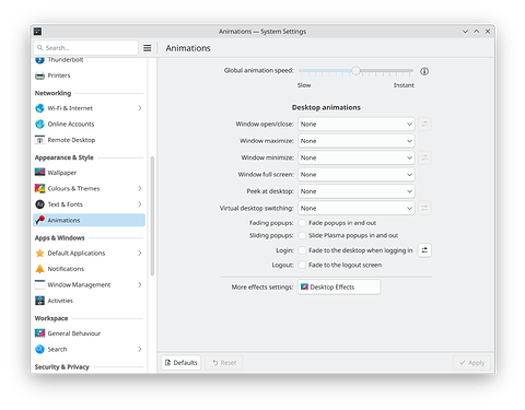
Same. Just noticed that 6.4 has a separate animations section in system settings now. Nothing enabled. The only desktop effect I have enabled is overview.

1 Like

I do personally like the idea of adding more bits of personality throughout the interface - some recent conversation about that general topic occurred here, for what it’s worth: Give Plasma a little bit more personality (#132) · Issues · Plasma / Plasma Desktop · GitLab

Just my opinion, but I’d be a bit cautious about statements like this. Many folks - including those who would benefit from the FOSS community’s assistance navigating the Windows 10 end-of-life - will lack the physical access or monetary means to get the latest high-end hardware. I guess I’d just hope that folks could somehow find ways to provide visual flair that don’t worsen the experiences for those with lower-spec devices :slight_smile:

1 Like

Even the lowest end, 10+ year old devices nowadays are just fine with small animations like these (I am talking about very small touches of personality here and there, nothing complex).

The post you mentioned shares exactly my opinion: Plasma needs more “personality”, because in a world were all OSs and devices are starting to look the same, personality and “fun” is what differentiates them. As the post mentioned, the cursor shake having an infinite size limit is extremely fun and even I sometimes play with it when I’m waiting for something to finish on my pc. This is good, my PC should be fun to use. Fun animations are literally the biggest selling point of Telegram for example, and on many countries where nothing could seemingly pull users out of whatsapp (and we are talking about users that hate changing apps), out of nowhere people just started switching because Telegram is actually FUN to use and has a lot of personality.

Cursor shake and wobbly windows are little things that draws new users (however the wobbly windows should be just very slightly wobbly so it isn’t distracting - again, finding the balance between fun and not being distracting). I have a cousin that literally decided out of nowhere to try linux some years ago after being a linux hater forever, just because he saw on a random youtube video that you could have “burn my windows” type of effects. These effects are, in my opinion, “too much” and actually an eye sore, but its a good example of what pulls casual people out of Windows/Mac, and that is exactly why UI/UX is very hard because you really need to find the balance.

Developers especially backend devs are amazing on what they do, but they don’t usually have the UX vision to understand why animations are so important nowadays. Some comments here already highlighted this: people commenting “I hate animations, it’s a waste of dev time”. Well that is a very close minded approach to modern software. I know that it’s kind of a common thing to “hate new things” on the linux world (Wayland), but hey this is why we need people with a great backend vision but also people with great UX vision. The Linux world lacks modern UX focused devs.

Plasma and KDE need more “personality”. It also needs to have a less cluttered UI everywhere (lack of padding, too much options together etc) but I digress, that’s a different topic. More fun out of the box, but a well polished and calibrated fun. Enough of “professional, stale looking apps”. We have too many of those on Windows already or other DEs. Make Plasma fun. But my post also talks about how this should probably be implemented on a framework or toolkit, so it could be consistent between all parts of KDE (consistency !!) and because, well, some people hate it and would be easier to turn off if all apps used the same tool.

Windows 11, Android with Material Expressive, Apple with Liquid Glass animations, and all app store apps like Telegram etc, even most modern websites with Framer Motion and etc, all of these aren’t doing animations just to waste dev time. They invested millions into studying what makes users love to use their device. It’s fun, and personality. Even GNOME is investing into animations. That’s modern software, and it’s fun and cool to use.

1 Like

A good example of slight, not distracting but still fun wobbly windows config is for example:
Turn on wobbly windows, turn of the advanced mode checkbox, and set these settings from top to bottom: 40, 60, 20.

This makes the effect be fun and active but at the same time just enough to not be distracting. Settings like these could be on by default. But this is only “turning on” stuff that KDE already has, which is a good thing to do, but in this brainstorming post I was talking about creating a pack of “KDE style animations” for devs to import and use inside apps, and create new animations for more UI elements.

I love when people say that flashy UI and animations consume a lot of resources.
Guys! We are no longer living in 2006 when Vista came out.
Even Aero Glass in Windows Vista / 7 was not that heavy. In 2006 I had Vista installed on Acer Aspire with Radeon X700 128MB and it ran beautifully. UI was much much more smother than in AERO BASIC mode where everything was calculated by CPU instead of GPU.

Todays PC’s have 8,16,32GiB of ram and GPUs with 4-16GiB of VRAM. Not to mention that even low end GPUs have processing power above 4TFLOPs. My Radeon RX570 from 2017 has ~5 TFLOPS

Exactly. Nowadays we have iOS 26 with EXTREMELY complex animations and it uses almost zero resources, on a phone with very limited hardware. Every single PC even 10 year old ones nowadays can run all animations with zero impact to system resources. I am not saying we should overuse them, but just small touches of “personality” here and there.

Yes, Microsoft finally flourished under the leadership of Satya Nadella. It was Steve Ballmer holding Microsoft back with his idiotic Salesman mentality.

There are certain animations that are more helpful than wasteful. If you go back to look at all the animations from beryl and compiz, those were the kind that were terrible. There are good and bad ways to use animations. There’s a reason we have UI/UX as a discipline. Linux tends to ignore it entirely at the cost of its hospitability. Windows has largely accomplished a good balance between pretty and usable. Apple usually does too but certain metaphors they use do not translate well to the typical human mind.

My problem with this sort of animations is that they often make the system feel less responsive, even if there was no lag, because the few milliseconds of animations makes the UI less responsive. This is especially the case in poorly designed systems (I’m thinking certain car infotainment systems for example). Instant response feels good too even if there are no animations. So if animations were to be added, it’s important to make sure that everything feels very responsive.

Personally I find the level of animations in plasma fine as it is. I enabled desktop effects with wobbly windows and other things, but that’s enough for me.

My problem with this sort of animations is that they often make the system feel less responsive, even if there was no lag, because the few milliseconds of animations makes the UI less responsive

Those are badly made animations. Animations should always be very well studied to make the system “feel” more responsive and fluid than it really is. Lack of animations makes UI feel clunky and stuttery.

This is what people fail to understand: Animations, when well done, actually make the OS feel much smoother than it really is. This is studied in UI/UX and called “perceived smoothness” which is very different from real smoothness.

You can have an extremely slow CPU and overall slow UI and have it still feel like the smoothest and more fluid UI ever if you know when and where and how to implement the correct animations for each component. This is very hard to achieve and why UI/UX is a whole course by itself.

With zero animations, any user can easily see if the UI is running fast or slow, and that includes stutters and delays, empty windows because the content takes a few milliseconds to load and stuff like that. Animations exist in UI/UX to try and hide these few milliseconds of content loading, so it “feels smoother”. When people complain that they “have to wait for animations to finish” then the animation is either badly done, or if you turn it off you would instead have to wait with an empty window for the content to load, which by modern standards, is worse than waiting for animations. You need to have fluidity and smoothness on the UI, you cannot show the user that something didn’t load yet. This is the principle of modern UX design. The user needs to feel like every action has fluidity and continuity and this continuity can never be broken by empty windows or empty containers because the content didn’t load yet. I said and will say it again, if you ever feel like you need to wait for any animation, than it’s the wrong animation.

When done right, animations look and feel amazing. They can also be used to transmit personality. Software nowadays can transmit a sense of personality when done right. Animations contribute a lot to that. The KDE team could join together and decide what personality KDE should have in terms of animations. KDE is known by its capacity of very complex animations, so we could explore that. Checkboxes could have a better animation, notifications appearing could slide in and out, the icons on the desktop could zoom in when logging in or unlocking the screen. The recent 1:1 touchpad gestures that KDE implemented are an awesome example of this “human design”. Makes everything feel more connected and natural, less “robot-like”.

If you use KDE with touchscreens you notice a lot where it should have more animations. When you interact with the UI via touch, the UI needs to “feel human” and respond with physics to your touch. Having no animations or badly done ones makes us feel extremely disconnected from the software. Again, this is a very complex topic and why UI/UX is actually very hard to do well. It’s not something that could be done in a few hours, nope. Every little animation needs to be well thought out. But on top of that, ALL of the KDE main apps should respect those pre-defined animations, and avoid fragmentation and inconsistency.

The Linux world needs UI/UX devs, many people constantly state that. I am trying to help here, and I hope people understand this vision of software “feeling human” and fluid.

1 Like