I’ve been using KDE Linux for the past week and honestly it’s been a really good experience. I had no issues at all. If it wasn’t labeled as an alpha release, I probably wouldn’t even notice it. No crashes or problem so far (maybe because I don’t really have any special edge-case use cases).
But one thing I want to point out is application management. Since Flatpak is basically the main source of apps on KDE Linux, Discover becomes the main way to install and remove software.
And Discover has a pretty serious UX issue.
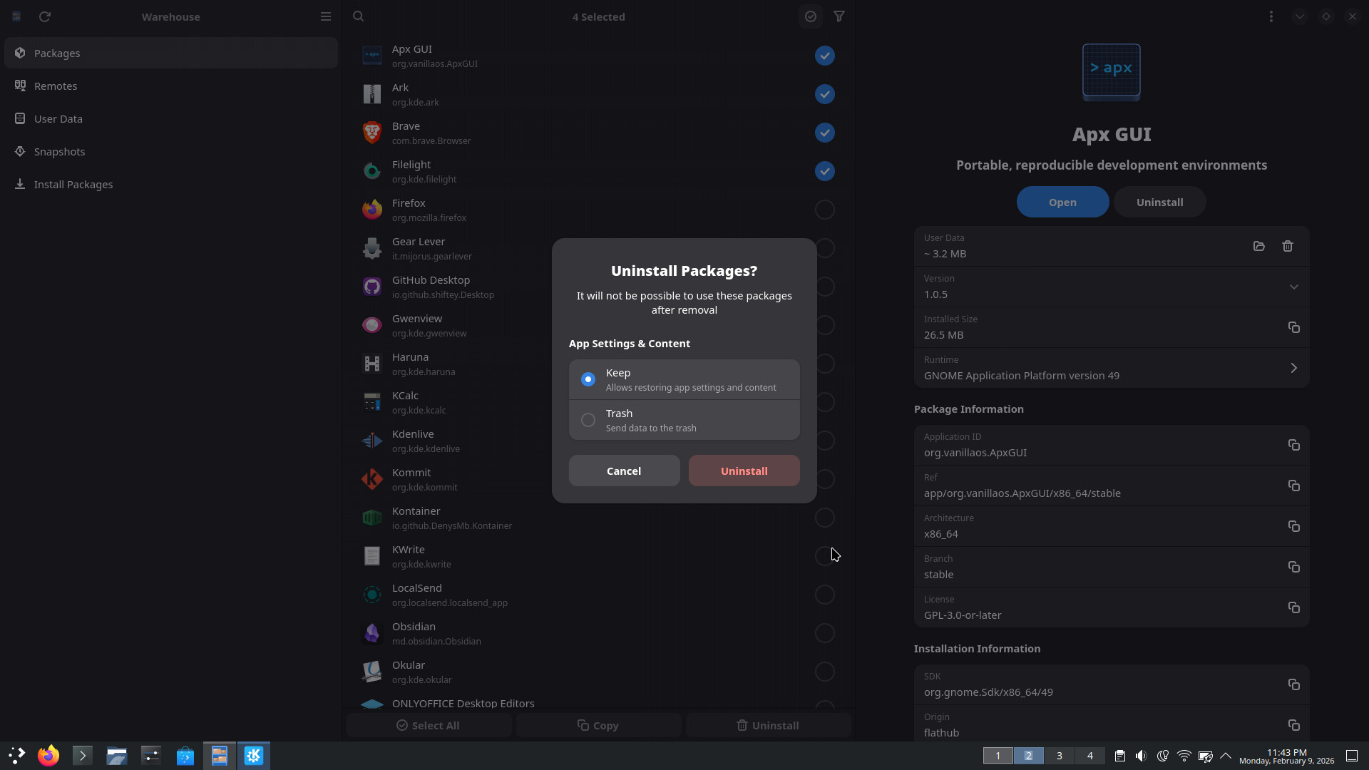
In the Installed section, it shows all installed apps and there is a delete button, which is fine. But if you click it, there is no confirmation popup, no warning, no feedback, nothing it just instantly uninstalls the app.
That is really bad UX. A delete button should always have a confirmation step. It makes no sense to uninstall an app instantly with one click.
This is especially frustrating for someone like me with very slow internet, and in a region where Flathub mirrors are extremely slow. Accidentally uninstalling a large app becomes super annoying because reinstalling it can take a long time.
i don’t see the need for a confirmation dialog for removal of a package from the details screen since i’m already on the application’s page in discover and therefore already in package management mode.
my major UX gripe here is that [Remove] and [Launch] buttons are right next to each other… there should be some separation for those widely divergent actions.
i could see an argument for a confirmation [are you sure] option for the [remove] button on the main page when you first open discover, or perhaps it should just take you to the details page where you can do the actual removal (tho this has never been a UX issue for me).
if / when discover ever gets a UX for uninstalling multiple packages, then i would definitely want to see a confirmation dialog there (at least initially).
as for the user files:
now, i’m still on plasma 5 but i assume discover works the same way in kde-linux after removing a flatpak, there is a button to also remove the associated dotfiles— if i’m sure i’ll never reinstall it.
I think a good solution would be to provide an option to enable or disable confirmation dialogs. This way, users who prefer the extra safety of a confirmation can have it, while those who find it unnecessary can disable it.
Yeah, this is a valid criticism. We can do better there.
Yep, it’s still like that.
No, I’m afraid this doesn’t work either:
If the setting for it is in the dialog, people click the checkbox, forget about it, and then any safety it provides is lost.
If the setting is hidden away elsewhere, people never find it and there’s no point for it to exist.
I suspect the best solution here — to the extent that anything needs to be done — is to implement an undo. Clicking Uninstall would show you an undo prompt that times out after a few seconds and it would only actually uninstall the app after the undo prompt goes away.
i’m afraid this would only add to the already prevalent criticism of discover being too slow to do things…. unless there was a way to disable it, and then—as you say—you right back to no net improvement.
would simply re-directing the [remove] button on the main page to take you to the details page be an easier fix? That would make remove from the main page a two step process by default.
then perhaps a setting to shortcut that re-direct and restore the current behavior to remove directly from the main page for those who are already comfortable with a “live” [remove] button there?
I understand the main argument against adding a confirmation is that it can get annoying if you’re uninstalling multiple apps one by one.
A possible solution could be to have both a confirmation dialog and the ability to select multiple apps. That way, users get the safety of confirmation but can still remove several apps at once without repeated prompts.
For example, the app Wirehouse (a Flatpak management app) implements it like this.
the way i see this is as a separate implementation of a multi-remove feature in discover, which, i believe, is already a wishlist item.
in the short term, a confirmation step, or at least another step deeper into the details page would address your original concern about it being too easy to accidentally uninstall something.
When someone needs to uninstall more than one application, if there’s a toggle for selecting more than one application on top of the list, that’d make things much easier and intuitive as no one would “mistakenly" toggle select multiple option and click on uninstall. When multiple apps are selected and uninstall is pressed, a confirmation dialogue should still appear asking whether the user is sure of their intent. One confirmation dialogue will do the job in this way.
No, uninstallation is a destructive action and it should be confirmed. (Just because a network connection might be available to redownload the application doesn’t mean it’s not destructive.)
Is mass uninstallation in Discover a common usecase?
That would be my point: how often do you need to uninstall multiple application? I’m okay to pass through 3 confirmation dialogs because I don’t usually need to uninstall 3 applications in a row. I rarely uninstall even 1, but maybe it’s more common than I know?
Do all application follow the right guidelines regarding where to put these kinds of information? Could it happen that upon uninstalling a poorly thought application I delete something I need to set again when I install the app again?
I do like the fact that I am not burdened with a bunch of confirmations when deleting flatpaks. I find, for whatever reason, that I end up deleting flatpaks much more frequently than with other package formats.
That being said, I do think there is some usability issues.
When you click the trash icon, two things happen, the item disappears and the view is reset and you are taken back to the top. This leaves you having no idea what just happened. If you mis-clicked, you probably have no idea that you even deleted something.
It seems like it should not reset the view in that case and, more importantly, there should be some kind of informational message letting you know what you did.
Above an beyond that, how do you delete the data associated with the flatpak in that case? There is no notification or obvious way to do so from that screen. Further, it isn’t even present anymore to click on it and know that there is part of it that didn’t get installed.
It’s making me think we should remove the delete buttons from these cards. If you have to go onto the app page to delete the app, that provides a bit more friction against accidental deletion, and also exposes the “remove this app’s settings too”? UI.