Here are some improvements in this updated version of Elisa,
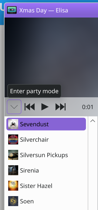
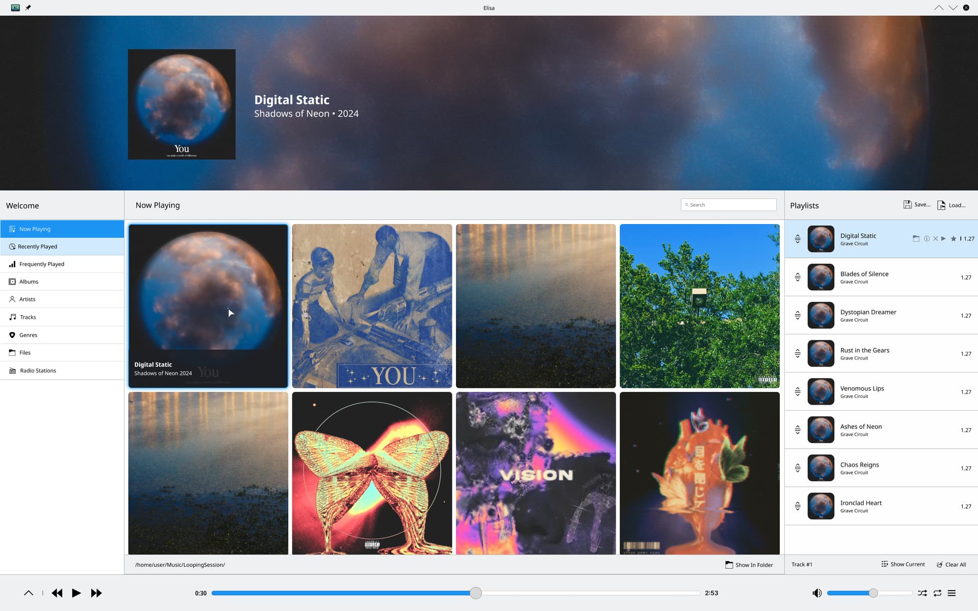
- Kept the prominent banner displaying large album artwork, artist name, and album title for the currently playing track.
- Implemented a grid view for album covers in the main area, allowing for easy visual browsing of the music library.
- Redesigned the left sidebar for quick navigation between different views (Now Playing, Recently Played, Albums, Artists, etc.).
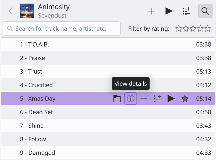
- Kept the playlist view on the right side, showing track numbers, duration, and small album art thumbnails.
- Integrated a search bar at the top for quick track discovery.
- Maintained visual consistency with uniform styling for buttons, icons, and text across the interface.
- Utilized blue as an accent color for highlighting and selection, complementing the overall design.
@johnandmegh For single tracks, we could add a new panel in the “Welcome” section called “Single Tracks,” which redirects users to individual track views without albums. This way, the default album structure remains intact, while users can still browse single tracks separately, preserving Elisa’s original album selection process.