I’m new to open source, but I’ve always wanted to contribute to a project like Elisa Music Player. I’m passionate about design and have been using Elisa for a while now. While I love its functionality, I believe there’s potential for a fresh design update to make the user experience even smoother and more visually engaging.
Here are a few ideas I’ve been thinking about:
Updated UI Layout: A more modern interface with clean lines, intuitive navigation, and better spacing between elements could enhance usability without compromising Elisa’s simplicity.
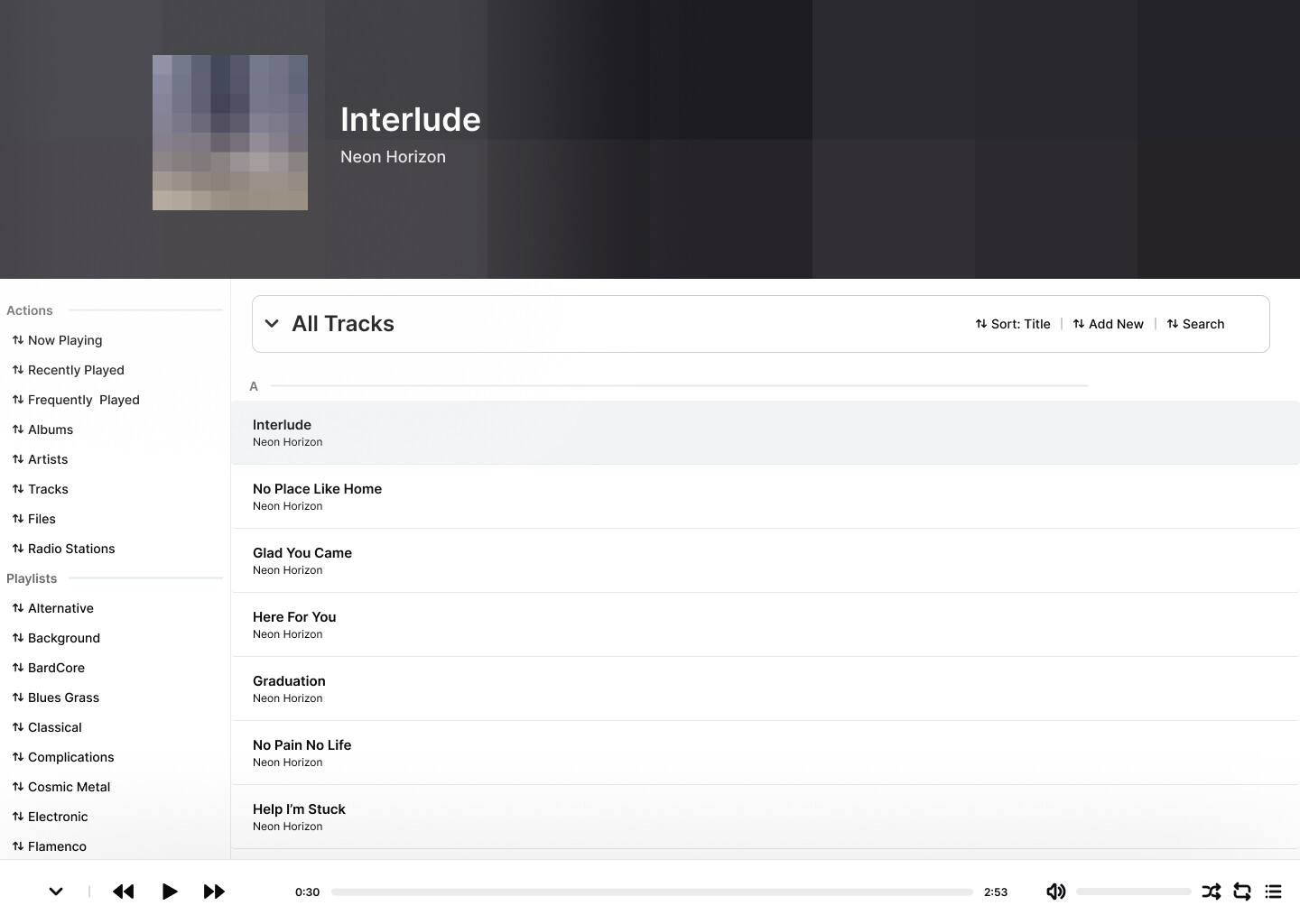
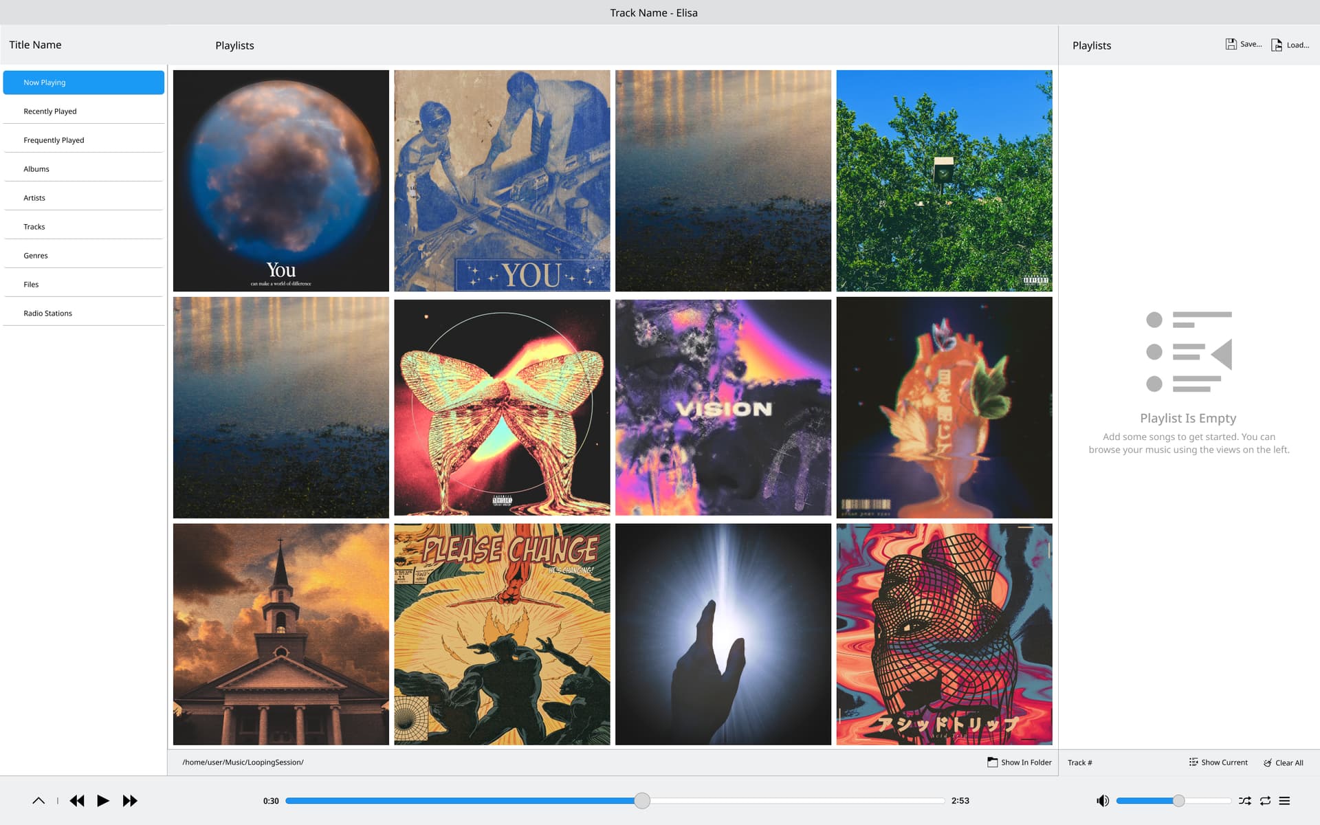
Play Single Tracks: Instead of having to play entire albums or playlists, users should be able to easily select and play a single song without interruptions or navigating through larger collections.
Collapsible Side Nav: To save screen space, the side navigation bar could be collapsible. By adding an icon-only mode, only the icons of each section would be visible, with the option to expand the menu when needed.
While I’m still learning the ins and outs of contributing to open source, I’m eager to collaborate with the team and community to bring some of these ideas to life. I’d really appreciate any guidance on where to start, and I’m excited to hear your thoughts and feedback!
P.S. I’ve also put together a small demo of something I’ve had in mind and would love to share it if you’re interested.
Collapsible Side Nav: To save screen space, the side navigation bar could be collapsible. By adding an icon-only mode, only the icons of each section would be visible, with the option to expand the menu when needed.
Just drag the sidebar divider, and you can reduce it to just the icon.
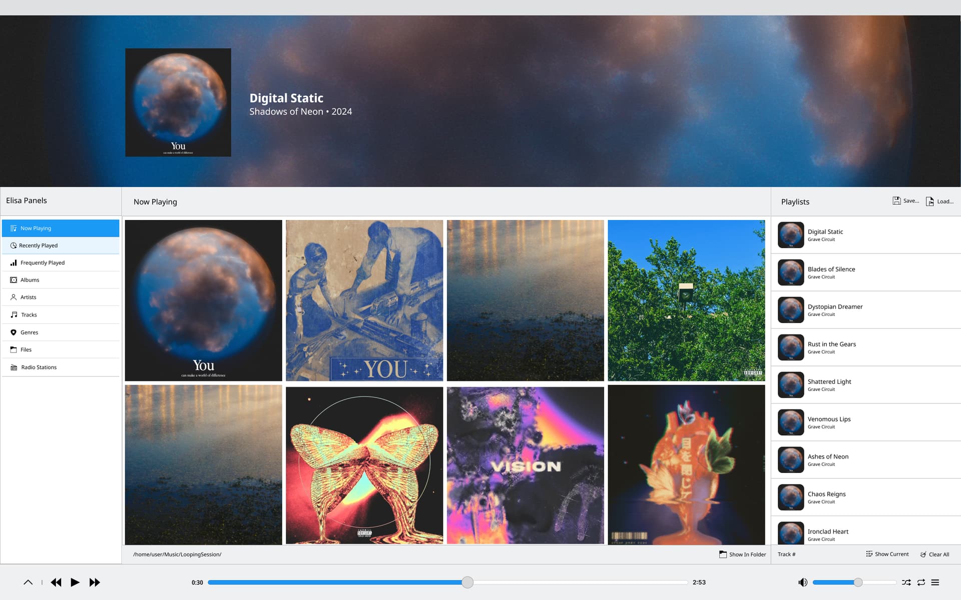
Say If a user want’s to get rid of it and just have a list of songs. Which is what I like to do, when I’m making music, here is a design I came up with:
Hmm, it doesn’t really look like any other KDE apps. I’m not sure we’re looking for redesigns that make our apps less consistent with one another.
The mockup also suffers from some common design pitfalls, such as extremely poor information density and failure to make scrollbars/scrollability visible or useful in a desktop UI. Also it looks like it goes all in on the giant header area which is already a major space-wasting UI element in Elisa that we periodically get complaints about.
Overall I would recommend refocusing on usability rather than visuals. Form should follow function.
Uhm, this is useful feedback, and I agree that my design focuses more on visuals than functionality. On top which desktop interfaces aren’t my strong suit. I took all of this on as a challenge to myself learn more about desktop interfaces, but I often jump in without fully understanding the scope of work or design guidelines. I appreciate the insights and areas for improvement.
If I were to shift my focus to one significant change where form follows function, I would propose moving the “Audio Controls / Track Information” to the bottom. I believe this adjustment would align better with user expectations thanks to familiarity. Here are some reasons I believe a bottom navigation could improve the experience of Elisa:
Enhance Accessibility: Users could easily reach the controls without disrupting their experience, especially on larger screens.
Optimize Screen Real Estate: Reducing the prominence of the header can help display more essential content without wasting space.
Maintain Visual Consistency: The design can still reflect KDE’s aesthetic while providing a familiar layout that users appreciate in other applications.
I believe this change would not only improve usability by minimizing the cognitive load for new users but also positively contribute to the user experience by creating a sense of familiarity with other music streaming applications. I’m keen to hear thoughts on this suggestion and how we might refine it to align better with KDE’s design principles.
What do you think about this potential modification?
Currently the animation and arrow directions make a lot of sense: you press the down arrow, and it and everything below it move down. It also helps keep the two modes separated.
I’m not really against moving the player bar to the bottom, but I don’t see the strong connection to how it achieves those goals:
For accessibility, there’s a Fitts’ Law argument to be made if we make the controls’ hitboxes touch the very edges of the window; is that what you were referring to? If not, I don’t see how it helps. In a desktop app, there’s no need to put controls on the bottom for thumb-reachability like there is on mobile.
For optimizing screen real estate, no actual space is saved; it’s just moving something from one place to another without changing its size.
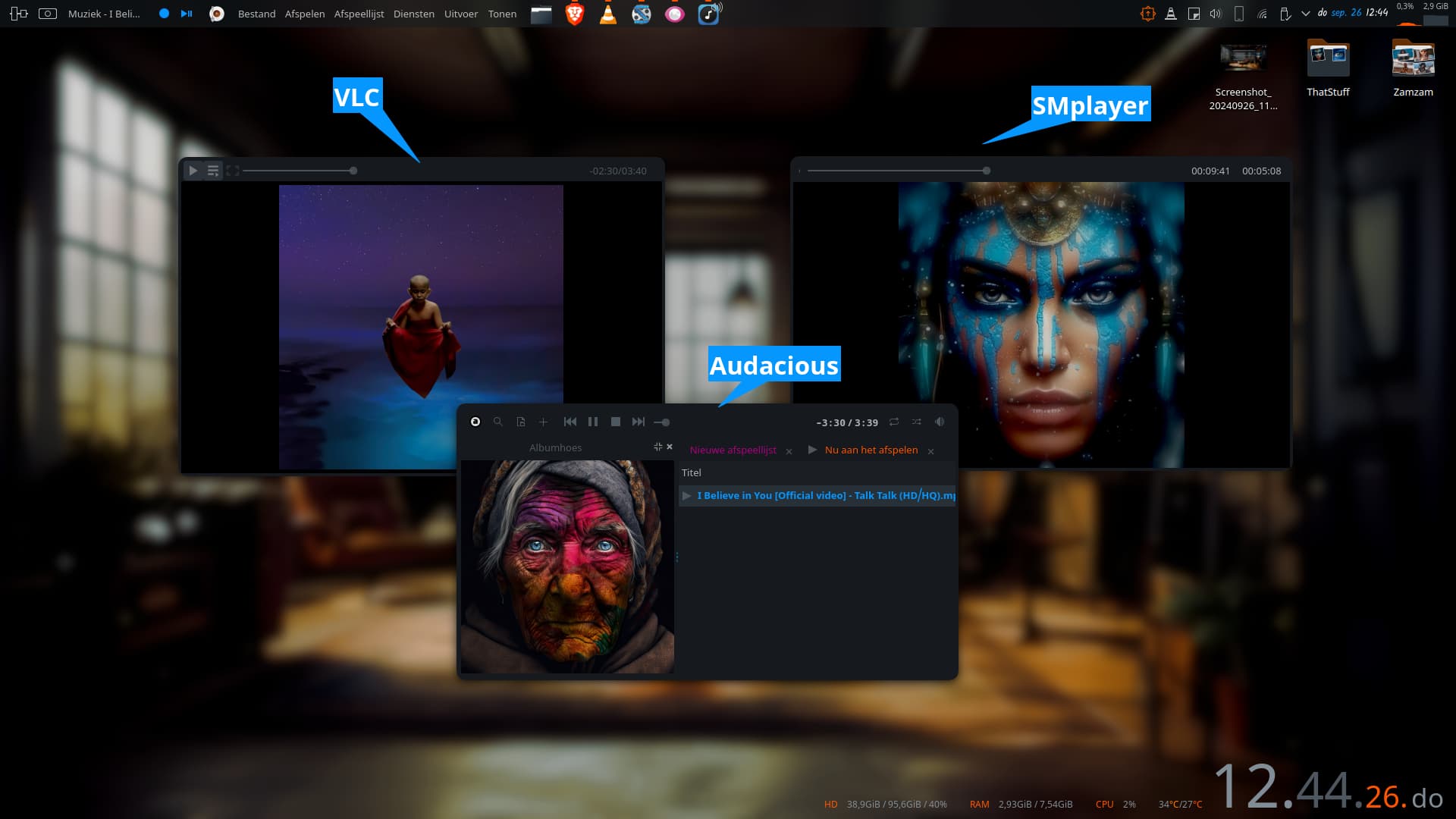
For visual consistency, consistency with what? After taking a brief survey of popular audio and video players available through Discover, I don’t see a clear winner with respect to having the player controls on the top vs bottom:
On top:
Dragon Player
Kasts
Amarok
Lollypop
Quod Libet
On bottom:
AudioTube
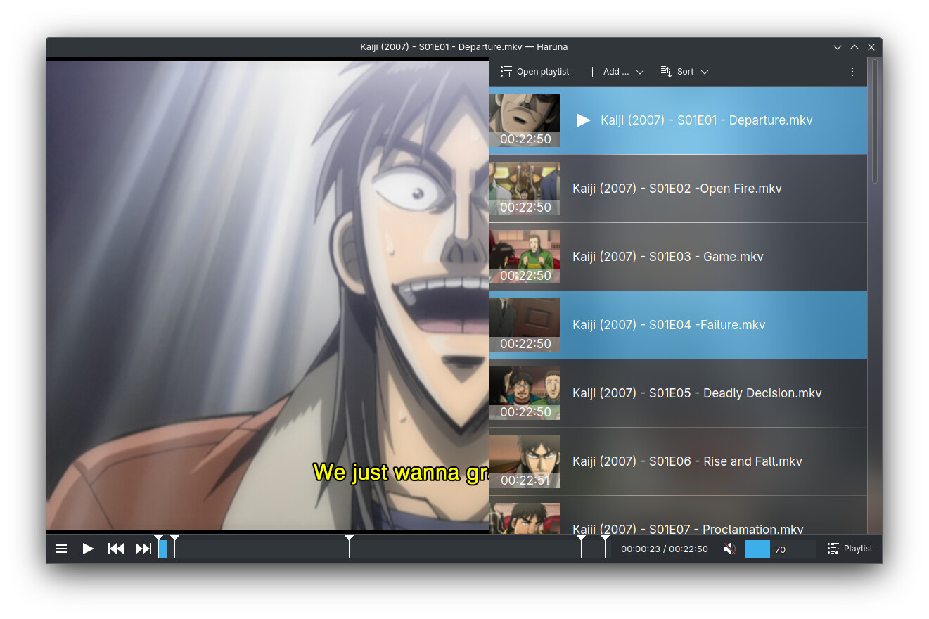
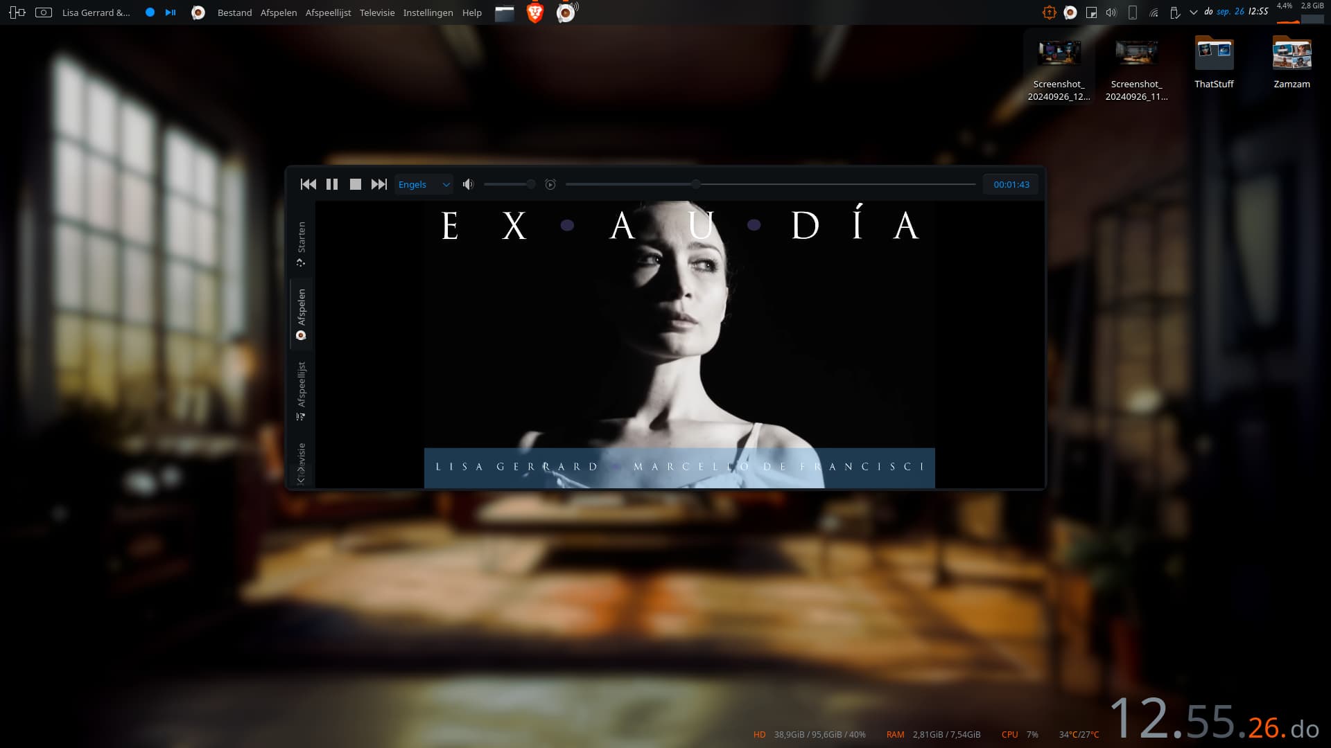
Haruna
VLC
Spotify
Strawberry
Tauon
Bottom controls might be slightly more popular, but this doesn’t seem like any kind of industry standard, or even a KDE standard! Three other KDE apps put their player controls on top (making a total of four when we include Elisa), while two put the controls on the bottom. So it seems to me that there isn’t really anything to be consistent with.
Again I’m not against moving the controls, but I would like to see high quality arguments used to justify the proposal.
This habit is popping up again. I’m going to take some time to step back over the upcoming week to properly internalize and flesh out my thoughts and reasoning, as you mentioned they feel too shallow right now. I won’t be able to provide my full reasoning now since it’s more instinctual at this point. I’ll respond in this thread with a new draft and some supporting data soon. Thanks for helping me find a new perspective.
As a daily user of Elisa Music Player, I am giving my 2 cents here.
Confusing Search
Elisa doesn’t have a global search. Instead all categories (Recently Played, Frequently Played, Albums, Artists, Tracks, Genres, Files) have their different search option. In my opinion, a global search button with various filters option (artists, album, tracks) is a much better solution that the search fragmentation we have right now.
Clustered Party Mode
Party mode shows the album art on the left and playlist on the right. User can click on particular song to play that but that’s about it. They can’t rearrange the tracks, delete or add that.
There is an icon the the top right side that open Playlist Drawer. Here user can rearrange, delete, save or loard m3u playlists. But no option to add new tracks.
To add new tracks user have to exit the party mode.
Many users have asked for a clean UI where only album art is visible and nothing else. This may be purely aesthetic, but it is certainly common among other music player (Tauon, G4Music, Tambourine, Amberol). So, a option to replicate similar setup would be greatly appriciated. I suggest something similar to Haruna, where clicking the playlist opens a playlist drawer.
Baked in playlist support
Don’t know if this belong in the UI discussion. Elisa is a playlist based music player. But it is missing the functionality of saving playlist on the player itself. In @BentoBox mock-up, the bottom left share a playlist section, which is currently not possible within Elisa.
Regarding Elisa needing a UI and UX change, I fully understand that it doesn’t require a complete redesign—that was me being ambitious. My suggestion about relocating the audio controls is more about aligning the interface with new user expectations. I’m currently working on some UX scenarios based on guerrilla testing I’m conducting.
That said, I agree that addressing the functional issues you mentioned should be the priority. Unfortunately, I don’t have any knowledge of C++ development and I don’t know where to start.
–
If there’s one thing I’d suggest to attract more designers to open-source, it would be to create an official Figma file for KDE’s Human Interface Guidelines (HIG). Since there isn’t one publicly available at the moment, having something like this would be a huge help!
Sorry for the delay. I’ve been working on replicating Elisa’s design in Figma and have made some modifications along the way. One of the key changes I’ve been experimenting with is moving the navigation controls to the bottom of the screen and exploring how that adjustment impacts the overall interface layout.
I couldn’t include the top layer in this demo due to my limited experience with Figma, but I’m hoping to refine it further with time and feedback!
@medin To that list I’ll add ReplayGain. Lack of ReplayGain for me is a deal breaker. My music is tagged according to the EBU R128 standard. My 1 cent to the discussion.
IMO the blurred album art color stuff up there is absolutely beautiful, and for an application that’s made to consume art, isn’t beauty a valid function of art? i.e. I’d argue all day long that it’s not wasted space, it’s delivering aesthetic joy to its users
As for the redesign suggestion from @BentoBox , the visuals for some reason remind me of the Apple Music web app. There seem to be fewer affordances given by the interface, such as scrollbars or handles for rearranging playlists. There also seems to be less information given visually - e.g. a grid of album art looks visually impressive, but cutting out the actual album titles and artists below each picture makes it harder to practically use, and wouldn’t work at all for albums where the art is missing.
If there were any visual design changes I as a random user would wish for in Elisa that would improve consistency with other KDE applications, it would be the possibility for a menu bar in place of the hamburger menu But overall I think it’s a highly beautiful and functional app.
I do agree that it is confusing as all heck to try to use as an “open a single file” media player, and that in cases like that I just use VLC or something instead. Perhaps there is more benefit that could be achieved by focusing on either the use case for playing a single track, or on how within Plasma to redirect needs for single-track playing away from Elisa and toward a more well-suited program?
You’re absolutely right—it does resemble ITunes from 2010. However I included my design iterations of the application further below, but it does have that Itunes feel. I’ll figure out a way to make the information more accessible similar to the application @johnandmegh