[rant]
I don’t know if the following is defined in HIG, but when single people do their own thing instead of following the overall look & feel it leads to something like the dreadful new overview in Plasma 6:
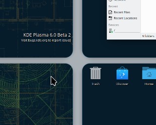
Exaggeratedly rounded corners for the sake of exaggeratedly rounded corners?!?
Nowhere else this corner style can be found in Plasma - only GNOME has those design elements.
Personally I think that the GNOME design language is bad (consistent, but bad), and I sincerely hope that this is not the beginning of “exaggeratedly rounded corners” in Plasma but the end of it…
[/rant]
PS: Sorry if this was a bit harsh, but I really got shocked by this when I saw it in Plasma 6 Beta…