Wow this suddenly got attention. Was a bit curious if it would😅
Personally, I think a lot of ppl got what I and mr.head(sorry, don’t know what else to call you lol) crossed with some arguments that exist that Ik I at least find dumb, and from my impression of mr. Head he also does. So first, some clarification.
“Have a dedicated feel even at the cost of customisation” NO! NOPE! No thank you!! If anything the kde feel should highlight the fact that it can be what you want! Tbh I think it might be my bad it came up this time😅 bringing gnome as an example was meant to show a de with strong ux guidelines but it also bring restrictiveness to mind, which, ew.
I also saw a comment talking about how if they wanted a feel of a certain os they’d use that os, and I think that only lends itself to the idea that kde should have it’s own identity. Bc I fully think they’re right. No one here is advocating to copy another de. We’re advocating for the opposite. I think if kde can find a style that appeals to and click with ppl they’ll be more curious to give it a try. It’s why I specifically used the screenshot analogy, a screenshot for a de is it’s first impression for a lot of ppl. And rn kde’s first impression doesn’t really show why it’s different.
The main line of thought in regards to looking for updating the ui for me comes from two major points.
Modernization: As it’s been mentioned before, if kde will stick to it’s current design it might become it’s own visual identity since Windows may be moving away from it, that being said, windows has the power through it’s size to set the absolute standard of the de look, feel and workflow. It doesn’t matter if it’s a good standard, a bad one, or whatever. It’s (unfortunately) a fact. Meaning, let’s admit it, they can keep the old look and and force the status que. But even they acknowledge the need to modernize. And that bring a simple question. Do we really want kde to hold onto the design they’re moving away from in this paradigm? No, srsly, do we? It’s a 100% honest discussion that I think is worthy to be had.
Expanding to the laymen: yes. I agree. You are absolutely right when you say that it doesn’t matter what kde look like on default bc you’re just going to change it. Hell, ik I think that way with my own setup. But that thinking disregard the layman who will never want to click the edit button. If we want to expand we need to recognise that we’ll start getting ppl who will use kde as is out of the box, and in that case I think kde having it’s own feel will make kde feel like a proper professional product. And, going back to not sacrificing kde’s power, there’s absolutely no reason why the default will be anything more then another theme option, and become irrelevant once again the moment the user takes the wheel
Tbh even before visual identity plasma really needs to streamline it’s setting. They decedes past the point of needing an “advanced” toggle in their settings. Hell, some settings I don’t think should be visible unless you’re looking for it. Colour management for example, is a tag that I think you can hide behind a search with an option to pin to the sidebar if needed. Bc, while extremely important for professional graphics, let’s admit it, most regular users don’t use and it can confuse when you want to change your accent colours and fall down a rabbithole
Luckily it seems like it’s a goal with 6. I don’t remember if nicco or nate said it… That the way the see plasma is a box full of tools and they’re trying to make it feel like a polished system
KDE has a rather unique design language as the world moves to trendy flat designs, while the current breeze blend of flatness and realism feels rather timeless.
Modernization is always cool, but what exactly is not modern in KDE right now? There are a quite some designers working on it and constantly improving it. In small steps. Maybe that’s what feels wrong for you? I’m pretty sure it’s not actually wrong. The history of KDE has shown that evolution is better than revolution.
As a long term user, dating back to the early 2000s, I can say that I’ve always thought KDE was unique and different to anything else out there.
Having said that, I don’t mean to say that the aesthetic design of the desktop is necessarily any better than anything else. Windows was what most of us knew from the 90s and MacOS looked and felt ‘nice’, but neither were particularly better.
Where I feel KDE has always scored is in it’s functionality. In the early days, I loved Virtual Desktops (originally not a Plasma feature) and found it really limiting having to use desktops on ‘other’ OSs. I still do. There was a bit of a brouhaha when KDE was updated from an earlier version some years ago, and I was one of the people that mourned the original functionality. However, the current capabilities are simply awesome.
As a practical engineer, I was never too ‘sucked in’ by eye candy, but I can understand its attractions. Whatever the outcome of this discussion, I sincerely hope that function over form is always the overriding consideration as KDE’s design develops.
[rant]
I don’t know if the following is defined in HIG, but when single people do their own thing instead of following the overall look & feel it leads to something like the dreadful new overview in Plasma 6:
Exaggeratedly rounded corners for the sake of exaggeratedly rounded corners?!? Nowhere else this corner style can be found in Plasma - only GNOME has those design elements.
Personally I think that the GNOME design language is bad (consistent, but bad), and I sincerely hope that this is not the beginning of “exaggeratedly rounded corners” in Plasma but the end of it…
[/rant]
PS: Sorry if this was a bit harsh, but I really got shocked by this when I saw it in Plasma 6 Beta…
precisely the reason why kde plasma needs a design guideline and direction. when the project has that , even inspired features would be made according to the structure (the current one is outdated.). It’s still in beta maybe u should request the devs to reduce the roundedness.
now this is to the other’s concerns - modernization doesn’t necessarily mean it will be flat .there is a kde plasma character that would be identified ,later they would find a design direction .
I’ve already said earlier that functionality wise kde’s(plasma) vastness is unmatched.
Any ui/ux improvements are usually aimed at making available features easily accessible (when u have alot to present , it’s better make ui/ux a priority ,if u can make wallpaper a priority ui/ux should be given atleast that much importance). What am saying is that , it will not reduce functionality but rather the contrary.
tbf if i had the skills to make some examples i would’ve instead presented them to compare .
I’m 65, so I am still quite attached to the old ways. I started with KDE 3.0/3.1 and I remember the change from KDE 3.5 to Plasma 4.0 and lived to tell about.
For me, Plasma is unique enough already. One can already make it look any way they want it to look, so how can you make it look identifiable, without taking away configuration options and features? That’s what Gnome did and I hate it. All these years and I still can’t force myself to use Gnome.
That pretty much limits you to a recognizable Application Launcher button icon. As far back as I can remember, nothing was more recognizable than this.
I feel like everyone in KDE agrees that we need to make a new HIG that shows how Breeze should progress.
The same thing is true for KDE’s brand, we need a central brand guide (and are slowly working on both).
New ideas and cool new designs come in often, the bigger problem is agreeing on a common vision and finding the developers who have time to implement it.
hey , thats nice. Now this might be a long shot.I think u guys are already familiar with penpot and they are getting more designer influx towards their software .Do u think some sort of communication or collaboration might cause new perspectives to come out that might help the group who are working on the design area of plasma.I see that most of the issues are already addressed within the issues section ,if that penpot convo or collab is materialized (or is a useful idea) i hope something fresh comes out of it.
(They haven’t made their desktop app yet maybe some sort of give and take can happen) .
1 issue i think exists is the busy-ness of kde plasma (especially settings )
2.we have great scope in modifying the layout , but is there something more accessible & fresh way to do that (a retake on personalization, for the other readers am not arguing to wipe away what we have, just wanted to spark new ideas).
3.it might be great to see the perspectives are not directed towards more flatness (i believe both designer community and people are done with flatness , there is a general dislike thats emerging). Something not-flat done tastefully would persist and have character.
lastly with brand brief being parent to everything else , we gotta address that first so that everything else gets sorted out . Of course i know all of what i said might be just parroting back your concerns (the VDG).
No - sorry, but the “standard” slightly rounded corners of the floating panel are about the same as the “standard” slightly rounded top corners of all the windows and are much less exaggeratedly rounded than the ones in the new overview.
The overview should use the ones that are used throughout other system elements to have a consistent look.
That I don’t like those exaggeratedly rounded corners (like in GNOME) and I think they belong to a mobile phone or tablet (and not even there, because they are a senseless waste of space) is one thing (and my personal problem), but the corners should be the same in all elements or this will look like a totally random design decision and unprofessionally.
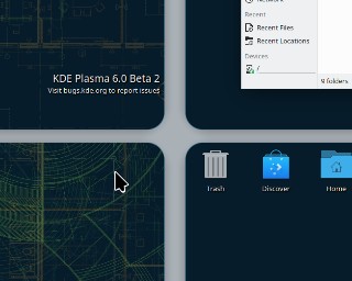
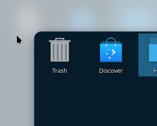
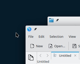
Here are screenshots of the new overview’s corners, top corners of applications (Kate and Dolphin) and the floating Plasma Panel:
PS: I think the slightly rounded corners in the last two screenshot really look OK and acknowledge some design trends (as bad as they may be) without taking it too far.