Simple, clean, efficient. Like Plasma.
To understand, you have to try it. Just like Plasma
OMG, now this is something different from all of other submissions
I like the dark one
I was sitting for half a minute waiting and thinking images were being loaded. ![]()
It’s a great bold idea, nice job!
![]()
![]()
![]()
![]()
(slow clap)
The texture on the gray one reminds me of what macOS was doing around the 10.7 Lion era.
(For example, the Mission Control background: https://cdn.arstechnica.net/wp-content/uploads/archive/2011/07/04/lion/mission-control-big.png)
“Linen”, I think it was called!
I always did like that. ![]()
KDE is a tool that is unrivaled in terms of usability, efficiency and visual appeal.
As a designer, I appreciate this.
immediately applies the dark version. Darkness + a bit of texture = win
I wonder if our solid colour background option could have optional textures and vignette.
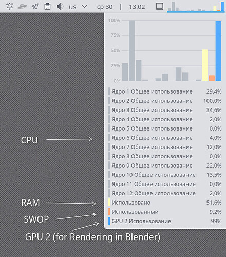
If I may, on a sidenote. What is that system monitor applet on the right side of the panel?
A, ok. Now I understand. Thanks.
Stunning.
And Brave!
that would be very cool
crazy how this pretty much looks like plasmas overview today…


