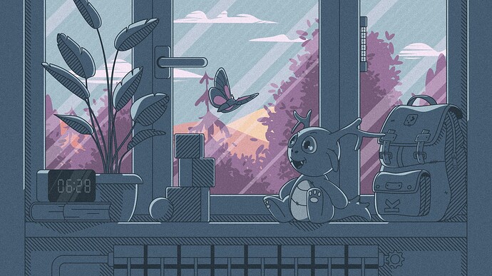
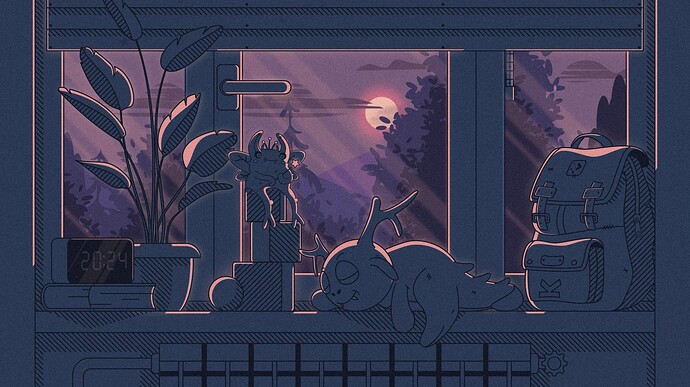
Everything can be))) But for now I’m busy with color. It seems to me that the dark theme is too dark at the moment. ![]()
Thank you very much! I am very glad that the efforts were not in vain, and the illustration found a response in the hearts of people.
Thanks! It is very cute. I think everyone will be pleased to read this under their wallpaper. ![]()
![]()
if I’m not mistaken the widgets pick up widgets from the colour theme (breeze in this case ). I think one could tinker with that to achieve some subtler colours for the clock.
using the sidepanel with the “windows can cover” and “floating” settings. This way it behaves kind of a transient/autohide panel. ![]()
Looking at and from that light version to make the dark version look ( too early here to find words )
Simply take any parts lighter than the main colour (in the light Version) turn them into black, not pink/light purple
Not making the main grey colour goto a purple haze leave as is, or just a tad darker reduce the lightness just so you notice.
I do see what you aiming for there, cool idea but no.
Throw a bit of grey over the moon to give it a more mystical look.
The hi-lites on butterfly/scenery could just stay as is because (part of the cuteness) the story is lost on the dark version.
There will be the illusion of night/dark enough from the changes without a drastic change to the design’s overall colour scheme.
Just humble opinions and ideas.
Only suggestions to use if you want to.
Has that effect from the the gone to purple on main colour that’s all,
Not criticizing only critiquing.
HEh what do I know your the artist and no offense intended so anyway it is wonderful work.
All the Best.
Just wanted to chime in with another thumbs up. This is a gorgeous design, from colors to general composition and all the tiny little details. The only thing I’m not sure about is how the strap closure mechanism on the backpack works in practice. But hey. I don’t have to wear it.
a bat instead of the butterfly?
Perhaps keep the butterfly, but have it sit down on the window frame instead of flying in the air?
It seems to me that the dark theme is too dark at the moment.
Looking at the picture in this bright white forum web page, it looks that way. But blown up to full screen size, everything is still very much recognizable and doesn’t even feel all that dark to me. It’s noticeably more purple and subjectively more saturated than the light mode version, but not at all too dark imho. Note that the stock macOS wallpaper I was using on my previous work laptop has an even darker background shade, and also a fat bright element in the middle.
how about the purplish one for the dark and bluish one for light
Not a fan. Please resist the temptation to adopt brighter and more saturated blues. The colors in the original design are already great, well balanced, calming, and frankly much bluer than the dark-mode draft anyway. I don’t need another baby-blue-and-leaf-green Windows hill background. I like the subdued approach much better.
If I had one concern regarding colours, it’s that the darkish blue from the original (light) design isn’t a great match for an always-dark panel (using standard Breeze colors) because there’s little contrast with a slight difference in hues. On the other hand, the dark mode draft contrasts nicely with the same dark-grey panel hue - another reason that I wouldn’t call it too dark at all. I wonder if there’s a way to make light mode colors a little lighter around the edges (where the wallpaper is) without changing the overall mood and intent of the original design.
Keep doing what you’re doing, this is great stuff all around.
you right, i forgot to consider artist original style and design direction into account.
personally, i prefer lively vibe for light theme and subdued approach for dark theme.
Guys, thank you all for your feedback. To my regret ((I cannot implement all that you offer, because then the work will be lost in the scraps of all your ideas and recommendations. I want to do something good for the contest, but because of the addition of everything and redoing it (it can only be worse, since it has to be divided into small pieces to embody the wishes of all of you. I really appreciate the interest of all of you)) It really warms my soul) I will try to improve some small moments before the competition. I hug everyone tightly. ![]()
![]()
![]()
I like the modified Harmony 2 and the Harmony Night did not expect that’s very clever .
I love it ![]()
Thank you!) I am very happy about it. ![]()
This is really cute! I love it!
Is there a vertical version for mobile?
Hi! Yes, there will be a mobile version, but I want to do it again with a different plot)))
Thank you very much! I am a very self-critical person. Everything I draw seems to me not very good for the competition) and in general. And such words) that speak in the direction of my drawings) help to balance it in me. Thanks again to everyone)))
Most everyone is their own worst critic. Don’t doubt your talent.
Hello again!) Yes, you’re right) You’ve hit the nail on the head)) We ourselves create a bunch of walls in our head) from which we ourselves suffer.
Thank you, kind man! It’s very nice to hear))) You are right that I need to take note of these tips, but you need to use them wisely and in small portions so as not to get into something bad)) Until the end of the competition, I will work hard. ![]()
![]()
Hello, colleague!) I like what you have suggested, but for me it is too bright and saturated. And I want to do it in restrained tones, so that the wallpaper does not distract attention while working. But thank you very much)) Hugs to everyone!) ![]()


