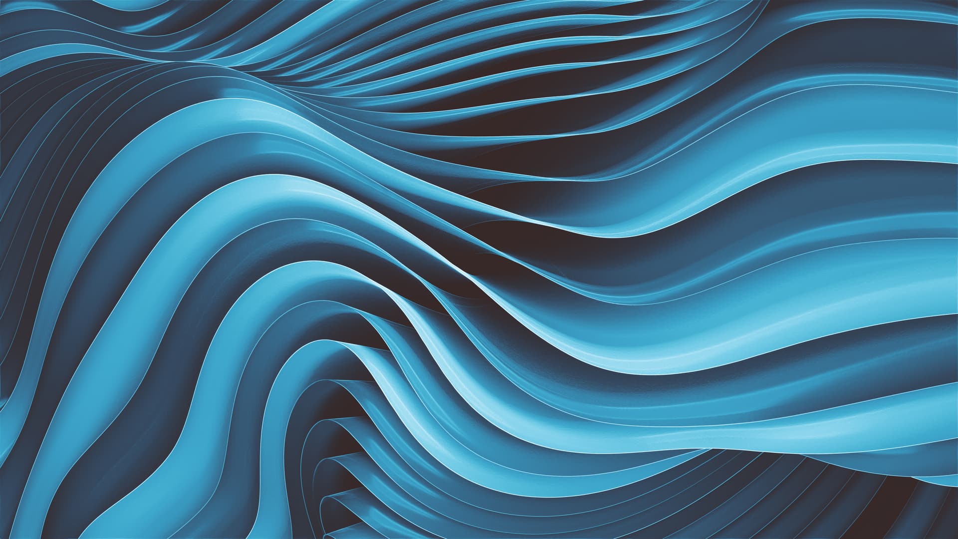
Hi, this is my wallpaper submission. Rendered with EEVEE (Blender 3.6) at 5120x2880px.
Dark mode:


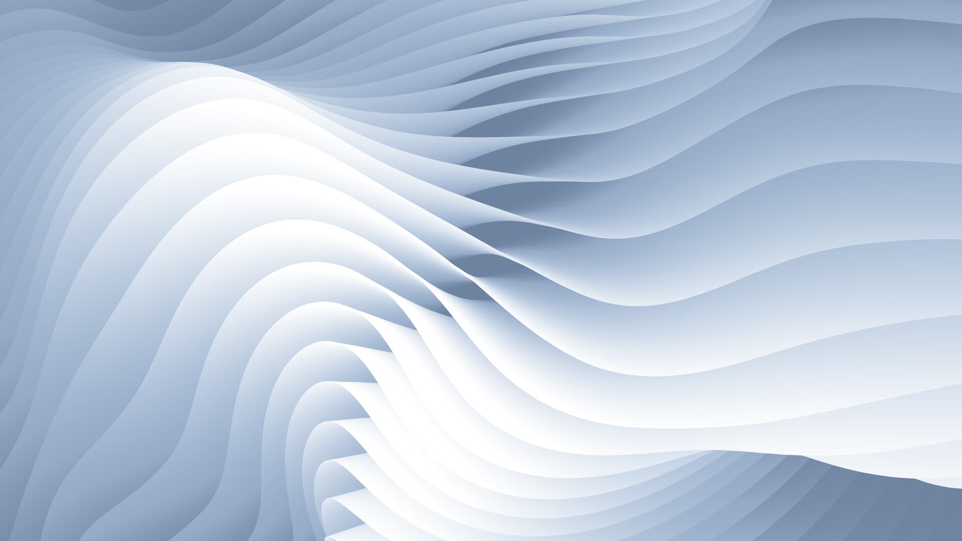
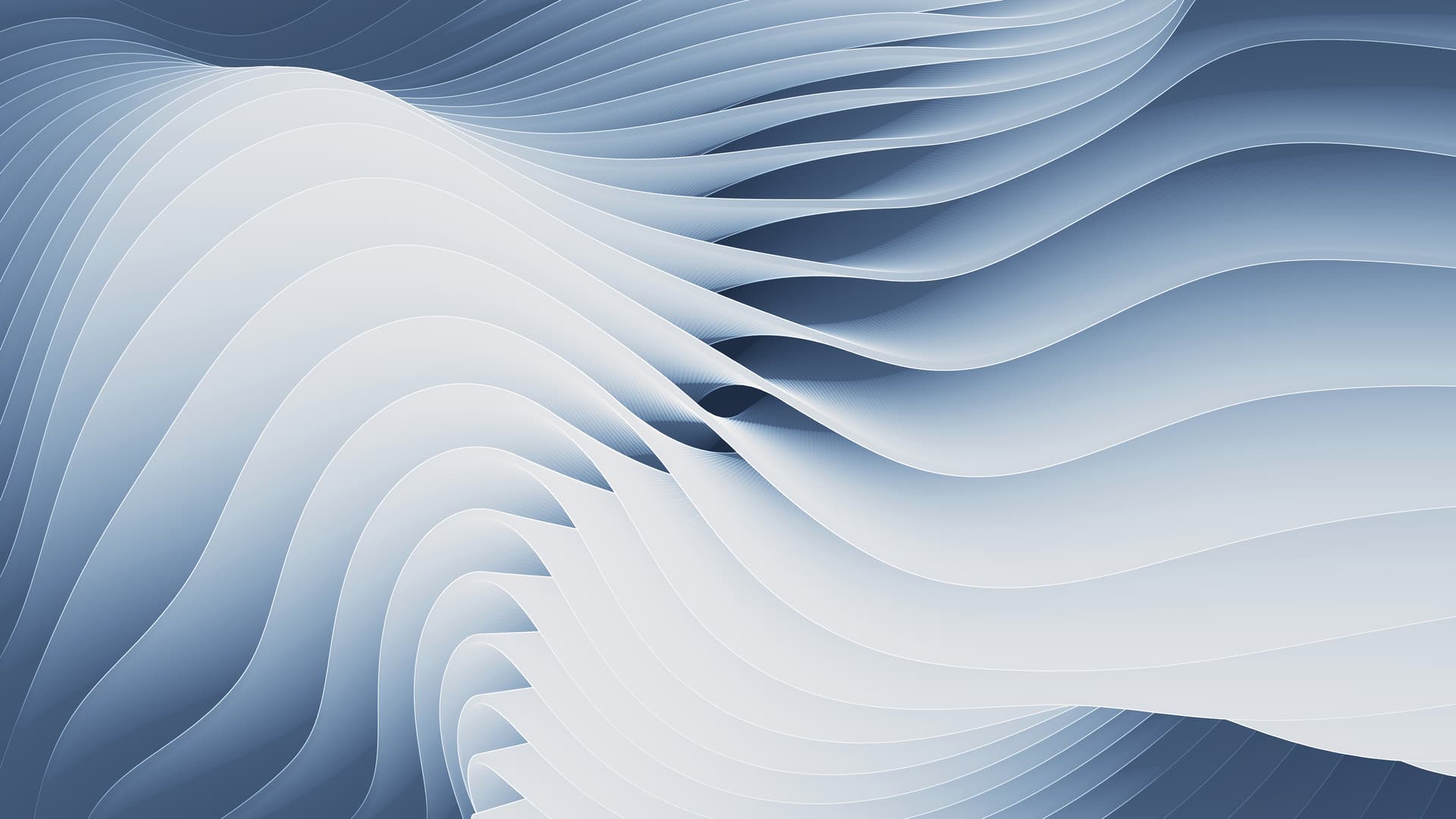
Light mode:
There are more variants on this link (with higher resolution)
Hi, this is my wallpaper submission. Rendered with EEVEE (Blender 3.6) at 5120x2880px.
Dark mode:
Light mode:
There are more variants on this link (with higher resolution)
These are really cool! Especially the dark variant. Good job!
Tyvm!!
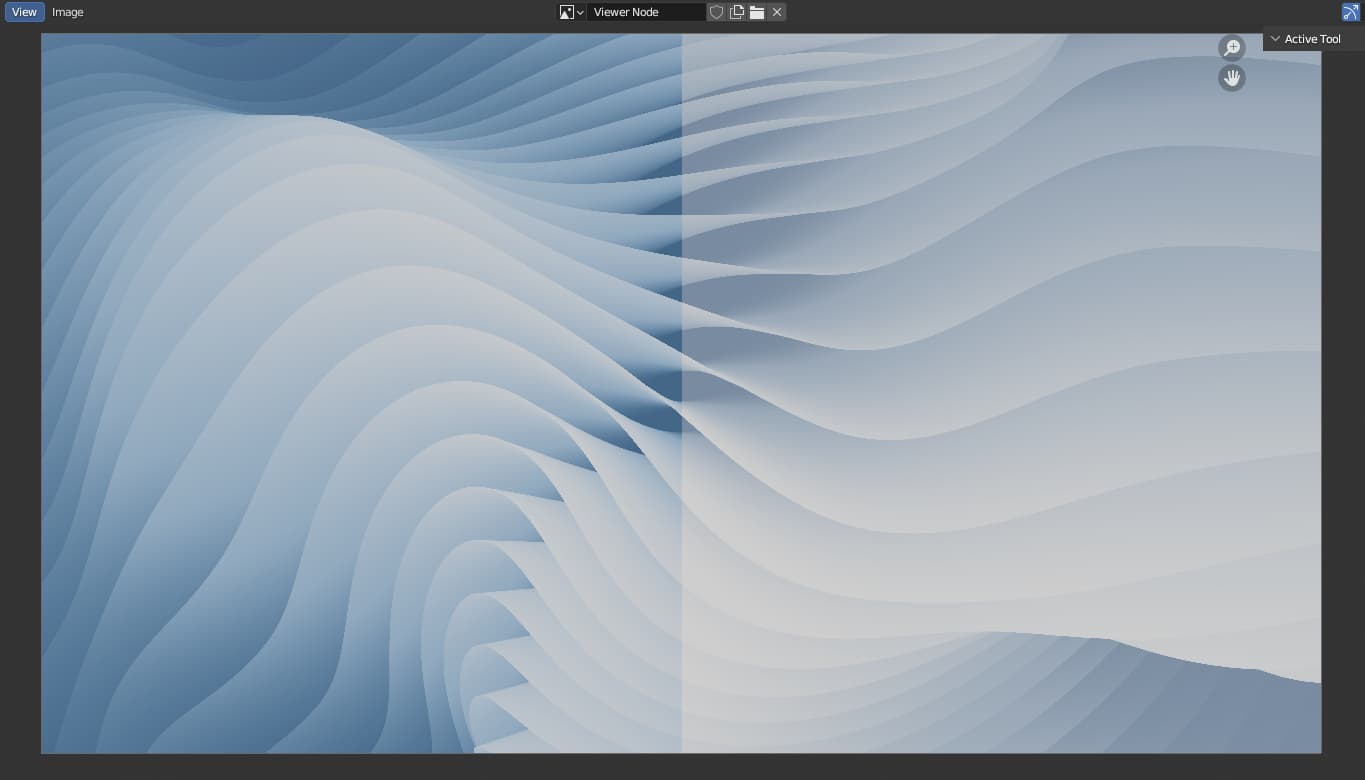
As always happens, I woke up the next day and now it feels off. I updated the light version because it looked very saturated.
Split comparison (Left is old, Right is updated):
IDK, its a little bit too much win11? ![]()
You got me. Im the impostor here, I use Win11 as a daily driver so maybe Im a little more bias towards Windows design, more gradients and color depth. I saw a post on r/Blender showing their wallpaper for this forum, and I wanted to give it a try because I like creating abstract wallpapers. Do you think that material design is more of a style for this?
Yeah, It definitely gives off Windows 11 vibes, but they’re still very good imo and it still looks different and not a copy anyway. It’s not like Microsoft owns a license on waves as a whole.
Mine isn’t inspired by windows but I still worry it’s somewhat similar…
The announcement has some themes, and you can check out previous Plasma wallpapers for inspiration.
Oh! You are the one who posted on r/Blender. I really like yours… the one with AgX looks insanely good, it really makes a difference in comparison to Filmic color space.
Ty! Yeah I know, it’s literally a procedural noise texture displacing lines on geometry nodes… but I get why it can be similar, all the W11 default wallpapers are layers stacked on each other like this.
I came back to read the suggested themes and I thought about giving it food colors, a familar and comfortable pallette. My personal preference is minimalist wallpapers with the least amount of colors possible so I need a second pair of eyes to judge it…
Candy ![]()
Blue… berry ![]()
Ratatouille ![]() (too much candy to call it Lollipop)
(too much candy to call it Lollipop)
What dou you think? Im bad at choosing color pallettes ![]() and names.
and names.
nope you are genius
Blue… berry ![]()
![]()
Ty! Idk if I need to post this as a different submission marked as recolor since the idea of these variants differs from the original images or do they already count as a submission if I include them in the Google Drive folder ![]()
mine wallpaper had 12+ variant ![]()
im not from KDE side but i think its fine to had many variation as long its not straying (very much) from its original concept, be it a color or a slight tweak of the images.
just make it clear to present the original images and mark its variation in neat and separate place.
I love the first one and the second, not sure I’m sold on the third but I like it as an option.
Agreed. These are better.
These are not is not my personal taste and I prefer dark red or b&w wallpapers, so thank you for letting me know! Blue is a good neutral color for wallpapers ![]()
well, isn’t plasma sort of Windows 11 … enhanced with superpowers!
btw: the whiteWaves thin is on my desktop ! very nice work !
Ty!! I’m glad you like it. Lovely to hear you are using it! ![]()
The original light/dark version of this is one of my favorite wallpapers of the whole contest, and I’m putting it in my personal wallpaper collection. So don’t be surprised if it shows up as the background for images in my weekly blog posts!
Thank you very much! I appreciate it a lot ![]()
Sadly, the contest ended. But I’m happy that there are many talented and excellent submissions!