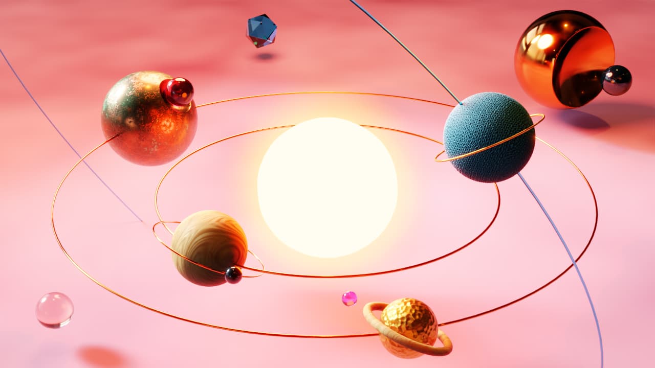
Heard about this on Lemmy (I think) and this is what my subconscious came up with inspired by the themes (it’s always super interesting to interpret your own stuff but it’s equally interesting to hear what other people get from it, so I’ll hold back my own thoughts for now):
Which variant do you like best? What would you change?
I’m unsure if I should try to incorporate the elements from the portrait version into the landscape format, because especially the copper D20 (is it actually one? ^__^) adds a nice depth to the composition. On the other hand I like the emptiness / white space around the landscape format …
I will probably have a look at the light / shadows again because it would make sense if the light source would actually be the sun (as someone pointed out on Mastodon). Not sure if that actually works or if it will take away from the (pseudo) realism of the planets just sitting on a desk somewhere too much. I’m also struggling with a dark version, though I would really like to have one.
The image and ideas good stuff , the blinding sunlight is very bright,
Jokes aside, is it good, OK, seriously, good idea and well done !
and you know what else
It’s a reminder of the science stuff we did in school years ago, Thanks for the memories, Cool.
Following your link, gottem that’s some fine work you got going with Leaves01 maybe drop a leaf or two in front of the sun, man oh man eyes my old eyes,
I’d like to see you expand this I like the planets colours they blend well with the background,
images that have that, they are ready to start moving.
Thanks for the feedback! didn’t notice that the sun could be too blinding (I tend to have my monitor brightness on very dark ^ __ ^), I’ll see what can be done about that, maybe the sun can become a red dwarf (or just not be as bright, I was actually thinking to make it more of a golden yellow and not almost white.
I feel you dilemma, I make a few variations then put them away for a day ( your timeframe) or more,
Open em and ugh decisions to make, viewed from 3 to 5 metres side by side can help.
Which variant do you like best? What would you change?
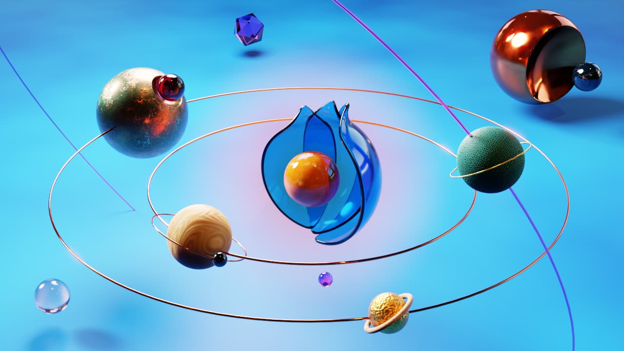
Would like to see the Dyson Sphere version (fourth picture, blue sphere) for desktop. Regardless, I am nabbing the Dyson Sphere version for my PinePhone.
Yeah, excellent tip, you get so focussed on small details when working on something, stepping away is always a good idea to get a feel for the whole (when you have the time …)
Oh, that’s an honour! ^ _ ^ Is something like this what you wanted for desktop? How do you like the Pinephone?
Since others commented on the sun being to bright, do you mind that? I tried to make it darker, but it just looks super weird, trying some other things atm as well …
Yeahup I hear you, done that then learnt (the hard way)
Have had as many layers as objects Inc the shading of each item and part item each one is one layer, many layers were alpha with just a splot of shading, eh.
You likely know this
You have everything on different layers ?
try this have the layers structures like this
top - layers above the sun and Bground (that’s the) Planets and other bits and rigs = no need to adjust until final assembly,
middle - Alpha layer(s) X?? how ever many you need/ try for . . .(never had or did this, this is where I used to go wrong)
bottom layers = Sun + background , ( I used to try adjust brightness here > big no! that’s where it gets weird,
It’s the alpha (middle section) layer(S) with the very light opacity.
on the alpha layer . . . try for a 5% to 15% opacity each layer different Hues
that should tone down the sun and background and then you control the opacity.
Separating the sun and the background from the planets and rigs is the key to removing super weird.
It’s easier to do than explain.
I really do hope this helps.
Mmmmh, interesting. Not sure if I follow exactly but alpha was most defenitely part of it. Rendering out the background, sun and foreground in different layers / passes is in interesting idea. I think I’m (again) stuck with the „I want to do it all in Blender“ mindset when it might actually make more sense to do 2D image editing here. I’ll see if I find the time to check that out, but thanks for the tip/idea! ^ __ ^
Can I not edit my original post or am just not seeing how?
Anyway, while trying to find a solution for the sun being to bright I also thought about maybe making the background more KDE blue and this is what I came up with:
Looking at it now I think I kinda prefer the original (at least the sun, the background is cool), I’ll see if I can render out the sun on it’s own layer and tweak it that way as @artytux (maybe ^ __ ^ suggested).
That’s the problem with artwork so many variations, opinions and ideas that evolve.
One good thing about digital able to keep old layers stored and compared to acrylic on canvas no going back when changed.
Changing the foreground planets sizes Very neat, WoW to the new version completely different to first one,
Dude, you can’t have 2 planets on the same orbit like that – they will just collapse with each other. Also, blue planet’s orbit is messed up pretty hard. This whole solar system is like a ticking bomb to a catastrophe
A good man! Do you understand that this is just an illustration for a wallpaper CONTEST, and not an illustration for some SCIENTIFIC article or book? Here the artist can do whatever he pleases) and spit on all the laws of physics, chemistry, biology, etc.