I dig the original wizard mascot, has that vintage 90s like look to it. Least favorite would have to be old konqi, looks like a creepy really badly done CGI movie. With modern konqi being my favorite, I just want to give him a hug he’s so cute.
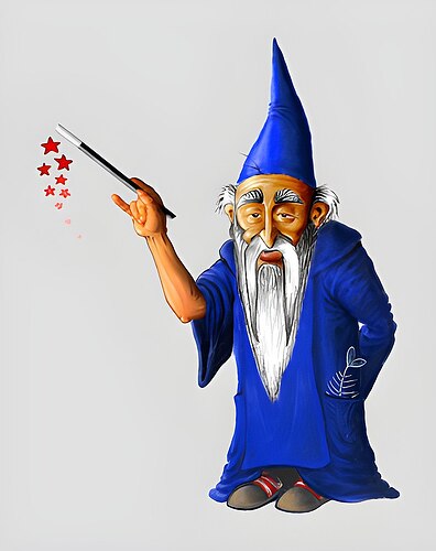
All of them have their charm, but the current one wins, hands down.
Somewhat offtopic:
I’m curious about how and why it was decided that KDE needed a mascot, I haven’t found much info about that particular process.
I mean, if this worked like any graphic design project I’ve been in, someone realized that there was a communication “problem” to solve, and after considering solutions, they decided that a mascot was the way to go (then begins the mascot design process, but I’m not talking about that). Was it voted internally? Or maybe the team thought it was just cool to have a mascot? Is it a Linux tradition to have mascots?
I guess I’m interested in how decissions about graphic design are made, and how the KDE team works. It would be cool to know the story
It’s an incredibly common thing for a free software project to have a mascot. It’s something nice to identify the group with. Krita has one, GIMP, XFCE, Blender, all the *BSDs, and so on and so forth have one. It make sense for KDE to have their own mascot too.
ImageMagick was started in 1987 and has a mascot similar to Kandalf (I wonder if that was an influence on the design of Kandalf). The GNU project mascot dates back to at least 1981. The Commodore Computers logo was amusingly nicknamed “Chicken Lips”. The face of Sega was/is Sonic. The face of Nintendo was/is Mario. Linux is famously the “Tux” penguin and dates to the mid 90s with many distros having their own names / mascots based around penguins, the most on the nose being Gentoo. The earliest BSD Daemon mascot dates back to 1976, but starts to appear as we most associate it as early as 1984 on the Unix System Manager's Manual.
Then there is the weird world of anthropomorphic “OS-tans” from Japan that represent various Operating systems, unofficially.
You can see a full list of computing mascots here.
As to the question of “why” open source tends to have more mascots than proprietary products… I think it’s exactly that. The difference between open source and proprietary culture. Proprietary stuff is owned by a corporation and branded with the logo of lets say “Microsoft Windows” and the Windows logo. “Microsoft Office” and the Office logo, which was originally just text, then featured a puzzle logo, which then morphed into different sized and coloured squares, which morphed into the door icon they use now. Then you have IBMs iconic text logo. Not much more needs to be said about that. Apple have the silhouetted Apple, but many people forget (since it only existed for a single year) that the original Apple logo was Isaac Newton sitting under the Apple tree, after which they adopted the rainbow Apple.
Then you have open source projects. They’re not corporate entities, often hobbyists. Often started by nerds with weird senses of humour who want something that identifies their project to the wider world and don’t have to adhere to corporate management and lawyers saying “you can’t do that”. So you end up with a Daemon representing the daemons within Unix, a GNU head representing the GNU project, the name of which is a recursive acronym, or a penguin called Tux because the main developer behind it either really likes penguins, or the story of him being bitten by one at the zoo is the original story.
That deep dive was precisely what I was asking for! When I wrote that it must be a cultural thing, I was thinking something along those lines, the difference between corporate design and free software culture, I mean, but I wasn’t exactly sure. I get it much better now, your summary makes perfect sense.
Torvalds claims to have contracted “penguinitis” after being nibbled by a little penguin on a visit to the National Zoo & Aquarium in Canberra, Australia
(Source: Wikipedia)
I didn’t know this and it’s hilarious.
Thank you for solving my doubts and for all these pieces of interesting info!
When it comes to KDE mascots, my favorite is definitely Konqi – the friendly green dragon that has represented the community for many years. Konqi is not only recognizable but also perfectly reflects the open and welcoming spirit of KDE. On the other hand, my least favorite would be Kandalf. While he does carry some nostalgic charm, his wizard design feels a bit outdated and doesn’t really match the modern and vibrant image that KDE aims for today.
The current Konqi and friends are great. They look good in info dialogs and help pages, and just make KDE appear a lot more friendly and approachable. Perfect mascots.