Examples
-

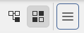
The height differs.
-
The menu bar’s highlight differs to the QActions’, whether exposed via the context menu or a QToolButton, as aforedepicted.
Explanation
I’m aware of the Union project’s intent to unify the Plasma Style, QtWidgets Qstyle, and QML QQuickStyle. However, in Dolphin’s case, the menu bar, context menu, and QToolBar (and its QToolButtons) are all provided by QtWidgets.
I’ll presume that the examples I’ve provided are already well known of, so why do they remain? As the most prominent example, why is the menu bar’s selection highlight still early Plasma 5’s, rather than the new (> late Plasma 5’s) Breeze’s?
I’m not fully understanding what you are wanting all styled the same. In your screenshots, you have toolbar buttons, the menubar, and the menu items. They all serve different functions, so I myself don’t want them to be styled the same.
@katherinemaxwell, the context menu entries and toolbar buttons’ highlights used to be square and solid. Now, they’ve adopted another style. However, the menu bar has remained like this. Considering that all other elements are rounded without outlines, this doesn’t make much sense to me.
Likewise, that the QToolButtons aren’t aligned with the location bar doesn’t appear sensical, which also applies to the menu bar’s height differing to that of the buttons’ and context menu entries’.
Per Fitt’s Law, there should be a specific button size that has been shown to be the largest that Breeze can have without it seeming too large, and that should be utilised everywhere. It is, except for these few exceptions.
Got it. I wasn’t aware of the menubar being the old style which has evolved for the other elements.
I can add this example to your button inconsistency complaint:
This is my dolphin menu button, which is somehow not square.
1 Like
