There was an initiative by Niccolo Venerandi back in plasma 5 to unify tab styles in KDE (plasma, gear, etc). Ironically it resulted in the creation of even more tab styles. Currently there are at least:
Tabs on the left side of DigiKam and bottom of Kate (no focus indicator line, surrounded by rectangle)
Tabs in Dolphin (usual breeze/windows tab style with focus indicator lines on top)
Tabs in the settings window of Dolphin (new immutable tab style with focus indicator lines on top)
Tabs in the bottom bar of KClock (focus is indicated by accent color in background)
Tabs in plasmoids (focus indicator on bottom)
Tabs in qqc2-breeze style (similar to the new immutable tabs but qml)
Custom tab widgets in amarok
Is there any plan to at least make these look similar?
ah yes, one of the biggest KDE problems, design consistency. It all starts from the part that we have many different UI frameworks and different toolkits to build apps, too many. Each one has different ways of implementing different things and then developers they themselves also create new ways to design stuff because KDE doesn’t really enforce anything, which is good, but ends up becoming a mess on some places. I think the KDE team should really focus on ditching less used frameworks and try to focus on one or two at most, and focus on improving those, and maybe enforce a few little things like those damn tab styles.
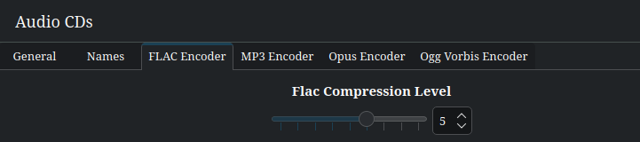
I am also a bit unhappy with the variety of tab styles. Personally, I favor the tab style where the active tab is visually connected to the active content. I find this most intuitive as it looks similar to a stack of cards with – well – tabs. Also it resembles a real thing. An example from systemsettings / Multimedia / Audio CDs:
It’s not as intuitive as the previous style. Especially because the active tab looks rather disconnected from the active content.
It always uses all the horizontal space. This can look very awkward in large windows on large screens. Also, you have to move the mouse much farther when you just want to browse various tabs (e.g., when searching for something).
It is visually more noisy as it uses a separation line and an additional background color.
I think such a style makes sense only when the active content is not necessarily directly adjacent to the active tab (e.g., in Plasma’s task manager widget). In such cases, it might not even make sense to still call it tabs, but just buttons instead.
From a standpoint of Web Content Accessibility Guidelines (it’s primarily for the web but can apply to software), if there is no focus outlines, that violates WCAG 2.2 Success Criterion (SC) 2.4.7, Level AA. A visible focus outline or highlight is important to ensure that users who rely on keyboard for navigation can know where they are within the application at all times. I cannot help but get the impression that we take mouse for granted.
Speaking of which, I came across a web application that makes use of different tab styles and widgets; however, I’m not able to disclose the names of the companies due to Non-Disclosure Agreement. I would suppose it would be okay if different tab styles are used when it comes to understanding the purpose behind it, but making use of tab styles willy-nilly without a purpose can be problematic for some users. Of course, Mac OS does make use of toggle buttons that function as a tab interface. Windows 9x operating systems do make use of consistent tab interface from one application to the next.
Last, but not least, Windows 95 is a good operating system to take a look at when it comes to keyboard support. Yes, Windows 95 is dated, but it should not be ignored when it comes to ensuring that people who use computers can access the standard applications without using a mouse.