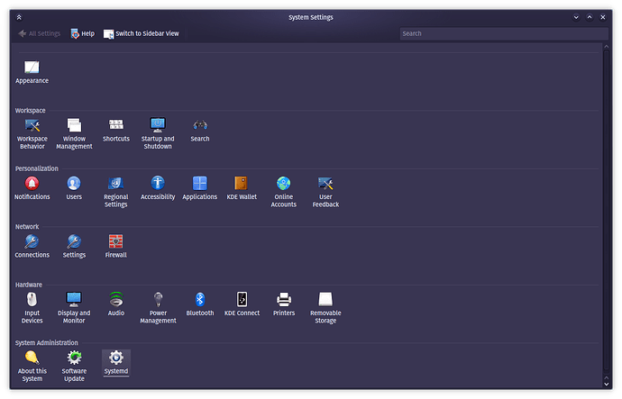
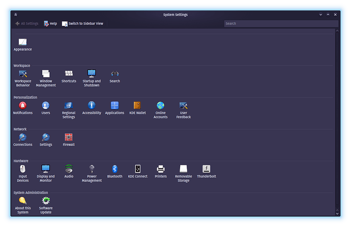
I use the Rose Pine Moon color scheme on KDE. I have recently installed Artix Linux on my system alongside Arch Linux and I’m trying to replicate the look of KDE from my original Arch install to Artix. When using the Oxygen theme, I noticed that the titlebars look darker and less vibrant on Artix compared to Arch, and that the gradient/glow is less noticeable. See here:
Arch:
Artix:
How do I make the gradient look more vibrant as it does on Arch? Why do the colors look different although it is the same exact color scheme? Any help is greatly appreciated.
A couple of total guesses here, but maybe helpful in prompting a more helpful thought in someone?
Does that theme use transparency/translucency at all…and are the wallpapers on both installs the same?
Are both using the same display server? (X11 vs Wayland)
Hm, so there is no transparency on any windows, this is a strictly opaque, Oxygen look. The wallpapers are different at the moment, but I do plan on changing the wallpaper over to match soon. (I most likely won’t be back on that system until tomorrow).
Both OSes use X11.
EDIT: I got a chance to change the wallpaper to match and it made no difference on the colors/gradient.

