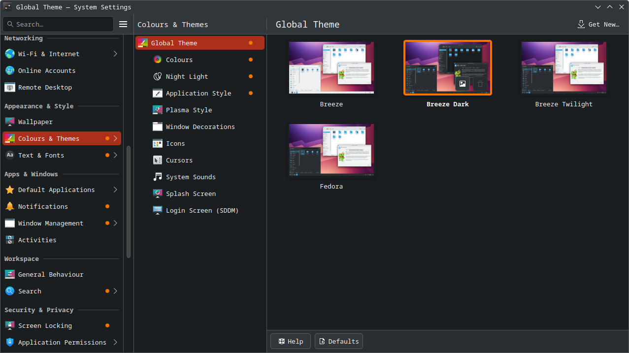
I believe it’s a conscious decision because I remember kate having a tree-style navigation sidebar in its configuration window, which was replaced by a simple list approximately 1.5 years ago. Everything but a tree appears to be considered acceptable, which seems strange to me, considering that I would expect the more versatile option (a tree) would be more widely used. I searched a little of invent.kde.org/documentation/develop-kde-org/-/blob/4f8a33855bc2d5a52e5eec6da5f4e0c9337539e2/content/hig/_index.md and didn’t see anything about this.
The current System Settings is very overwhelming, I hope they do get around to revisiting this. In the ticket you linked (thanks for finding that) there was a good mockup for a simple overview that didn’t require scrolling but it was rejected.
@aronkvh, on that note, I re-read some of that thread, and it seems like: [1]
An explicit goal here is to not have a tree of any kind, either an explicit tree view or an implicit tree view that involves parent groups and child items. I want the sidebar to be completely flat.
…hasn’t quite been achieved, although that’s somewhat tangential.