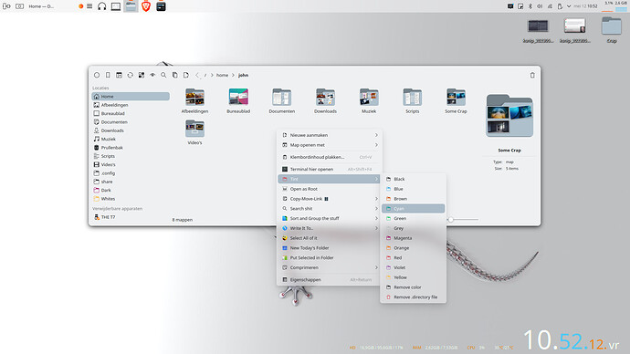
And…in Lightly application style, klassy window decoration and breeze rc chameleon icons. Roundness everywhere.
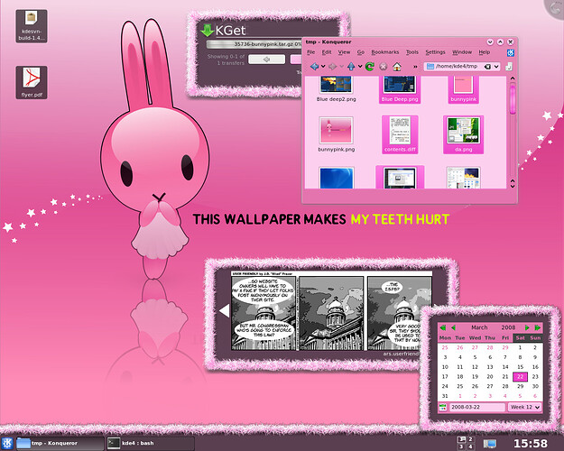
I still use some Oxygen, Plastik and Tango remnants… ![]()
Please, let’s talk about modernizing the desktop. Talk about Kirigami, matching or beating the best design. It’s not Sierra Breeze, Klassy or Lightly, it’s Kirigami. Improve style. When do we move forward? 3026…
Personally, I think rounded corners are ugly. They offer no functional benefit over sharp corners. They are just a fashion fad right now, but soon people will get bored of them.
There are actually valid - UX - reasons for rounded corners, and I wish people would stop jumping to the conclusion that design decisions are artsy personal preferences instead of deliberate choices made by professionals who ground their work in human psychology. Research shows that users see interfaces with rounded corners as easier to use (rounded corners, being almost universally preferred, feed into the aesthetic-usability effect), and find them less intimidating.
Since there is a lot of general feedback in this thread, I’ll throw in my basic two cents - the Plasma desktop with the Breeze theme is the “cleanest”, most modern and attractive-looking PC desktop I can ever remember using or seeing.
Maybe that makes me an old fuddy-duddy, but I already think it looks extremely modern with the translucency, the lines that show up on the panel when you slide out a menu/widget, the way the accent colors look, the super modern design of the icons…de gustibus non est disputandum and all that, but for my money it’s beautiful and actually looks useful and usable (unlike the perennial challenge for me of figuring out how to even use a modern-style GTK/Adwaita app, or something in the Apple/Google phone design language).
(Take my opinions with a grain of salt, though - I also thought at the time of its release that Windows XP with the clouds in the background was beautiful, and as a teenager would sometimes just stare at the pretty blue colors)
It’s funny how every time I modify and tinker themes, i always end up going back to Breeze style.
It just works.
Most people seem to be bothered how “rounded” things are. If it did not add any technical debt and would be super easy, having a “roundness slider” in Plasma settings would probably calm most people ![]()
I don’t want a MacOS or Windows clone either. I want Plasma.
I guess my biggest problem with current Breeze is the flatness of some elements. I think there could be more of the good ol’ skeuomorphism. But that has tendency to make things look a bit dated… So, dunno.
It’s funny how every time I modify and tinker themes, i always end up going back to Breeze style. It just works.
Same! No weird glitches or issues finding a matching GTK theme.
Most people seem to be bothered how “rounded” things are.
I have a theory about this. While round elements give people the impression that interfaces are easier to use (there are studies on this), I think that the perceived difficulty of an interface plays a role in the sense of pride & self-worth some users gain from the idea of using an ‘advanced’ operating system. For these users, greater perceived ease-of-use may not only reduce this sense of pride, but they may also feel patronized, as though effort put towards usability implies that they need a more usable interface.
I guess my biggest problem with current Breeze is the flatness of some elements. I think there could be more of the good ol’ skeuomorphism.
Hard agree. Studies continue to show (as they always have) that flat elements receive less interaction, and that users often don’t understand that flat elements, or interactive elements that only consist of text, can be interacted with at all.
I think it’s totally possible to apply skeuomorphism in a targeted way that doesn’t feel dated. Subtle gradients on buttons are often enough to make a big difference, and text/icon-only interactive elements shouldn’t exist for sure. It seems like the key principle here is depth: interactive elements should look physically manipulable.
Some apps like Qalculate-qt, qBittorrent, Transmission-qt… already use Qt6, they appear using Fusion theme due to absence of any Qt6 Breeze theme on Plasma desktop, this causes them to look inconsistent with KDE and GTK3 apps.
I agree the KDE Wallpaper contest is going insane.
But the requirements are also rather un-techie. Its simply a wallpaper, and not a huge collection of icons. So everyone can make their awesome wallpapers creatively.
I agree that the Breeze icons look pretty horrible. Sharp edged and pretty bad, on the Kirigami Website for example, “this is supposed to look good?”.
But I agree, Plasma 6 would sound greater if it had not only great wallpapers but also better icons.
I really like Adapta Icons, they are rounded, have colors and just look better. And they are actually very old which is funny.
Lets make sure what itches us about the theme:
- sharp edges? Do you prefer rounded corners?
- only monochrome, do you prefer colors?
There is some MacOS-like iconset too, for things like apps, file previews etc. It also looks great and somehow smoother than Breeze, I prefer Breeze a bit though. And KDE should still look a bit different.
But I think simplicity, elegance, roundedness, maybe some colors could really be great for it.
Currently I think finding maintainers for Adapta would also be great, as its very old and partly broken.
As the old saying goes… you can’t argue about taste.
You will get some people, who are happy, some who prefer skeumorphic design, some who go for mono colors and so on… And everyone is right and has a point in that… A good default theme (icon, wallpaper, theme and colour) is imo one who doesn’t get in the way and breeze is doing a decent job here. Not too simillar to the usual suspects, but distinct enough to be recognized.
Concerning your questions: No round excessive roundness, and if tinting e.g. of folders follows my accent colour I’m happy.
So, I’d go for evolution instead of revolution…

