Thanks, was just curious if I could help somehow. Klassy is Kool, so I will try to run it a bit and see what happens.
1 Like
No need to apologize (or delete), it just looked like you responded like it was a bug report. (which I found funny ![]() )
)
Klassy has not been abandoned. I had some different personal circumstances, and also got demoralised slightly after kwin in Plasma 5.26 introduced a complex-to-debug regression, despite Klassy working perfectly in Plasma 5.25.
Today I released Klassy 4.1 as a workaround. If you are interested, please test it out.
I hope to further develop Klassy in the next few months.
12 Likes
Klassy is really awesome, thank you for your work. ![]()
Never said it was. In fact, the day it won’t be “compatible” probably won’t be due to your doing. I’ve used it pretty much since day one, mostly the days I still used titlebars. Nowadays I still do. There’s a glitch in Lightly ( which I use overall) window decoration which isn’t the case in Klassy.
In my opinion, Breeze needs a major facelift.
1- ditch the ubiquitous blue and let the user choose a highlight color. This is already the case but it does not apply everywhere.
2- Redesign the icons, Dolphin folders have an outdated design. (and still that aggressive blue everywhere ![]() …)
…)
3- Use rounded corners for windows, elements and icons
(personally I use papirus icons, the only valid and creatives ones)
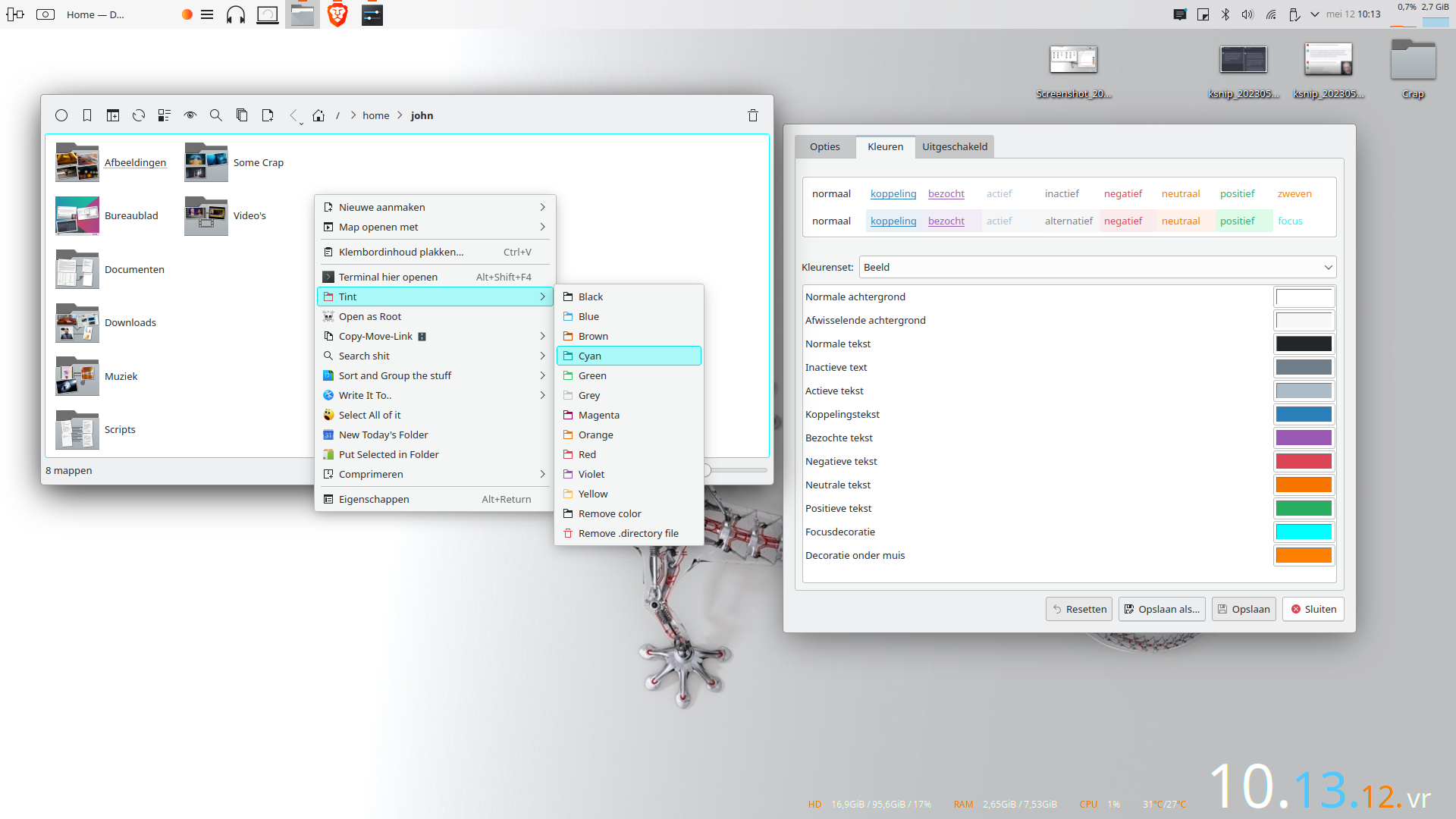
4- The colored frame in dolphin (for highlight the folder’s frame when the mouse clicks into ) is very ugly. (to stop seeing this horror I had to adopt the “Fusion” style instead of the “Breeze”)
5- Take inspiration from Gnome-shell for a new, more contemporary design
2 Likes
Most, if not all colors can be set in a color scheme. However, a ton has been messed up since the introduction of the wallpaper and custom highlight thing which, to this day, still isn’t fixed. As for the breeze icons, whereas, again, the custom highlight thing isn’t working properly for the icons, you can use the chameleon set which does a better job at it. Furthermore, the breeze RC was released a long time ago and comes both as regular as chameleon. There are also scripts available to make your own colors so Papirus is hardly the only valid one . As for rounded corners overall, there’s always Lightly which, besides overall roundness in the ui, transparency…comes with its own window decorator which allows to set roundness as much as you like. So does Klassy, Sierra Breeze etc… That being said, unless you want to use a different application style, window decorator style and custom adaptable icons, then yes, Breeze looks outdated. I personally don’t use titlebars but one thing that might already make a diff in breeze is a csd option. It would be perfectly possible if a custom toolbar button option would be available in every kde specific app. Right now, in most, only a shutdown button is available. Not a big deal if you use “active window control” or “window buttons” on a panel, but still…
Breeze needs a SF Icons treatment. It doesn’t get any better than this IMO.
There’s always room for redesigns, but stability comes first.
Where are the new but experienced developers and designers willing to undertake a massive project like this while avoiding the mess that came with the 3->4, 4->5 transitions?
2 Likes
In short, this will happen if the following happens:
- Someone passionate puts the work into it
- Someone pays someone to work on it
Currently there are a lot of other stuff to do, it’s better to get into stable ground with Plasma 6. After that, who knows?
3 Likes
made an issue for this:
Hmmm, Sierra Breeze, Klassy or Lightly, no thanks, are not for me, I don’t want a copy of iOSX or Windows. My best graphic reference (and experience) is Gnome-shell but I prefer the KDE desktop approach.
1 Like
Ok, the transparency have an old Vista flavour.
Your third eample is better for me.
So, I prefer this for example with excellent papirus icon set ![]() :
:

Yeah, well…the third example is apple.
1 Like
Personally, I think rounded corners are ugly. They offer no functional benefit over sharp corners. They are just a fashion fad right now, but soon people will get bored of them. Rounded corners remind me too much of ɢɴᴏᴍᴇ, which has this childish, toy-like design, almost like winXP.

I quite like the current appearance of Breeze – it’s quite unique and recognizable. The only thing I dislike is the fact that the default blue is still hardcoded in some places (mainly screen edges highlighting).
2 Likes
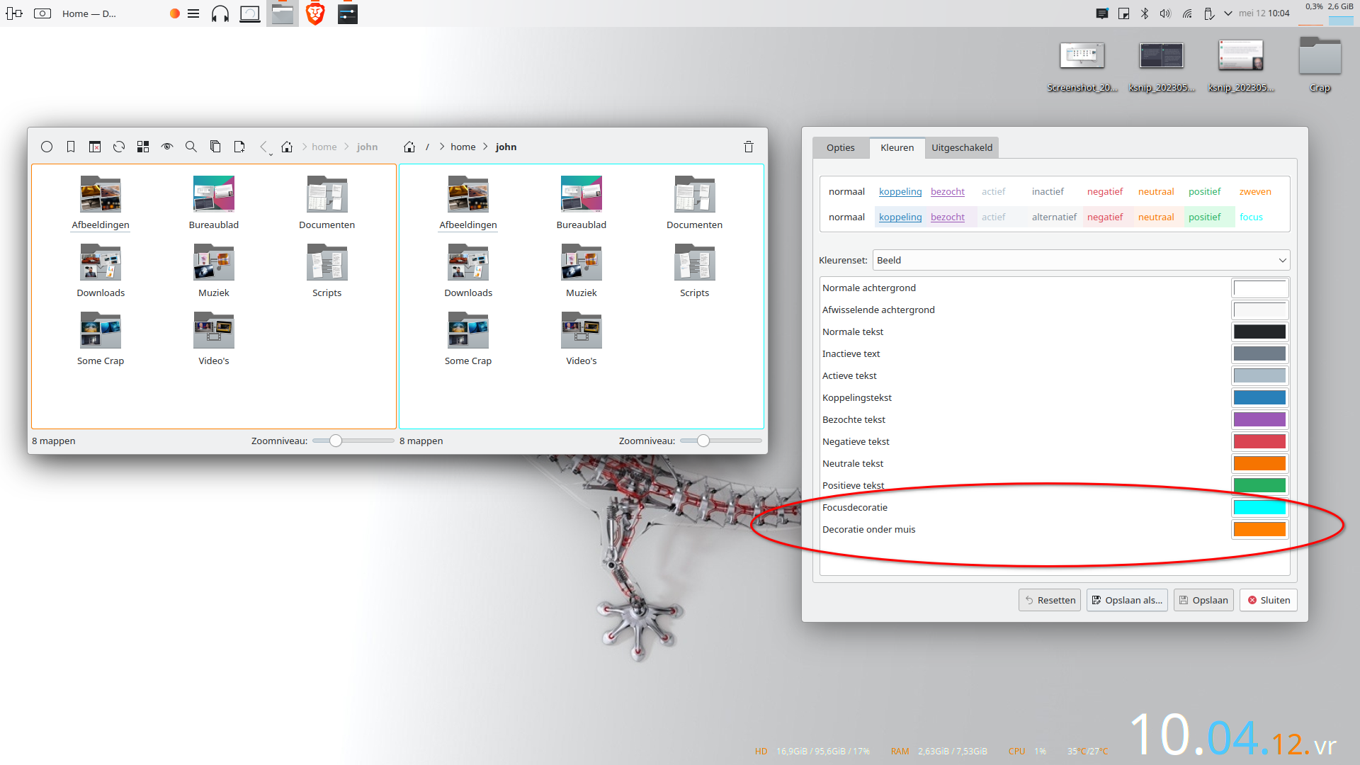
Not sure what you mean by “the colored frame”, but you can change that to whatever color you want. Won’t work with wallpaper or custom color highlight though. That stuff breaks a lot.

Yes I talk about this frame.
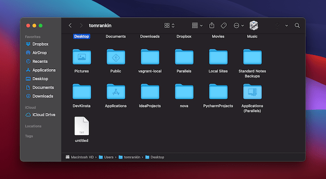
You have two different highlight color on the same desktop???
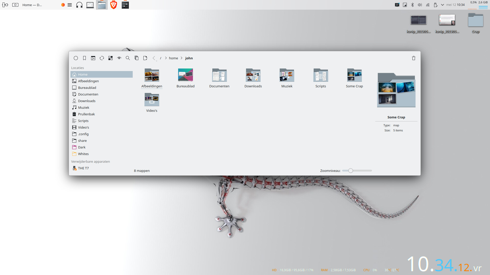
Your screenshot, close than a fresh installation kde, confirms my idea about Breeze :
The graphic design is too aggressive and contrasting.
It’s an example man. One color is fixed and the other is mouse hover highlight. In your color scheme it’s under image.