Please let me know your thoughts and opinions about this, while I know I can’t just ask for a redesign maybe this mockup can give the KDE team an idea for a new approach.
Can you explain why you consider that? From my perspective Discover has too mucho happening at the same time in the same screen. It has search, categories, and other options in the same place.
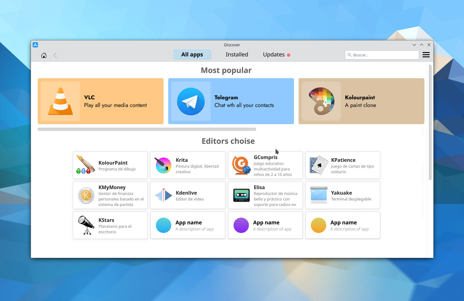
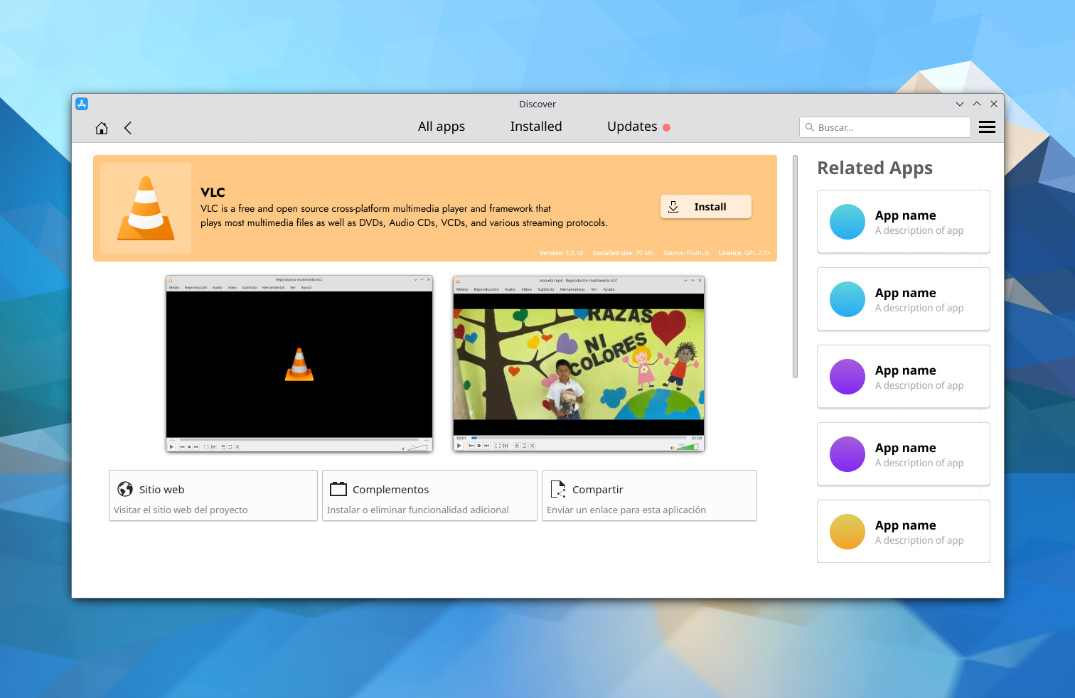
This removes all of that by focusing on the actual content and discovering apps.
i would like to pin a default view, say installed, that will show when i first start the app… instead of the featured which always comes up and provides little value to me.
it would also like to be able to sort the installed list by date originally installed so i have some reference of what order i’ve installed things…
I like the idea of choosing what it show when opening, by default it should show the available apps, that’s for sure, buy maybe in settings or even on the page to show a default view, I might add it later, thanks for the idea
I like the idea of thinking about different approaches, although I have to say I find this - especially the home screen - a bit too reminiscent of GNOME Software for my personal tastes.
Nothing inherently against GNOME Software, but what about leaning into the concept of categories even further by thinking about the types of work (or play) that people do on PCs, giving folks the choice to indicate which ones are important to them, and then giving them a picture of what software they already have installed for each purpose, and what additional/alternative software could be used for that purpose?
(For example, I might check in the preferences that I like using my PC to look at family photos - it might show me that I have Gwenview already installed that can show me photos, but also that photo gallery programs A, B and C also exist that I could consider as well - just using existing category data)
I must confess that I also don’t personally spend much time in Discover, although I have enjoyed its current form when I have used it (I’m running openSUSE Tumbleweed right now, so it’s just easier to run my alias for flatpak update && sudo zypper dup from the command line for updates).
All these “scenario”, “popular”, “trending”, “featured”, “editor’s choice”…, found in various appstores, I think the problem is that Discover is not an appstore/repo/package-manager in itself, but merely a frontend to various package managers. So it has neither the statistics nor the human editors to create these lists.
I think Discover should look close to System Settings. The tab view selector in the middle of the top bar is not found in any desktop KDE software and looks straight out of GNOME.
Thank y’all for the comments, I’ll be working on a new iteration and post it here or a new post. It looks like a redesign of Discover is actually something that is desired so, I’ll do my best to integrate the feedback.
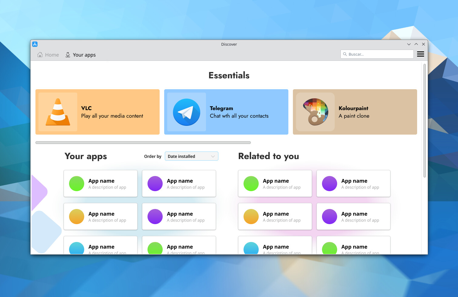
Ok, so, I have worked on the feedback I got from all of you:
Categories are back, but at the end of the home page.
A list of installed apps is now visible in home, for quick pick of recent installations. (Suggested by: skyfishgoo)
A new list of “Related to you” work as an intelligent way of the OS to track what apps you have installed and how these apps can help you on your daily task. (Suggested by: johnandmegh)
Gone is the central bar with the options to change the view, now the navigation is more classical.
Apps now must showcase “Key funcions” so user know easily what the app can do. (Suggested by: skyfishgoo)