Hello,
After 122fee56 Dolphin no longer highlights last visited folder after navigating back. There’s an obvious user resentment in thid bug but nobody hear them to this very moment:
https://bugs.kde.org/show_bug.cgi?id=494125
Please, nobody wanted this usability regression for it really breaks our workflow and muscle memory. Please hear your users. There isn’t a single file manager with such behaviour and it’s for a reason. You can see more here as well:
https://www.reddit.com/r/kde/comments/1ividwi/comment/me70iko/
Hi - I don’t have any technical perspective or personal workflow preference on this one, but to comment on the process here…
A bug report has been filed, responses from developers have been provided on that bug report, and discussions continue among developers, as you’ve linked to.
Based on the interactions I’ve had with KDE developers so far, I am 100% confident that constructive suggestions on interface designs that would address both your wishes, and the factors that led to that change being made in the first place, would be well-received.
Language such as “destroyed our workflow and nobody cares” and “stupid behaviour” in cross-linked social media posts is not constructive, and is unlikely to lead to productive dialogue.
This is an interesting choice of attack vector - to state that nobody wants a usability regression. We might reflect upon developers discussing this issue seeing your comment and wonder how they will react (whilst they’re trying to improve things) to someone saying ‘nobody wants this regression’.
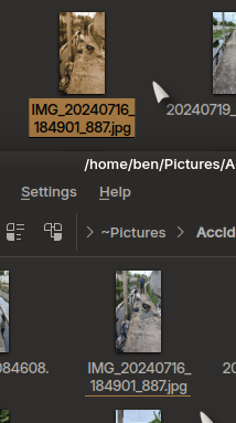
However, something I have noticed is that when using double-click to open a (jpg) that there is still a minimal underline indicating the ‘current file’… and it is not actually a real regression, it just seems to remove the more obvious highlight as can be seen here (before and after clicking to open).
When navigating via terminal, or keyboard shortcuts, this is also the case, freshly selected files are completely highlighted and after action is taken, the highlight is reduced to an underline indicating the ‘current selection’.
Given that (most of us) we know what we selected and opened and that it is still selected (and still underlined as the ‘current file’ then it is, at best, a minor visual change - but which will not interfere in ANY way with muscle memory.
Some discussion around the ‘hover’ and ‘select’. Personally, I think that the ‘underline’ should perhaps be extended to a full surround.
The highlight issue was created a year ago right? And I’m sure it’s here to stay at least a year more. They could introduce this intrusive change after they solved the highlight problem. But no - two problems are better than one. And actually nobody work on them. Cool.
But no - two problems are better than one. And actually nobody work on them. Cool.
I am not clear about what you think the ‘other’ problem is at all.
This is also a mis-representation of the facts, as my screenshot shows.
There is simply an issue (which I never felt was much of an issue) that the ‘current selection’ highlight is subtle compared to the freshly selected file/folder highlight.
The file remains selected and ‘muscle memory’ remains unaffected.
What are you actually posing as the actual problem here? This seems to be something you read about on reddit and got angry, feeling the need to come report it again here… but why?
You also state that ‘there isn’t a single other file manager’ with this behaviour.
This is also untrue, and you obviously are just throwing words into the mix without any evidence whatsoever.
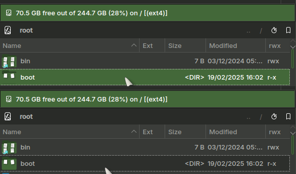
Here are two screenshots from Krusader:
As you can see, there’s a different kind of highlight for a ‘currently selected’ boot folder, which surrounds the item - as compared with the top ‘boot’ folder which is fully highlighted after clicking with the mouse.
The behaviour is essentially the same, but the Dolphin highlight is a little too subtle in comparison (as I said, I would expect an outline, not a thin underline).
Again, this would have zero effect on muscle memory and is unlikely to cause any serious usage issues.
It has serious usage issues and it’s very well explained in the bug. In this bug as well:
https://bugs.kde.org/show_bug.cgi?id=492404
You can see in details what people thinking about this change including me. The bug is mine and I didn’t see it on Reddit as you assumed, it’s six months old. You can see George’s post, it’s very well explained.
@mozo - are there any…
…to be made here? Continuing to complain about the current state of things, without constructive design proposals or code contributions, only accomplishes increased negativity.
Considering you have previously been banned from Bugzilla for persistent rude and aggressive behavior, I would encourage you to reconsider how you could more effectively advocate for and advance the changes you would like to see in KDE software.
It might be the language barrier.
Indeed it is - if I’d read this before, I wouldn’t have been so surprised at my own findings - that the item is still marked, but with a much more subtle underline with Breeze which I would suggest better be served with a complete outline.
Visibility would also be affected by the colourscheme and contrast for individual variations… as my theme varies with the wallpaper, it can vary between a bright underline and a very subtle one.
There is an issue, I agree, with language (and not only yours) and perhaps confusion between ‘selected’, ‘highlighted’, ‘current file indication’.
What would be more interesting would be a blow by blow series of events which might lead to an error.
I did notice that in your bug report, you stated that ‘the parent folder is not selected/marked’. This is sadly incorrect, though the style of selection/marking is changed from ‘currently selected’ (highlighted) to ‘current item’ (i.e. underlined).
If you hit Enter at this point, then you will again enter that folder - it IS still the active file/folder… so the workflow is not broken in that respect.
The file/folder IS still marked with an underline - so you could pose the suggestion that this is not visible enough in your opinion (and which I would agree) and this was mentioned already.
It is also important to remember my favourite expression:
All software sucks - it’s a pretty indisputable fact. What we though was perfect some years ago has since evolved into something better, bringing forward better interfaces which lead us to make fewer errors.
The only question is - which software sucks less, and how can we tweak it to suck even less than that.
So overall, from this discussion and reading the reports I can see two issues which are actually valid:
- When returning to a parent folder, it is marked too subtly.
- When returning to a parent folder, it is marked active, but not selected.
The second scenario is valid if, for example, you wish to enter a folder with mp3 files, convert them all to opus, then return to the parent and do Shift+F6 to move that folder to the other pane… it will need to be re-selected and I’m not sure how to do that other than use the arrow key.
Yes this and one more problem - let’s say you have a GOG game with 30 DLC’s. When you start the first DLC it gets deselected and just subtle underlined so it’s unknown which file you started last to continue to the next. It’s very inconvenient and I really don’t know why we have been tortured with this half a year already ![]() I use my file manager extensively, and I can’t imagine that if Felix used it even a little, he wouldn’t notice that this change is really quite disruptive.
I use my file manager extensively, and I can’t imagine that if Felix used it even a little, he wouldn’t notice that this change is really quite disruptive.
Surely to continue to ‘the next’ you can press the arrow because it IS still the ‘current file’.
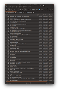
30 files can be entirely listed in one view, this is more of a thing IMO when there are more than that - so my folder here has 169 subfolders.
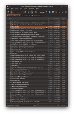
Let’s look at Acoustic stuff:
Now returning to the parent folder - where is it? The subtle highlight is more of an issue because the file is also scrolled off the view.
I’m clicking with the mouse. It’s very frustrating when one have to work with many files. It seems Felix worls with 1-2 files or don’t use Dolphin at all and I’m wonder WHY he torture us this way…
Items should only be selected if the user wants to act on them.
Yes. I selected the item with a double click to open it.
I think it’s a bad idea to change fundamental workflow such as this in a product as mature as Dolphin.
Is there a shortcut to reselect the item without arrow keys?
No, this is the annoying part - it is deliberately deselected…
So imagine, you go into a folder and select some of it’s contents, move them somewhere you want them and wish to remove the folder… or do something else (move, rename - whatever) - so you navigate up, and it is now deliberately deselected, you must now move the selection to another file/folder and back again.
There is no ‘left click’ on the keyboard to reselect it, and pressing Enter will just go straight back into the ‘current folder’ because it IS still the active item (marked underlined as ‘current item’ but unselected).
It’s confusing.
As others, I also feel this is a huge step backwards in usability for Dolphin.
I am older and my vision is not the best. To make matters even worse my memory has also been severely affected as I’ve aged. My media storage locations contain thousands of directories. When I browse upwards, I am completely lost as to what my last directory location was. I wasn’t even aware the last directory is identified by being underlined, as it is far too subtle with my color scheme and poor vision to even notice the distinction.
When I was younger I had a memory like a steel trap and this change in Dolphin’s behavior likely wouldn’t have affected me in such a negative way. Unfortunately, with advancing age and a degraded memory as soon as I’ve left my last directory for even a second I can no longer remember my old location. Using the keyboard is really not a viable option, as this is an HTPC computer and I select and navigate everything via mouse.
Unless you are older and suffer from debilitating vision and memory impairments, you likely can have no appreciation of how severely frustrating and negatively this change affects older KDE users. When I upgraded to KDE 6 not that long ago I assumed this was a KDE 6 bug that would be remedied before too long. It is exceedingly disappointing to now hear that this was a deliberate design change on the developer’s part, and there are no plans to reinstate this usability feature.
I can’t remember exactly how long I’ve been using KDE, but it’s in the 20 year vicinity. I thought KDE was focused on making improvements for vision and hearing impaired users these days, but this seriously makes me wonder about where the KDE development team’s priories lie.
You can be sure we will not let the situation as is, users feedback has been clear.
Something must be done and will be.
When is the only question left.
Just came here looking for a fix, because boy is this ever an annoying thing.
I am looking into Linux Desktops to replace the dying Windows 10, but since I work with nexted folders a lot, KDE is not suitable like this ![]()
Yet nobody is doing anything and people have to struggle with this.
There’s a PKBUILD which fixes the bug:
As I already voiced myself about ~year ago in 424723 – When going back or up, underline the folder you just came from instead of selecting it
I would prefer this to be reverted. Now after ~year of living with the changed KDE6 at home vs KDE5 at work, I would strongly prefer this to be reverted. The new “unselected but active” state in Dolphin is causing me only extra pain: more actions to get desired result (when I want to delete folder I did check content of and going up), more confusing look as it’s harder to notice where the active item is, and I don’t recall ever regretting the item was selected and doing something inadvertently with it.
Were there some hard data about users deleting files by accident and how often that happens?


