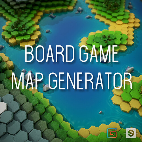
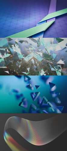
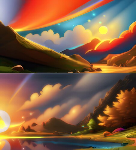
I don’t see originality in the work “HEXWORLD”. I have seen many images very similar to it. I attached the first image that google gave me.
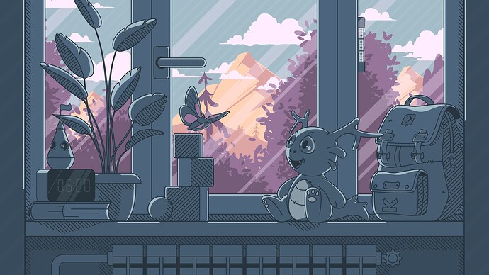
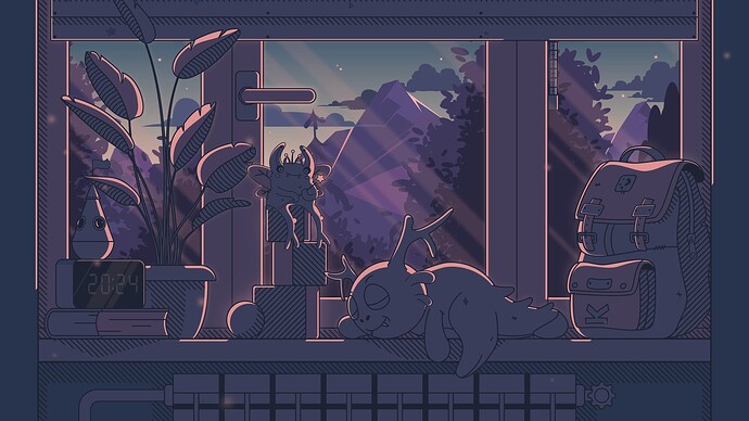
Maybe there isn’t a need for a widget. You could make 12 different versions, each one with one hour of the day (from 1 to 12, doesn’t matter if its AM or PM, or if you want you could make 24 versions). And you could have some element hiding the minutes, like the plush, or a book that is in front of the clock. That way only the hour is visible, and the wallpaper could be changed automatically every hour.
Favorite one is Sun/Comet, but all of these are gorgeous! Congrats to all.
Hello everyone! I decided to completely remove the noise and hope it will be better this way. I have divided the areas with shades to give some depth. I’ve redesigned the dark wallpaper to a greater extent. This is not final yet, as there is still time for changes.
Suggestion:
It would also be nice if the wallpapers would be made available in a 16:10 resolution (like e.g. 1920x1200, 2560x1600 or 2880x1800) for the people that use certain business laptops like Lenovo ThinkPads, HP EliteBooks or Apple MacBook Pros or 16:10 screens at their workplace.
Personally I really think the noise gave the wallpaper a unique personality but I am but one person and it is only my opinion. Either way this has to be my favorite of the selected finalists.
the window handle is in the unlocked position… it gives me the heebee geebees
Frankly, I am a little uncomfortable with the decision on 2 of the wallpapers. As well as asking not to use AI, the contest rules clearly state “Use abstract designs more often. Keep realistic and literal elements to a minimum”. I didn’t submit a couple of wallpapers that I really liked in order to comply with that premise. However, of the winning entries, both “Sun/Comet” and “Harmony” have realistic elements, especially “Harmony” (although it is very nice and complete with the dark version).
I believe that in this respect, the specified bases have been applied very loosely. I am sure that, even if my backgrounds were not chosen, there would be wallpapers that fit more closely to the rules.
I intentionally didn’t quite stick to this, as I wanted KDE and plasma to get out of their comfort zone on their own. My starting point was the illustration with the rocket, which was posted above in the comments. This wallpaper is not much different from all other abstract wallpapers, and for me it served as a kind of rebellion against abstraction in its true manifestations. If plasma is developing, then I want to see this development in everything that will allow us to expand the scope for more creativity. I am glad at least that my work is not called boring, to whom I showed it from the Linux community. Hugging everyone, guys. MAKE WAY FOR CREATIVITY!)))
This is going in a good direction IMO! The lack of noise significantly improves readability of desktop icons and text.
That is a suggestion and should not be taken as a hardline style requirement. And as previously said here:
Plasma 5 historically has had rather abstract default wallpapers, however this was no barrier for other types of artwork. There is no reason to believe that this will change for Plasma 6.
I think it is a lovely wallpaper regardless if the noise or no noise it is spectacular. I am hoping for a larger resolution of the latest one without the noise. I have a folder for some of the entries of this contest and this one I super like a lot.
I partly agree with you. I’m generally a fan of abstract art, but I’m also for any kind of creativity. What bothers me more is the unoriginality of the work than the way it is made. “HEXWORLD” and “SUN / COMET” are generally super uninteresting works, in my opinion. Although the work “SUN / COMET” evokes pleasant emotions, it looks very banal: a tree and the sun, in this case I would rather use a screenshot from a cartoon or anime. I can’t say that I like all the abstract wallpapers of the finalists, but I’ll probably single out “STAIRWAY”, I think this background is very nice. “FLOW” and especially “WAVES” evoke a pressing feeling. Well, this is largely a matter of taste, of course, but I especially liked these works:
I usually accept and follow the rules of the competitions, because they are the ones that indicate what they are looking for. Had I known that his interpretation was going to be so loose, I would have submitted either of these two (unfinished) representative images that I discarded from proceeding precisely because of that rule.
Anyway, as the saying goes “there’s no accounting for taste” so I can only conclude that “Stairway” would be the only one of the backgrounds I will use when available, because “representative” backgrounds are distracting and even difficult in many cases to identify the desktop icons.
I love the first and the third image of those works you attached. 2nd and 4th are too much “confuse” to be “my” wallpaper choice.
perhaps it’s a matter of interpretation and i’m certainly no art expert, but i don’t find any of the examples here to be fitting the description “realistic and literal”.
even the official 5.25 “safe landing” scene is an abstraction of everything depicted with unrealistic colors and features… none of it looks realistic or literal to my eyes.
your two held back works also fit well into the abstraction of reality with the colors and textures, i don’t see them as in conflict with that suggestion at all.
i’m sorry you didn’t feel they were worthy, because they certainly are.
@Rafael_Social_User The problem with those is not that they are “literal” and not abstract but that theyare very clearly AI drawn. You can see all of the AI artifacts and weirdness in the works. Which is definetely against the rules.
The only thing that I would say was weird to me about the rules was that a lot of them sounded like “You shouldn’t do that but we’re not telling you that you shouldn’t do that in fact that would be great if you did that but it is not recommended”. Not sure what I should have gotten from those. The three themes and the “abstract” part seemed like whoever was writing the rules was not even confident about those in the first place.
Just wanted to mention that there were submissions which I preferred earlier iterations of, one of these being an entry that you’ve highlighted here. Some of them in their earlier stages could’ve ended up as finalists IMHO. But oh well, submissions can only be judged in their final form then the finalists changed as per feedback given.
Still unsure if I can be more specific about this, at least right now.
The noise gives your illustration more character. I would personally stick to that original version.
Hello, dear man! I also like it better with noise, so I’ll try to come up with something. On my old device, the noise doesn’t look as strong as on good devices (and because of this, it turns out that I seem to be fine, but on good devices, too much noise is visible. I’ll think about it while I have time. Guys, who am I not answering here, who is writing me all sorts of advice) I see and read everything. I don’t answer everyone, because I don’t want to litter everything here with my comments. But I hug everyone tightly) and I feel your warmth and support. Good luck to everyone. ![]()
![]()
