thanks for putting that all together, it’s a very nice summery of a great deal of discussion.
i also think incorporating an obvious “6” would set a limiting precedent for future versions and incorporation of the 3 blobs in some way is a good direction.
for those reasons, and because i think they just work, i come down to these two:
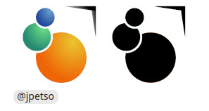
because it scales down well but maybe the > can be restored to normal rather than tapered font (or just eliminated entirely)
or:
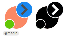
because it scales down even better and still manages to incorporate the > even if the whole look is a bit flat.
both are immediately recognizable and carry the plasma brand elements while being unique enough to qualify as a design evolution over the plasma 5 logo.