How about a new logo for Plasma 6?

With all due respect to the original creator, Plasma’s current logo looks a bit dated now, and, in my opinion, does not totally capture how exciting and dynamic the environment has become.

As we are on the verge of switching over to 6, it may be a good moment to look for something new.

We (Promo) asked @ohyran to create some logos as visual cues for the Plasma 6 campaign and he came up with the attached designs.

MAJOR EDIT

New versions:

We were not asking for a new Plasma logo. One of these designs was going to be used in videos and other graphical media as a visual cue that indicated to the viewer something like “Hey! This is about PLasma 6!”. That is all.

But some contributors in the Promo channel pointed out that they maybe could serve as the new Plasma 6 logo… Or at least serve as inspiration for a re-design of the logo.

So, here they are. Do you think any of them could serve as a logo for Plasma 6? Or do they inspire you to design your own logo (and submit it here)?

Please tell us (and show us) what you think would be a good logo for the new Plasma.

14 Likes

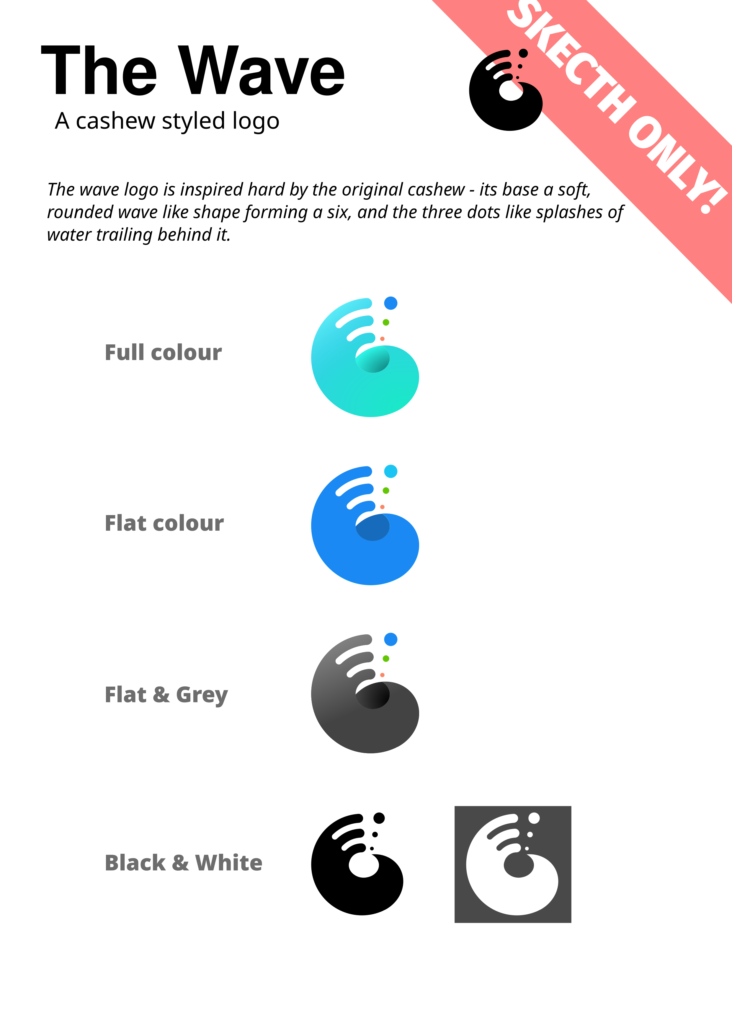
That full color wave is gorgeous, personally Im into the idea of a logo like that one. Most people like the flat look these days but the gradient on it caught my eye immediately.

2 Likes

My primary issue with the wave logo is that it wouldn’t reduce well to a window icon or the kickoff icon. Any icon design needs to be readable at small symbolic sizes.

1 Like

I really like #3 its simple yet effective

1 Like

It won’t be used in those areas though, see:

Yes, the designs weren’t produced with that in mind - just wanted to stress the point.

What do you think of the black version?

That said, one of the goals was to see if, by posting them here, the designs would inspire workable variations.

1 Like

Number 3 is the best imo. Still looks familiar with just enough change to make it look new

1 Like

It looks a bit dated to me :person_shrugging: . Apart from that, it is fine.

#3 Resemble Nepomuk logo.

About the new logo, i think that need a white/black version to be used in the meta key in Slimbook KDE laptops

Thanks I couldn’t remember yeah Nepomuk similar.

and as much as I like the full colour, No2 would be easier to update to KDE 7 and beyond.

Finished the four sketches so this is where Im at - there is no font or detail work obviously as these are sketches

Part of this is kinda figuring out how to use it in print, web, presentation and as an animation

3 Likes

I kinda like the “folded” logo, but the dots are to flat compared to the rest

2 Likes

Well all can be modded its just sketches.
So when you say “too flat” what do you mean? I mean … adding some shape and form to stuff is doable :smiley:

Each dot is composed of a single color, so I guess that adding some gradiant or shading would make them less “flat”. A bit like the “full color wave” (the wave in itself)

I’m not really good with all those terms, excuse me if I’m unclear.

A brand new logo for Plasma would be amazing.

4 Likes

No no! No excuses needed lemme add some shapes and stuff to them, will repost later today so we can see what it looks.

Again feedback is always not just relevant but fun because doing something together is part of it. So no excuses needed :slight_smile:

3 Likes

Ok ok… was this kinda what you ment? Shaded the balls (sounds dirty) with the same kind of pattern as the folded symbol.

EDIT: Which reminds me - I have this inkscape document now with a stupid mess of all the sketches. Should I upload it here or somewhere so others can drag and doodle around with it and watch the weird mess of “random ideas being discarded”?

10 Likes

That was exactly what I meant ! I love it !

2 Likes

I have to admit, while I find the proposals interesting, I like the current logo most.

2 Likes