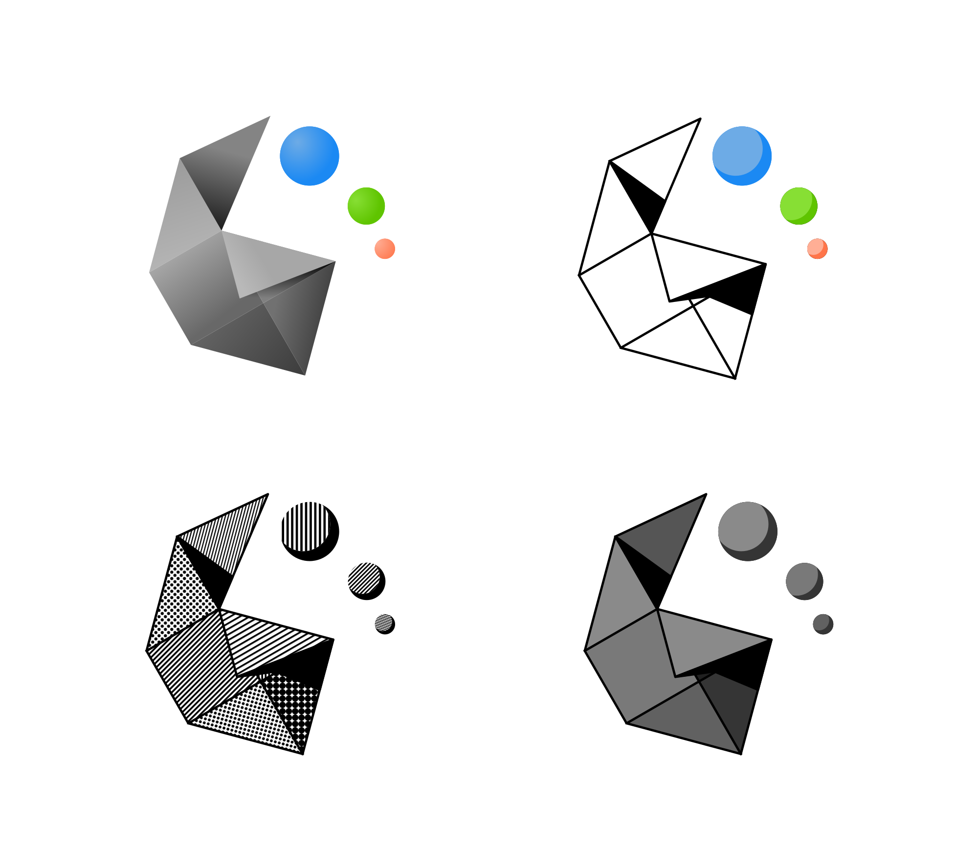
We selected the 6 most ed logos from the original thread and made a poll to determine which is the most popular.
The three most voted options will be passed on to the Plasma developers for their consideration. Please note that this poll is non-binding and changing the logo will depend on the willingness of the Plasma devs. They will have the final say.
TL;DR of the prior paragraph:
This poll is non-binding and purely consultive. We do want to know your opinion, but devs are completely free to ignore the results
We hope this is now clear. Any questions, let us know in the comments. Please carry on.
In any case, the change, if it does somehow happen, is unlikely to happen in time for Plasma 6.0, as the project is currently in Feature Freeze. This means that only corrections, bug squashing, and minor tweaking for Plasma 6.0 are accepted at this point. Nothing new may be added and, if the devs do finally decide to change the logo, this won’t occur until at least Plasma 6.1.
Without more ado: Here is the survey and check the designs below to see each of the options. For simplicity’s sake, you can only vote once and only for one design.
This poll will finish and be closed one December 12, one week after posting it.
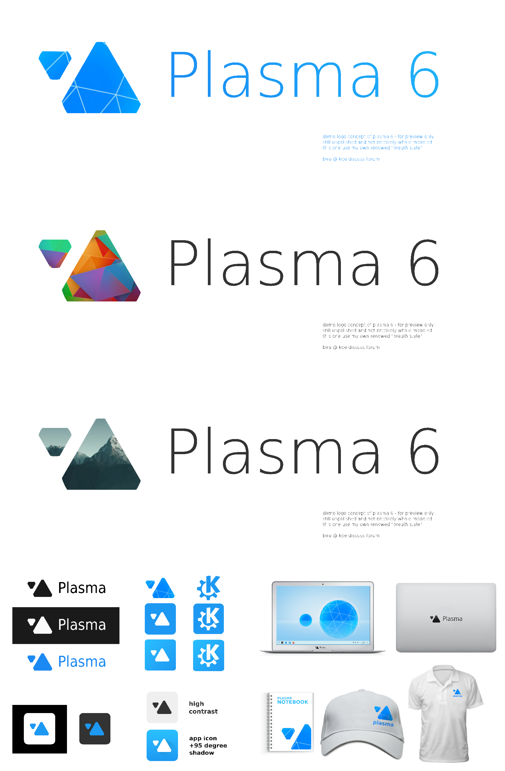
Love Triangles as it is super minimal and simple while it also brings a sense of Branding and Exposure which can make KDE stand out. I’m all for KDE Branding because I love KDE Plasma! That’s why I choose Triangles.
IMO we should use this opportunity to choose a design that actually looks good and it’s noteworthy instead of going with one that looks most similar to the status quo.
I don’t think any of these logos are bad, but is keep the logo as it is not an option? It’s been what greats me after every login for ~6 years, I’ll miss it.
Don’t create a social media hype of something before discussing it with Plasma devs. That’s obviously going to antagonise people, and puts us in an awkward situation afterwards.
We are not putting this out to social media. Only the KDE forum, mailing lists and internal channels. Also we wrote a very clear and massive disclaimer.
There is no intention of putting this out to Mastodon, Twitter, Reddit, or anything like that.
Of course! If the devs do not want to change it, then it won’t change, and there i nothing to say about that. Other projects can ask the authors whether they can use logos for other stuff and the they can be recycled.
My suggestion would be that the logo chosen would be the new KDE Frameworks Logo. Afaik Frameworks has no logo, so I hope that would not be as controversial.
It’s already on social media, here is lemmy https://lemmy.world/post/9193079 and it’s a matter of minutes or hours until it ends on reddit if it’s not there already.
Like I said earlier in the promo channel, creating a poll like this without contacting the devs is the wrong way to introduce a change in Plasma (or any other kde product).
There is non-ambiguous, very prominent and very detailed disclaimer in the text explaining how this poll is non-binding and devs can totally ignore it.
But among these 6, I believe that Triangle would be the best, still pretty detached from current KDE and Plasma image however, so obviously not good. Changes this radical only happen when your brand suffers some major burning, and it needs a face washing.
Squares is a close second place, but it resembles the Kodi logo, and that could lead to confusion.