I think “The Wave - Flat & Grey” looks best by far in case one wants to use a “Plasma 6 logo” in combination with the current “main” Plasma logo.
The Wave is the best, hands down
The wave feels like something I’ve seen before from some startup or GNOME or OpenKylin (
 )
)
The Wave looks really nice
Wave looks really nice!
Personally, I like the classic plasma logo, it has the brand recognition and unique look that always tells us, “This is Plasma”
perhaps the same logo design can be refreshed in a modern design?
regardless, here is what I think of all the logos.
The Wave looks okay in blank and white version, rest don’t speak to me at all.
Blips looks like a git icon, maybes that’s just me. Also feels incomplete without the box around it.
Interplanetary is simple yet interesting. maybe because it reminds me of the current logo but flatten out and without the arrow thingy.
Folded is unique among all of these, it keeps the language of the current plasma logo, mostly. I did flip my laptop and stared it for too long. It would like to see this design done in the current logo outline?
Well the same was true when the one by Uri Herrera was made for Plasma 5. The core complaint was that it wasn’t the classic logo from 4. Its not the classic logo will also be true for Plasma 7 in the future.
BUT I feel you, you mean like something that feels extra much like the last one? Like they are too much of a departure from the Plasma 5 one?
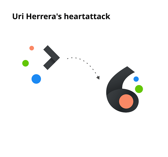
So ok I have this idea that I called “Uri Herreras Heartattack” (Uri is an awesome dude, but would probably punch me in the face if he saw what I did to his logo ![]() hence the name)
hence the name)
It was made as a tongue in cheek jokey idea though so bear that in mind
But jokey example aside - something a bit MORE like the Plasma 5 one so it doesn’t feel like such a leap away?
Oh darn it! I gotta fling the inkscape file up here for people to stare at and wonder “what is wrong with your brain Ohyran?” and edit mod etc. Also maybe we should have done this in Penpot? Give me until tonight to get the inkscape file up here?
Or high blood pressure?
a slight increase in blood flow is good for the whole body ![]()
I like this one, It looks like its saying 6. I want to see this in the promotional videos, even for a second.
I really like the old design because it is really simple. I think all the different Operating systems use very simple designs for the application launcher Icon, so I hope Plasma also keeps a simple one.
My favorite so far is The Blips proposal.
I like Folded and Wave.
With Folded I especially like the one with dithering effect. Retro but still looks new! ![]()
As a space nerd I also like Interplanetary, but it may be a bit too little?
Honestly, I completely disagree with the notion that the current design looks dated. It’s both visually distinct and easily recognizable at a glance. In contrast, Blips looks an awful lot like Git’s logo, The Wave looks vaguely similar to MS Edge’s logo, and Interplanetary is a little too barebones and thus looks a little generic to me.
Folded is definitely much more distinct than the others, but the skeuomorphic appearance makes it look even more dated to me than the current logo. I think if it were somehow modified to be more flat or even two-tone it could serve well as a successor to the current design, but even then I don’t think it would necessarily look more “modern,” just a little fresher.
Cool! Always good to see creativity flowing!
I like the current logo a lot! But a good change can always be appreciated!
I loved all of the proposals, but I loved “Wave” the most.
Blips is cool, but I think I have seen an app logo very similar to it. Also, it looks a little corporate to me, like it’s lacking some movement or dynamism.
Interplanetary is awesome! I love it, but I feel like it’s giving huge Space Agency energy, so it might lead to confusion. But it’s so cool.
Folded is cool, but for some reason I don’t enjoy it as much as Wave, maybe the shadows and folds make it a little too complicated.
I would chose Wave, but seeing it as an icon for the menu on that screenshot, it seems a little heavy too, the current logo has space between its elements that give it an impression of lightness.
It would be reasonable to keep the K letter as base and play with it to get something modern, those proposals are too much heavy and have no identity related to KDE Plasma, something simple like this or better would be perfect at small and big scales
Thats awesome looking but the K is for the community - and not Plasma and part of this is keeping the things kinda separated. I mean I totally get where you’re coming from and its a great idea BUUUUUT part of it is making sure Plasma isn’t the same as KDE
Again this is a brilliant concept, so not in ANY way slagging off your work.
I don’t really have anything useful to add, but the third version of Interplanetary feels like the logo a movie or animation studio would make. ![]()
If I were to choose though, Wave with flat colors.
Edit: the K looks great too actually.
So far, I choose Wave Flat, but I am still most likely to stick with this on my PC.

Radical changes only destroy the recognition effect, my opinion.
The logo is ingenious and should always remain as a basis.

Samples
I am not a professional and hate changes ![]()
While I agree that brand recognition is a thing - and I too am middle aged and therefor by nature hate change ![]() - the reasoning here is to try to make something that is sorta kinda like the two last logos but being different enough to make the release different in “flavour”.
- the reasoning here is to try to make something that is sorta kinda like the two last logos but being different enough to make the release different in “flavour”.
So for example when we made the Plasma 5 logo (which IS awesome, I agree, but it was also considered too big a change at the time) the “cashew” was the logo for KDE 4 that we based it off of.

The icon/logo that we now know as the Plasma icon was a spin on that. The idea was to make something that had the same shapes, the coloured dots, but more as an arrow shape pointing forward. That icon in turn pushed a lot of the new logos that came during the Plasma 5 era (the shapes and ideas can in many ways be seen in a lot of the logo work during that time)
So what we kinda wanna do here is find something new (I know I know I feel ya “new? pah! young whippersnappers coming here telling us what to do!” ![]() ) that exist in a tradition.
) that exist in a tradition.
Something that inspires along the lines what was but also looking at all the cool things Plasma 6 will be that Plasma 5 never could.
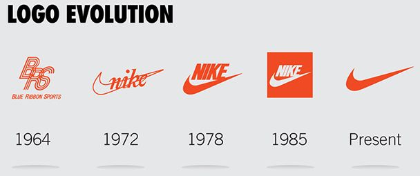
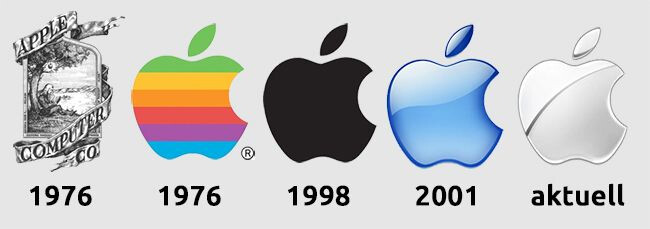
Sure as a logo evolution it will always be more radical than Microsoft, Nike, Apple or any fortune 500 company - but thats because we can. Our logos can be flags raised as we charge forward toward the horizon, instead of banners hung over forts, if that makes sense?
hey , i’m new here , i just saw the post on reddit , i really like the idea of at least trying out new logos , i have done some amateur level gigs . Maybe there are better people here, but would it be possible for me to contribute in terms of logo designs? also if possible a small brief on brand personality and interests in terms of style would be great , maybe others can also read the brief and do some sort of competition (contributors competition or something) . I’d be glad to contribute if any ideas that seem good comes into my mind .
also the wave one is great
