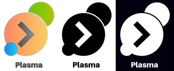
True, the ‘l’ seems to be easily confused with ‘I’, I changed the font from Noto Sans to Aileron
Of the first group at the top above, I like the 3rd one down the best.
I mostly like this. But the big circle color seems off for RGB; also orange means “warning”. The alternative may be to make the smallest circle red (means “stop”), the medium circle blue, and the largest green (means “go”, which is perfect for a launch button.
Also, as I mentioned to @Anditosan, I think the edge margins should be larger, at least on the color rendition. The shadow edge treatments are too fine a detail to present in a favicon, for example. Instead, a crisp, clean edge with good spacing probably works better.
If we are going to change the icon and do it right, we should probably use a design review board for comparisons. This is standard practice for industrial design (my degree), and I think the importance of this decision warrants this. Does anyone have a recommendation on the best way to host this? I could could host a board on a “non-public” page if that is preferred.
Here is the mock with the tweaks I was suggesting. This is done in a well-structured Gimp file, and I’m happy to share!
Changes: Revised Green > Blue > Red. Move chevron to visual center; Remove color shadows and borders; Add greyscale; enlarge object cuts; pull bottom dot further BL, revise mono variants to keep overlap with small circle. Used Nunito Ultra Bold for more Plasma-like rounded letters.
A logo should not need to have the name below it. Given that, what about the logo screams out PLASMA? When I think plasma, I think hot gas.
Do an image search and see some examples.
@WilsonEPhillips There are use cases which are presented in the Brand Guide (a subset of the VDG), where the font and spacing must be defined for consistency. Do an image search for ‘Skype Vertical Logo’, for example, to see what they provide for this use case.
Variants for brand icons generally include Square (icon-only), Vertical (as shown above, icon + label above or below), and Horizontal (Icon + label to left or right). Look at lots of web sites that include trophy walls with vertical logos to see a typical use case.
I am aware that many do.
My point is the current logo does nothing for me as far as brand recognition, and what we are looking at is just more of the same.
But that is just my personal viewpoint and means nothing in the grand scheme of things.
@WilsonEPhillips Do you like the font with the logo better than the previous, more square one? I presented it both to be consistent with the original mock from @medin and to see if people found the rounder font more fitting with the plasma concept.
I like the rounder font better, but I never understood why the > got stuck into the last logo. I’m sure some like it, but it doesn’t do it for me. However, I am just an outsider, so it really doesn’t matter.
heh, I always saw the mono icon as a too small pointy closing bracket, building a bridge between gears, apps and framework… ![]()
Thing is… I seem to have used distros (Arch, Debian) or now BSD and which shipped vanilla plasma and thus sport the default icon for the application launcher, splash screens and so on. So I grew accustomed to it.
IIrc many other distros customized it and replaced it with their brand logo (like SuSE, Fedora, Kubuntu) , so it wasn’t really present to their users.
But I agree, also outsider and if I don’t like the app launcher icon I can always change it to a Linux Distro or FreeBSD logo.
My collected thoughts so far (I hope it is OK for the OPs that I copied their logos as examples for this post…):
I do think after 10 years (2014-2024) it is a good idea to have a new logo for Plasma 6 that replaces the current Plasma (5) logo.
Plasma 4 was replaced after 6 years (2008-2014).
- Although on the surface Plasma 6 may look quite similar to Plasma 5 (due to the Breeze icons and theme) there will be lots of major changes “under the hood”.
At first let’s look at some history:
K Desktop Environment 1/2/3 → KDE 3.5 → Plasma 4 → Plasma 5 → Plasma 6 ???
In my opinion it is not good to have an additional logo for Plasma 6.
IIRC since Plasma 4 “KDE” has been separated from the desktop environment (I hope I expressed this understandingly).
- An additional logo for version 6 would mean three logically consecutive icons: KDE logo + Plasma logo + version 6 logo - that is too much IMHO…
Some history again:
KDE + Plasma 4 (no extra logo for version 4) → KDE + Plasma 5 (no extra logo for version 5) → KDE + Plasma (5) + Plasma 6 ???
Thoughts about the general design of a new logo.
AFAIK Breeze will still be the main (icon) theme in Plasma 6.
- I think the general design and the colours of a new Plasma (6) logo should also refer to that (Breeze), as did the Plasma 5 logo with Breeze and the Plasma 4 logo with Oxygen.
- I also think that the three dots/planets/blobs/circles/drops should remain a part of a new logo as should their colours (RGB - red/orange, green, blue) to ensure a certain “value of brand recognition”.
Both the Plasma 4 and the Plasma 5 logos contain these elements and colours. - And it must not be too complicated or “fiddly”, because it also should look good when quite small (e.g. in a Plasma panel).
Should the general design of a new Plasma 6 logo contain the number “6”?
I honestly don’t know.
- IMHO a consequence of this would be that all logos of future Plasma version then should also contain the version number for consistency reasons and recognition factor.
That would further limit the possible design choices for every new logo of a new Plasma version. - On the other hand I am not aware of any other (major) Linux desktop environment that has the version number as a main part of their logo - a good chance for Plasma/the Plasma logo to stand out a bit more in the future?
So finally let’s take a look at some of the drafts that creative people have posted in this thread so far.
- Examples of posted new Plasma (6) logos containing the number “6”:

@Paul_Brown - The Wave

@Paul_Brown - Folded

@ohyran - Uri Herrera’s Heartattack

@schwarzerkater - entirely unprofessional (to stimulate your thoughts)
- Examples of posted new Plasma (6) logos without the number “6”:

@Anditosan (and @artytux) - sorry: I was too lazy to replace the backgrounds…

@jpetso (and @schwarzerkater) - to stimulate your thoughts
PS: Added two drafts to stimulate the real designer’s thoughts. ![]()
thanks for putting that all together, it’s a very nice summery of a great deal of discussion.
i also think incorporating an obvious “6” would set a limiting precedent for future versions and incorporation of the 3 blobs in some way is a good direction.
for those reasons, and because i think they just work, i come down to these two:
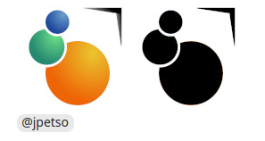
because it scales down well but maybe the > can be restored to normal rather than tapered font (or just eliminated entirely)
or:
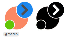
because it scales down even better and still manages to incorporate the > even if the whole look is a bit flat.
both are immediately recognizable and carry the plasma brand elements while being unique enough to qualify as a design evolution over the plasma 5 logo.
Hi @schwarzerkater!
This is a nice summary. I think is a reaction to this scrolling post method that is hard to follow, and lots of good ideas get lost in the shuffle. Better to have a single, current source of truth where we can all collaborate.
@Paul_Brown @Anditosan @artytux @jpetso (and everyone else!) could we use a single shared document instead for this? Here are some alternatives:
- Penpot (test document deleted). The benefit of PenPot is you can design in SVG. The downside is it has a learning curve.
- A Google Slide Doc could perform the same function. The benefit is almost everyone knows how to use it, and it is mature with a great commenting and access system. The downside is you can’t design in SVG well enough in it, and it doesn’t have the infinite canvas.
- Some other shared document?
IMO, unless everyone here already is up to speed on Penpot, I propose moving a design board to Google Slides because I know we can get all the features we need there to manage and collaborate on the project well. The benefit of editing directly in the tool I do not consider significant for this project.
Once we get this set up, everyone could add ideas in once spot and compare without the clutter. Also, project goals and guides can be developed there.
Thoughts?
EDIT: Updated to reference Slides doc instead of penpot
I don’t want to repeat myself too much and this probably shoud’ve been a separate post, but…
While I like these ideas, I think this new logo ultimately shouldn’t happen - yet.
The reason is that a new Plasma logo should optimally be introduced for both Promo and the UI. And this process started from the middle. A new Plasma logo would be timely when we have
a rebrand of KDE: when we find a design system/language: a new or updated KDE logo, color palette, print + event appearance, websites’ design, typography, imagery, tone of voice. And all of this documented in a brand guide with examples, while figuring out how much influence it should have on KDE’s sub-brands.
I love how spontaneous and consensus-based KDE is, and I start things from the middle all the time. But I think we should find a balance between professionalising KDE’s brand, or keeping the brand feel “community-made” too, having more variation in stuff made by different people in different styles without a common reference point.
These things are being done (Promo/Guidance/Branding - KDE Community Wiki, ⚓ T16966 Create a Brand Brief and establish Brand Guidelines for KDE), but they are a mix of old and new for now.
So in my opinion you could make a better Plasma logo after we figure out these things.
@aronkvh A lot of the content you mention is sketched in a (EDIT: Slide document, see below) along with additional brand guide details. Perhaps that work can be done in parallel with the logo, as they can make either work more complete.
An important question in my mind is does using a collaborative document like this provide any value in the development process?
@jpetso (and @schwarzerkater) - to stimulate your thoughts
Thanks for the edit. I actually like your version with the original thick arrow better than the one I did.
But also, note that this isn’t an actual logo proposal, I was just trying to communicate the idea of relocating the arrow to make more space. Not a graphic designer and my draft insufficiently emphasizes the “plasmoids surrounding the larger desktop” (or “planets/moons”, if you will) idea. If I did another one, I’d try to fit a fourth blob.
I really like how the latest @medin/@depmann draft puts one of the planets into the background. I wonder if we could stylize one or both of the remaining planets as negative space inside the large central blob.
Also, the more I look at “Folded”, the more I like it. At least the shaded version; I think as a logo it has a really hard time distilling to black and white. I also think it’s the only one proposed so far that has any business representing Plasma in promo material if we’re not also coming up with a new logo altogether. It’s the only one that really drives home the “6” prominently enough without trying to introduce a whole new independent brand unto itself.
@aronkvh’s point resonates with me, although as an utter amateur I don’t have much to offer in terms of evolving the greater brand identity as a whole. It would be neat if the professionals can communicate in which ways the wider (and largely not professionally experienced in branding / graphics design) community can best contribute to this question.
@depmann I signed up for Penpot. The document you linked does show a permissions error, but does not show a link about or pointer towards how to ask for permission.
Sorry about the Penpot issue. I’m not aware how to invite people without an email address, and I was hoping the link would allow you to sign-in and at least request access. Unfortunately, I am not very familiar with the tool, and do not know if it has the necessary collaborative capabilities.
I moved the current content to a Google Slide which I think is easier to manage. I understand may not be preferred collaboration mechanism, and am happy to delete or move it. This is just a proposal to accelerate collaboration with the finalized content would be placed in official KDE docs.
Penpot is a good idea, we have a KDE VDG project there if you’d like to move it there.
We use open-source tools for everything in KDE. Please use these instead of Google Docs:
https://phabricator.kde.org/T16966
@aronkvh I’m happy to set up a Penpot document and link to it from that page. Do you want this added to the Penpot VDG instead of creating a separate document? Please let me know.
Also, if you have suggestions on how to arrange sharing I would appreciate it. Penpot is all a bit new to me, and I was unable to get a link where people could access the page without me first knowing an email address, and I don’t see that in the profiles.
I’d be happy to add you guys to the VDG Penpot team, so people in the team would already have access to the document. As far as I’m aware, you can only share with an email adress on Penpot.
And you’re very welcome to join #kde-promo:kde.org if you’d like to help with branding&promo.
