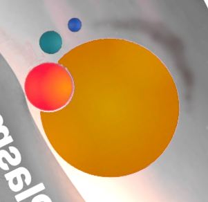
Interesting colors. I see interesting differences.
I still prefer @Anditosan’s originals, but I understand why some would prefer to keep the Red Blue Green of what we have as a transition. It’s all a matter of taste.
Is it just me who’s seeing the dots as planets? And even moreso with this coloring it reminds me the Mars trilogy, “Red Mars, Green Mars, Blue Mars” - it’s even the right order!
That said, I’ll throw my hat in the ring for liking the current logo a lot, but there’s also been some pretty nice suggestions in this thread.
I like the wave one very much, I think it looks very modern and beautiful. @anditosan’s proposals made me feel like it was from the 2010s. IMO it doesn’t look good for plasma 6
I am seeing planets as well. It was the first thing that popped into mind. I think that’s what makes it a great logo to me; it has this cosmic imagery which is connected to the very science-y name of “Plasma”. By contrast the current Plasma logo doesn’t suggest anything to me.
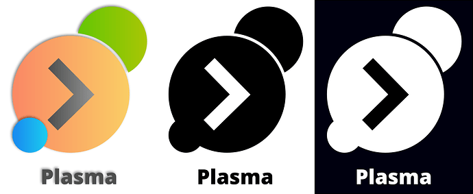
I’m thinking if we turn the arrow by 45˚ and put it into the top right corner, we can keep it as design element but make more space in the center for planet-y blobs. Like so,

Plasma. Discover what’s next
[Edit: or perhaps transform the arrow to become something like a shadow/corona/arc for the large orange blob. That could work too, and eliminate some of the weird positioning challenges.]
I’ve got to say that @Anditosan’s blobs look a lot more planet-like than the draft I just put up in the last comment. It’s that central “sun” blob that makes it look like that, I think.
We can even align it like a 6 and it still looks like planets. With apologies to previous posters,

Yeah I was having a ‘distract myself from other things’
Your sun and planets is a great design thanks for sharing, adding details to the sand easy, doing the suggestion from @schwarzerkater was fun.
Merge the @Anditosan design with the idea from @jpetso
then there be a 6 could be Plasma 6 Logo.
Is it possible ?
Would that work ?
Yeah I know, I’ll let myself.
The only suggestion i would have for this is that the yellow and orange right next to each other arent great from a contrast perspective. Being someone without the best eyesight those 2 colors are close enough to blend together when i dont have my glasses on.
While i generally have my glasses on and its not the worst i think some slightly higher contrast would help some more visually impaired folks enjoy the logo more.
Regardless of what you see, the relationship with planets, or an exhausted Pac-Man eating pills from the floor (what I see), and Plasma, apart from the letter ‘p’, is not very clear to me.
To help focus, it may be an idea to define what plasma, the real world plasma thing, is:
- it is either the fourth state of matter, in the form of highly charged particles
- or the liquid our blood cells float in
If I were asked to crank out a couple of slogans on the spot based on the above, I’d go with
- Plasma: Raw energy
- Plasma: The lifeblood of your computer
Which are both a bit trite, even corny, but if the idea is to somehow create a logo that is related to KDE’s desktop environment (or its name), I would start by drafting something that is the visual equivalent of that.
hm, after seeing some of the arguments here, I just wonder why taking on the effort for changing the logo at all…
If a new logo should have a meaning or represent what plasma is all about, neither of the proposals nor the old one imo fit such a role, but the old one has one big advantage it’s already known and linked to Plasma.
If I do have to chose from these new proposals I’d go for the original red/green/blue Mars, but dunno if ain’t broke… you know.
If a new logo should have a meaning or represent what plasma is all about,
That is not exactly what I am saying. I am saying that all arguments that rely on trying to convey meaning to any of the logos can by ignored. None of the designs convey anything even remotely close to what Plasma is – except maybe fold, as it shows an origami 6, as, you know, in “Plasma 6”.
So saying things like:
“It represents the spirit of Plasma because… uh… planets”.
is not a very good argument.
But, if you were going to go down that route, and require the logo did represent somehow Plasma, that ![]() would be the way to do it,
would be the way to do it,
That said, saying
“I think we should choose X because I like it”
should be fine, especially with the more abstract designs, and we’d all save a lot of time by facing the fact that ultimately it is all going to be down to taste.
if ain’t broke… you know.
That there is so much discussion would indicate the contrary, that the current logo does need changing, at least for a significant number of people.
sigh I never said I would like to have rgb mars because I like it best but if I had to choose from the ones presented here to replace the old logo. That’s a big difference. Again, the big advantage of the old logo here, is it’s known and recognized to represent Plasma. If it didn’t come across, wasn’t intended. Mea culpa English is not my first language.
About the amount of discussion here as an indication there’s need for a new logo. Imo it’s a bit of a misconception discussions are always the indicator for the pressing need to change something, it’s more an indication of a creative process, which might lead to a change but doesn’t necessarily need to lead to anything. But maybe that’s also a misconception on my behalf. ![]()
I have yet to see where any of the old or current logos have anything to do with the word plasma. At least the ones proposed by @Anditosan do this. Some say the current logo has brand recognition, but I have to question this. Most people would have no idea what the logo is. The Kgear would be much more recognizable in my eyes. Maybe a huge push with a new logo and the launch of Plasma 6 could be successful in getting some recognition out there, but we are still just a Linux DE and most people in our world have no idea that KDE exists.
I don’t see a need for a new logo, but I don’t see a reason not have a new one with a new version of Plasma. In fact, until this thread started, I had not even considered that we could get a new logo. Then, I thought, well we got one for Plasma 4. We also got one for Plasma 5. We might as well get one now.
Colors are nice except the L on the first image.
@Anditosan I really like the Sun design. Here are my thoughts on which option to choose and some possible improvements:
- Using an orange large sun and red planet 0 provides too little contrast. Planet 0 looks much better in yellow.
- Consider CMYK to guide color selection instead of RGB?
- Planets need to be larger. When reduced to a small icon at the current proportions, it can appear too much like a circle with some noise.
- Keeping with 3, clearance (margin) around the planets is too small in the black and white variant. To my eye, it should be roughly double the current mockup.
- For any logo, one might consider 12 permutations: text+logo (horizontal) vs. Icon only (square), full color vs. grey scale vs. b/w, light theme vs. dark.
- I suggest avoiding the desert motif background. It comes across as dated and too skeuomorphic. If you do keep it (or a variation thereof), then the horizon should either obviously intersect behind the main orb (roughly at the 1/3 from bottom) or have substantial clearance. Right now, it feels uncomfortably close and cluttering.
I agree with your comments. I think if this idea takes hold and is accepted, I can develop this proposal at the level you describe.
The background selection was done at random to just put other colors around the logo idea and see if worked out well. There was no deliberate decision to place the logo against a desert so that it matches some kind of context. It’s only there so I didn’t have to place the logo against a white background.

