Radical changes only destroy the recognition effect, my opinion.
I would agree that this would be a problem if the brand was widely known outside out tiny bubble. But it isn’t. Not at all. Zilch in fact.
I doubt it is even recognizable outside a subset of KDE users, because Manjaro doesn’t show it on the desktop (only very briefly when the desktop starts), nor does Fedora, nor openSUSE, … .
It is definitely not recognizable like the Nike and Apple logos.
on the other hand a new Plasma logo (that replaces the current one everywhere) would make sense when a larger rebrand of KDE and its subbrands happens - which is not now
so in the end I aggree with using it just for this promo campaign, just wanted to stress why
Well, many things are going to change version simultaneously: the desktop, the frameworks, many of the apps… Maybe come February it will be the best moment for a rebrand.
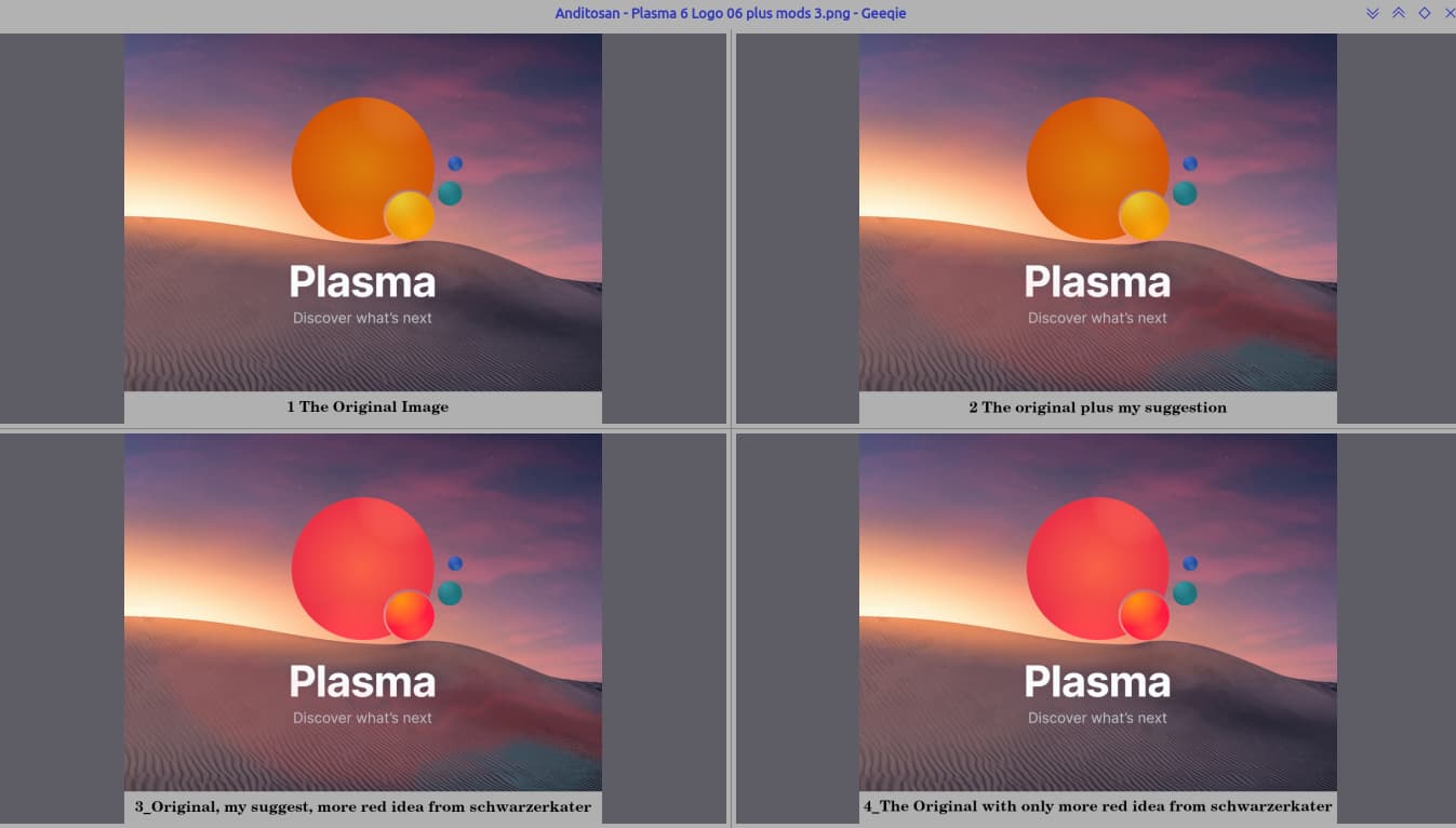
these are beautiful, especially the first one, the “planetary” star look is nice, I think it needs bit more depth or detail? i don’t know any artistry words to describe it better
Wayland, QT 6, Plasma 6. That seems huge to me. I’m just an outsider that has been a KDE user since 3.1. How much more change do you need for a new logo?
hey, would anyone be able to provide a brand brief . it’d help identifying the qualities that the brand represents so that we could discuss on the elements the logo want .
Looking at just the first two images for this comment, the second image seems to be a better balance of the light and darker areas
then look at the first image it is really beautiful and imaginative only problem from my viewpoint is the radical difference between the bright coloured spheres and the foreground.
an idea,
When looking at the second image dark spheres the colours of shading under the text works with spheres
When looking at the first image the two tone grey lines don’t give any flow to the image , could try , might help , shading the lighter grey lines with , in light saturation , the vivid colours of the spheres , just a light amount of , a hinting of the spheres colours, think of the sun’s colours on the sands with an outgoing tide.
Apologizes about the long explanation it’s just difficult to put words to ideas what I see so that other people might have a chance to understand.
if u guys have been here contributing for long time , u guys would have an idea what kde plasma represents , or want to represent when it comes to a DE . to me Plasma is a cutting edge , an always improving de with its horizons beyond the sky towards cosmos . its known for being able to adapt to any setup . things like that .There would be a consensus in what the feeling kde plasma should invoke when someone knows about it , u guys could just type them out like three words that would sort of define the feeling that would communicate kde plasma to everyone . for me it’s inclusive/community(contributions even in themes and widgets) , always forward , adaptable (i could be wrong ).
Alright i’ll try creating a brand brief after reading that , but be warned i’m a complete novice and had only done amateur logo designs . i’ll post it after i;m done with it . i also hope someone with experience would do this and post something that would be clearer.
The Wave, as was suggested at the start of this thread, looks too much like the Gnome symbol. Let’s not take that one, let’s either use the same as it is or a completely different one.