thanks.
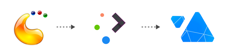
that up and down triangels is actualy a scaterred breeze triangles
- facing up and down that means dynamic
- in different shape means choice
- both identical means our diverse yet united/solid community.
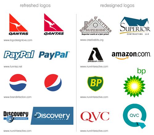
mine ideas might look like a complete redesign rather than logo refresh. my goal here is to give simpler vibe that aligned with nowadays modern trend.
a bit drastic changes like that might looks menacing at first but is actually common in corporation to adapt and to stay recognizable within current trends.