I am looking forward to it!
But could you perhaps please try how your logo looks in a Plasma panel of 40px and 32 px height and make the “sun” a little bit smaller in relation to the three “dots” if need be? Thanks. ![]()
1 Like
Reminds me of Windows
1 Like
how about like this ? ![]()
ps: im not intended to competing with others or anything, this kind of thing is just part of my hobbies during my free time.
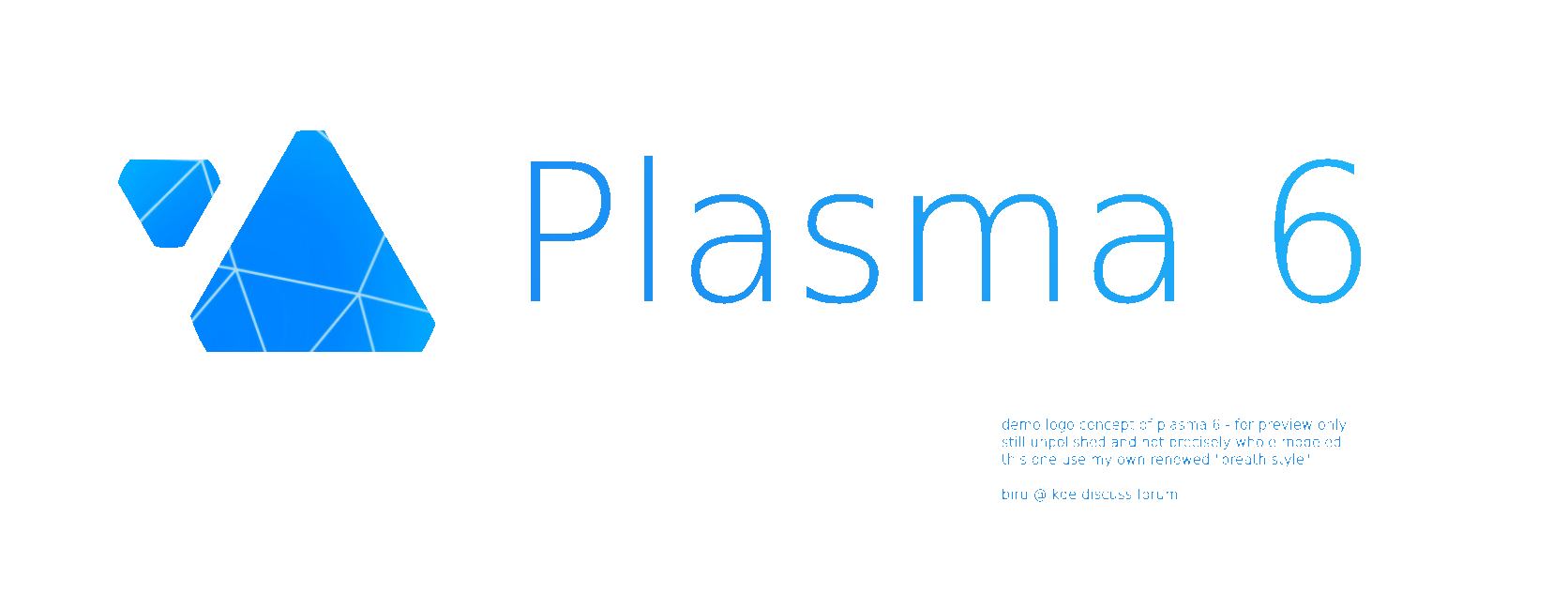
FULL:
about breath style >>
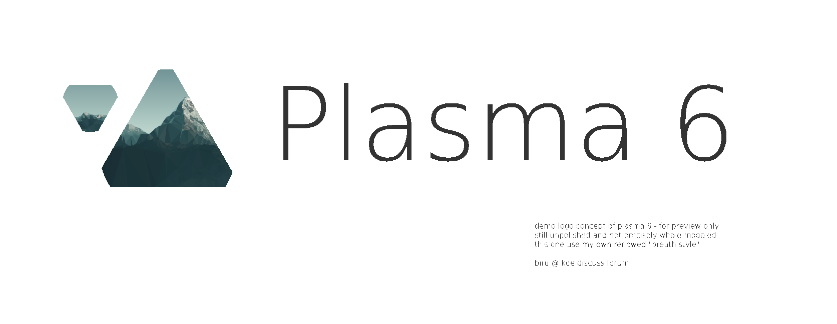
LITE:
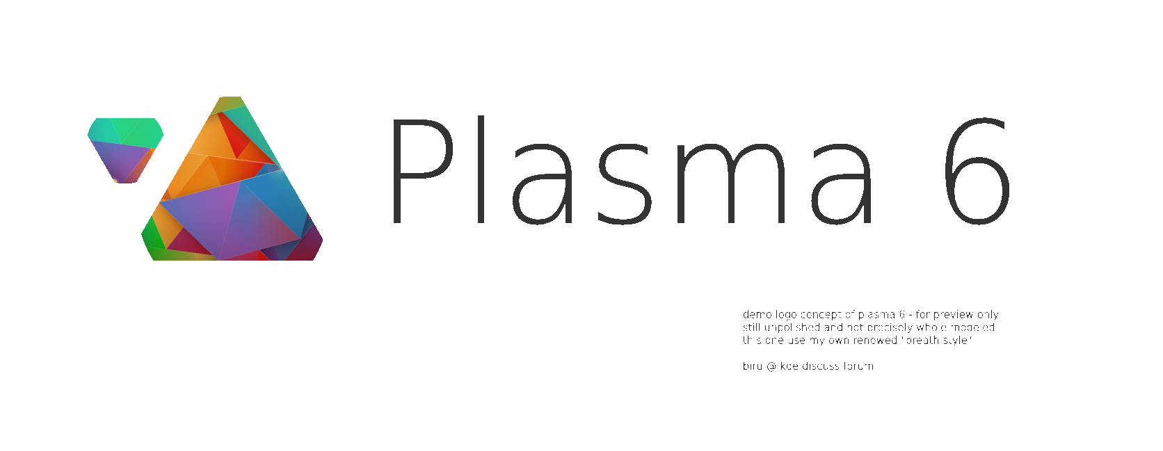
UI:
SCALABILITY
MY OPINIONS:
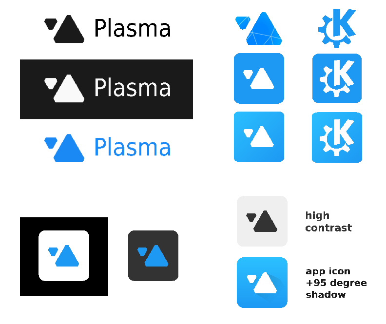
regarding logo and brand representation
its just a symbol for people to easily remember and interpret the whole thing behind that logo creator. so a logo doesn’t need to symbolize its exact product respectively. ex: apple is a food used for a computer logo. some logo also just a typefont like samsung.
a good logo and brand identity
should be simple yet different from others. the simpler the more easily and quickly for people to remember. the rest is to maintain a good impression behind that logo’s product. ex: windows logo is literaly just four square & adidas is just a three stripe.
making it looks professional despite created by communities
this topic requires long explanation but i believe it boils down to represent the wisdom of eldery just like parents habit:
- make things simply and easily as possible.
- love to be organized, clean, neat and tidy.
- someone who really knows what they do and what is best.
- someone that always think carefully, always prioritize long term decision.
use as design guide and you get that corporate vibe feeling (especially no 1 & 2).
CLOSING NOTES
obviously all of those is is just my opinion. for that i had provide other samples as well, might find something you like.
SOURCE:
please fell free to adopt, reuse or modify my work
samples and mini test panel svg on gitlab
nb: all of this concept is still just a quick, unpolished and non precise model.
26 Likes
Love it and if we want to do the continuity, I think the third one at the left starting from the top would make a great « start » button.
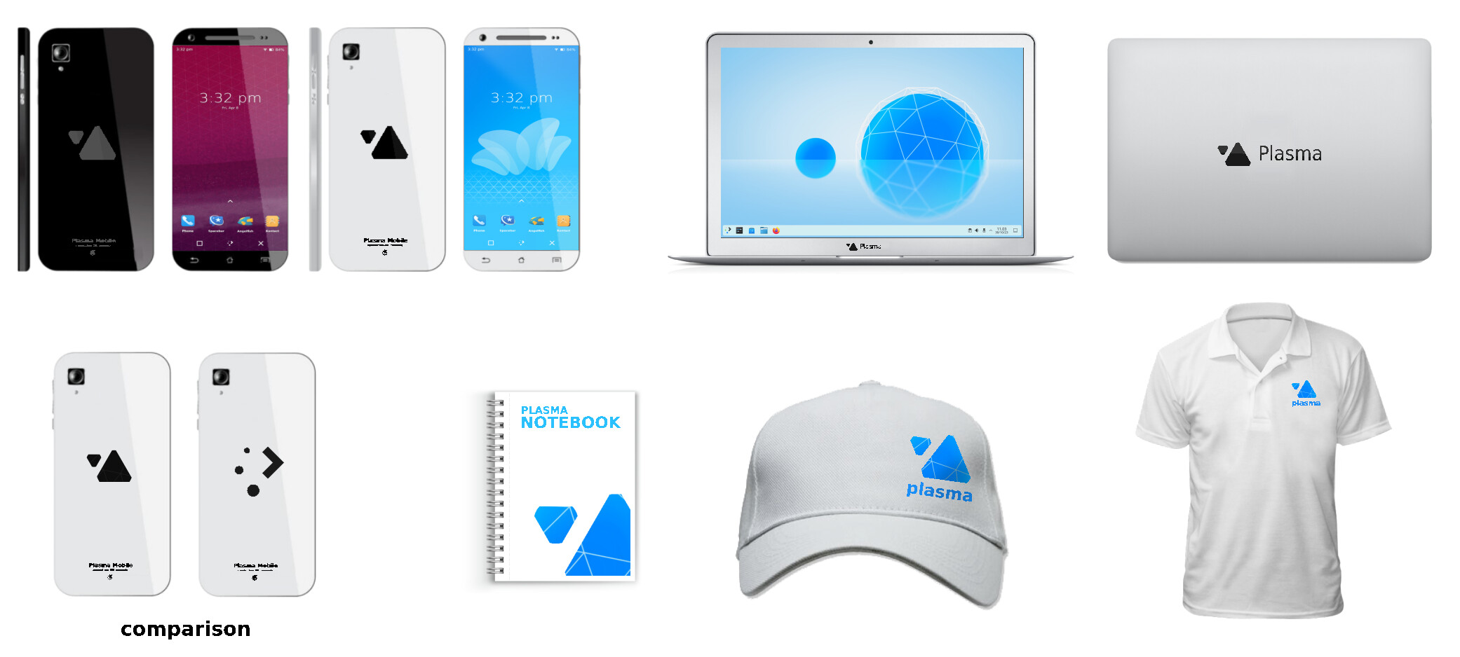
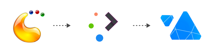
Okay , here we go . I will now upload a logo presentation , the presentation isn’t really that great , but i hope i can infer my ideas clearly through it . My design concept is based on aurora borealis /northern lights . its a spectacle that’s made of plasma . gonna attach few inspirations.
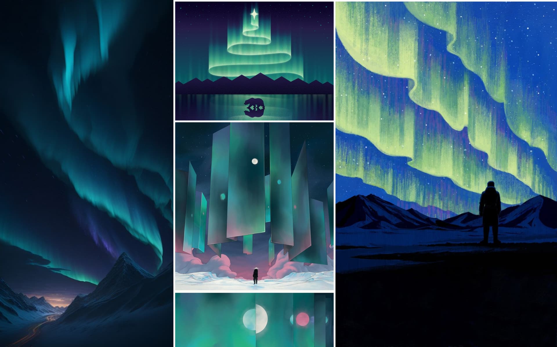
The logo i created is simple and versatile enough to be scaled for any use including favicon or task panel icon if needed .
I wasn’t provided with color preferences , so i couldn’t do much there .
We can use different textures according to the need , i have some ideas like , making the wave a glass panel inside it the aurora borealis breathing/burning etc .
A decent motion graphics guy can create animations , like the wave coming out of the mid area of the spheres , or animated balls racing down the wave towards its original position etc . any feedback would probably help others in coming with better ideas , and i’m sry for the not so good looking pdf .
i would love attach the svg , so that u guys could try it out , Font i used is Poppins , although u wont need it.
https://drive.google.com/file/d/1XfxqseXxZ_2EXpoikogb3XMYPlT6QMkM/view?usp=sharing
4 Likes
I absolutely love the idea and the design. Anyway, I’m not sure if it isn’t too fine-grained.
The icon should work as well as a small starter-icon in a toolbar. My toolbars aren’t that high, so the starter only is 28 X 28 px.
Maybe a further simplified icon for smaller resolutions would make sense.
1 Like
Very professional (and I do like it visually), but I think the “dots” are too small.
Try using it in a Plasma panel that is only 32px…
Sorry, in my mind those left right staircases trigger no link to Plasma. And its scale compared to the dots is too big to be used as small icon.
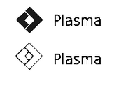
The one with up and down triangles and no circle looks pretty good. With round corners it will look much better.
thanks.
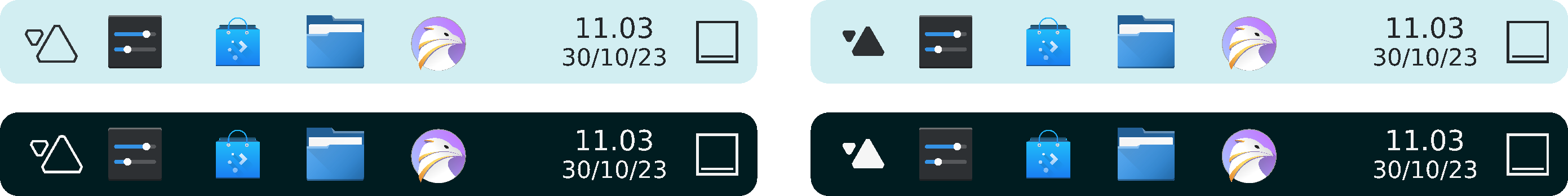
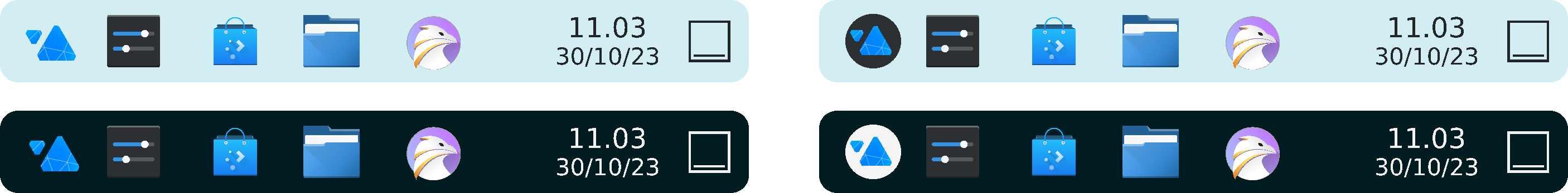
that up and down triangels is actualy a scaterred breeze triangles
- facing up and down that means dynamic
- in different shape means choice
- both identical means our diverse yet united/solid community.
mine ideas might look like a complete redesign rather than logo refresh. my goal here is to give simpler vibe that aligned with nowadays modern trend.
a bit drastic changes like that might looks menacing at first but is actually common in corporation to adapt and to stay recognizable within current trends.
2 Likes
Like the two triangles with cut off corners.
in all its variations, including as a b/w icon.
I also like
as it is reminiscent of the old logo (so continuity, yay!) , but more… er… integrated? The pieces seem to belong to each other (not so in the current logo).
So better.
Either way, a step up from all those circle-based logos.
5 Likes
I really like Breath! We use the triangles in other places too which is a nice touch.
2 Likes
What should happen with this? Because the first alpha has already released, making some decision would be timely in my opinion.
3 Likes
i use triangles, btw
Yes, why not making a poll and people can give a note to the logos from 1 (meh) to 5 (awesome) and the one that get more points wins. We did it for my association, and it worked well because people likes multiples designs, and we had to make a choice.
5 Likes
agree with that. all designs surely had its own good and bad and fans!.
maybe the changes doesnt need to be effective immediately. we can include both new and old logo and mark it beta until fully transtitioning into new logo.
in that meantime we can also share the intention of new logo on press/news to gather more feedbacks ![]()
2 Likes
The problem is that it has to be put into the system before the ISO gets locked for changes. Technically, if we were planning to do a new logo, it should have already be chosen and being planned in marketing material.
A poll would be good. Luckily for all of us, we have a LOT of talent hanging around here. ![]()
The freeze is not done yet and the alpha is just out, it is just a logo, I think it could be introduced for the beta. Even the wallpaper is technically still not choosen.
1 Like
No, as Paul stated the logo would be used for Promo purposes only.
I personally think it should be in the UI too, but as things stand that’s not planned yet.
2 Likes