Silly idea:
Why not the current Plasma logo with a “6” in the center?
Hi, I really like the cog design. It clearly indicates that Plasma belongs to KDE.
I’ve got an idea of placing the big blue dot inside the cog, and making it look like the letter P (for Plasma) or an eye like Xeyes.
Pardon me of the crappy editing, I’m not an inkscape wizard.
In defense of planets and “spacey” theme, stars are actually made of plasma, and so are the Auroras I think. So it is a beautiful, powerful life giving natural phenomenon.
I am liking very much the ideas given by depmann
These are some very interesting logo design already posted so far.
So what’s the plan of carrying this forward? Maybe deploy a logo submission system with polls to help decide based on popularity?
A new set of logos @ohyran forgot to mention
Personally, I like these the best of all submissions so far.
i like this logo very much (especially first one) it is similar but also represents wider Kde ecosystem with gear, i would love this logo to be one of options if a vote to be done
@aronkvh Could you add me to the Penpot page? I’d like to help add more logos from this Discourse page onto there. (Not sure if you’ll recognize me or not, but I’m active in the KDE development rooms.)
I like this! Modern, has continuity and works as a kickoff icon.
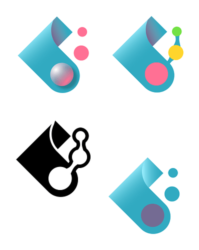
I really loved the ‘Blips’ one. ![]()
![]()
The second sketch in the Blips; the gray outline would look cool if there is a white gap between the coloured dots.
Looks real good, but the dots/planets are missing. Maybe at the left inside the cog.
This user wallpaper is i was thinking when say “current Plasma logo with a “6” in the center”
https://discuss.kde.org/t/wallpaper-submission-always/6724
The “6” would be too small when you use the icon e.g. for the application menu in the Plasma panel.
This is the best logo set for me on this thread. Maybe a new breeze theme with plasma accent color.
The “6” can be the size of one of the dots
I’m just blown away by the level of creativity displayed here. My preference is as good as anyone else’s preference but so many good options here.
I completely agree with this post.
And as the author I will contradict myself by partecipating in the logo discussion saying that @Anditosan Sun logo is my favorite (of course we can tweak it to make it perfect): not only Plasma is what makes up stars but also the Sun was the god for many civilizations in history, it’s powerful, it’s necessary for life and this is in line with @ngraham Plasma’s world domination plan.
Anyway returning to the actual point I want to make: we need a consistent brand identity. @ngraham again pointed it out (can’t remember whether explicitly or not) when proposing his original goal: Professionalization of KDE, which was later renamed and modified.
As much as I love community contributions to stuff like logo designs or the new wallpaper contest, I strongly believe we need a more professional approach to the matter of looks. That is not to say that stuff (wallpapers, logos, icons, etc.) can’t be designed by community members, it’s just that if we look at for example the “raw” guidelines in this thread for designing the logo and we then look at the guidelines for designing the wallpaper they are separated when we need them to be consistent and in line since they are serving the same purpose: brand identity of Plasma.
Many times when people are comparing e.g. Gnome and Plasma you hear things like “Gnome is more polished and consistent, while Plasma is more powerful”.
To achieve consistency and a “professional” look, and rival not only to our friends at other FOSS DEs and WMs, but also to our proprietary rivals, we need people working on it before starting to submit designs and vote on our favorite logo / wallpaper (sorry for the hypocrisy).
I’m no one and I don’t have any competence in the matter but I have friends who work on brand identity and design and it makes a real difference. It makes using a product feel like you are using the best thing in the world.
Maybe it’s too late for Plasma 6, since we already have a release date and a wallpaper contest ongoing + a merge request for new icons but I think it’s something worth considering, maybe for Plasma 7.
P.S. Among the people who KDE wants to hire after the crowfunding initiative, it could be a good a idea to get a professional on brand identity.
Thank you for the kind words. I am definitively open to tweaking the colors and some of the shapes to work best with different sizes. I just haven’t done it because I wanted to see the outcome of this discussion.
I can go ahead and start creating the rest of the shapes to build the icon collection required.
I dunno, warp cores are notoriously unreliable. The ejection system never works in an emergency.
![]()
Joke aside, I’ve always associated the default blue tones of KDE Plasma with warp plasma, and it always gave that futuristic vibe to me.


