Who can decide if it should be planned or not ?
Thanks a lot in advance.
Who can decide if it should be planned or not ?
Thanks a lot in advance.
If is for promo purposes only, it risks diluting the message a bit, a new logo used only in promo messages and not going to be found elsewhere is a bit… strange.
As for a new logo in the ui, i wouldn’t be against as i never liked the current one that much, tough among the proposals here so far i didn’t yet see any that made me really think “this is it”
(honestly i still think that so far the best variant is still the one that was chosen for plasma-nano, which in reality it didn’t need any logo whatsoever as is an implementation detail and not an user facing product)
I too, find a logo to be used in promotional material and not in the UI to be strange. Why would that be done?
Plasma-nano is great as well it looks like some propositions here.
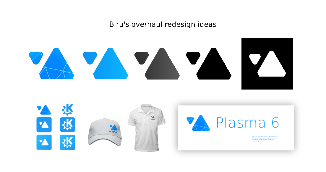
get back from work and got bored last night, so i think to added a bit more ideas. now it become a full brief concept. also good as a template.
hope you like it ![]()
![]()
Now that i’ve seen some replies , i think people have misunderstood my direction.
The staircase was merely a texture idea , i also said there could me more textures based on the context of use . secondly the relation between plasma and my concept is
and how do you like this bootsplash :
those are my wallpaper submission btw.
so both splash and wpp are in breath style ![]()
having some time i took the chance to revisit some older messages in this thread.
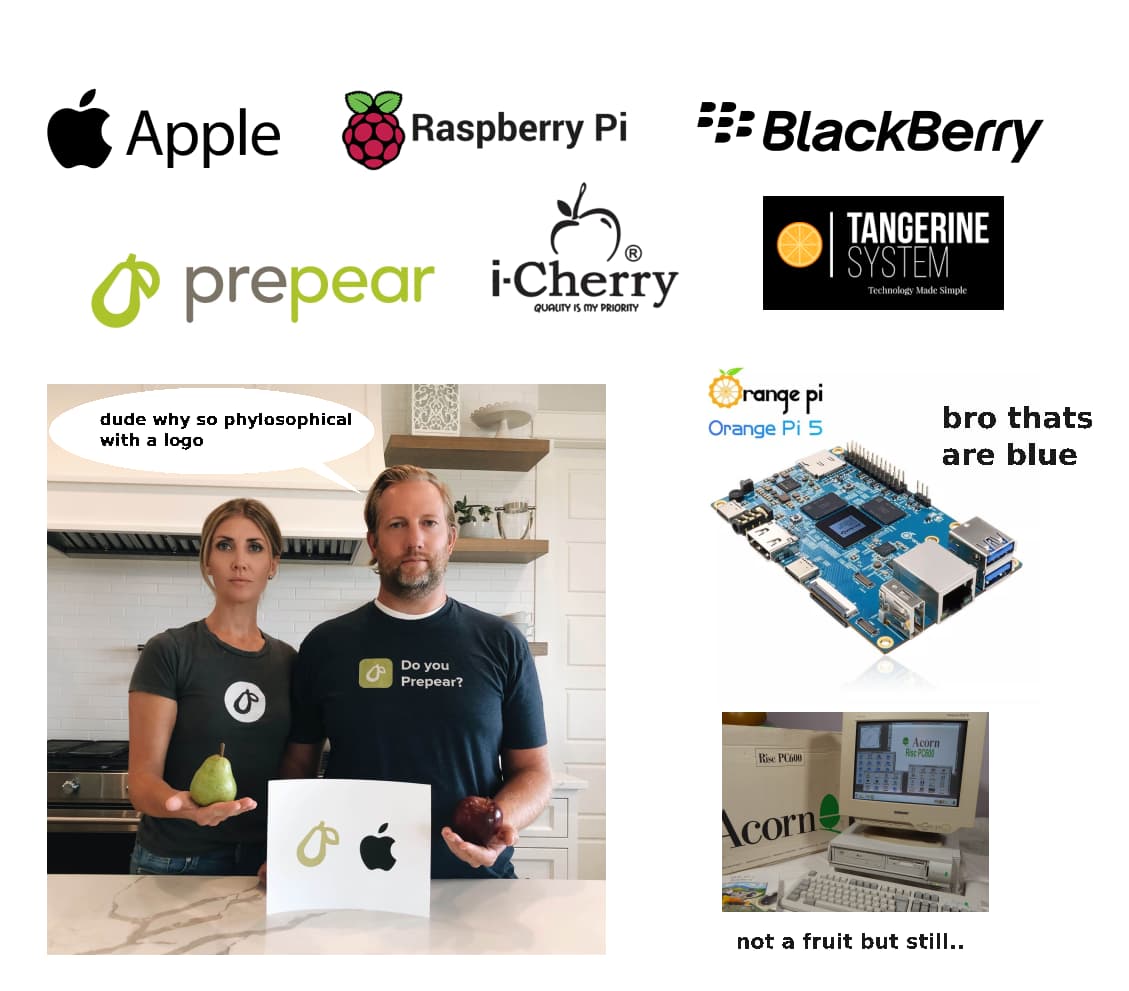
i dont really know where the root of this come and i only saw it once in a while: that “simple by default, powerful when needed” tagline is really rings the bell and branded into my brain. so i think why dont use that to define KDE brand brief further easily.
also lets simplfy the logo making and selection, we only need something that looks good, related and practical. all of the deep meaning, connections, and other pyhlosophical stuff can comes later, i think its only hinder and made things complicated.
i mean look at this.
what are these fruits had things to do with technology ![]()
just some though from simple brained penguin.
True. The triangles seem very “Plasma”. We have had many triangle-based wallpapers, so, again: continuity (to a certain extent).
While I really like it, just fyi: Plasma isn’t a real brand, it basically just exists to distinguish the DE from the Community. So we don’t print the Plasma logo anywhere, and we don’t use it a lot
It is used for the launcher by default right ? Before was the KDE logo but now the Plasma logo.
im not implying my logo though, just saying we need to simplify things out. thanks for the appreciation ![]()
nooo i want Plasma fame exceed KDE itself. main brand should just sit back and be a proud parents ![]()
if its cool enough maybe we can use it a lot and anywhere.
*art not mine, just for imagining
I’ve only skimmed the conversation here. I think I like @biru’s triangles the most, but I’m a bit worried that it’ll be hard to recognize as an original logo. I kind of like the wave and think it’s pretty recognizable as an original logo, but it has details that are too small and would easily get lost or blurred at small sizes. I kind of like @Anditosan’s orbiting planets logo, but it has similar problems to the wave and I think it’s less recognizeable as an original logo.
I don’t believe in true originality, so take my concerns about being recognized as original with a grain of salt. When I see the logo in pictures from NASA/ESA/whoever or some TV show, I wanna be able to think “Oh, they’re using Plasma!”
When I talk about details that can be lost at small sizes, I’m thinking of 16x16px icons. It’s hard to fit details in those and sometimes sacrifices have to be made. As long as the logo is still recognizeable at that size, it might be good enough, but beware of small parts and close gaps.
I generally dislike the current plasma logo and the older cashew logo. I don’t think they are that well known either, so I don’t see any reason to make the new logo something based on the current or cashew logos.
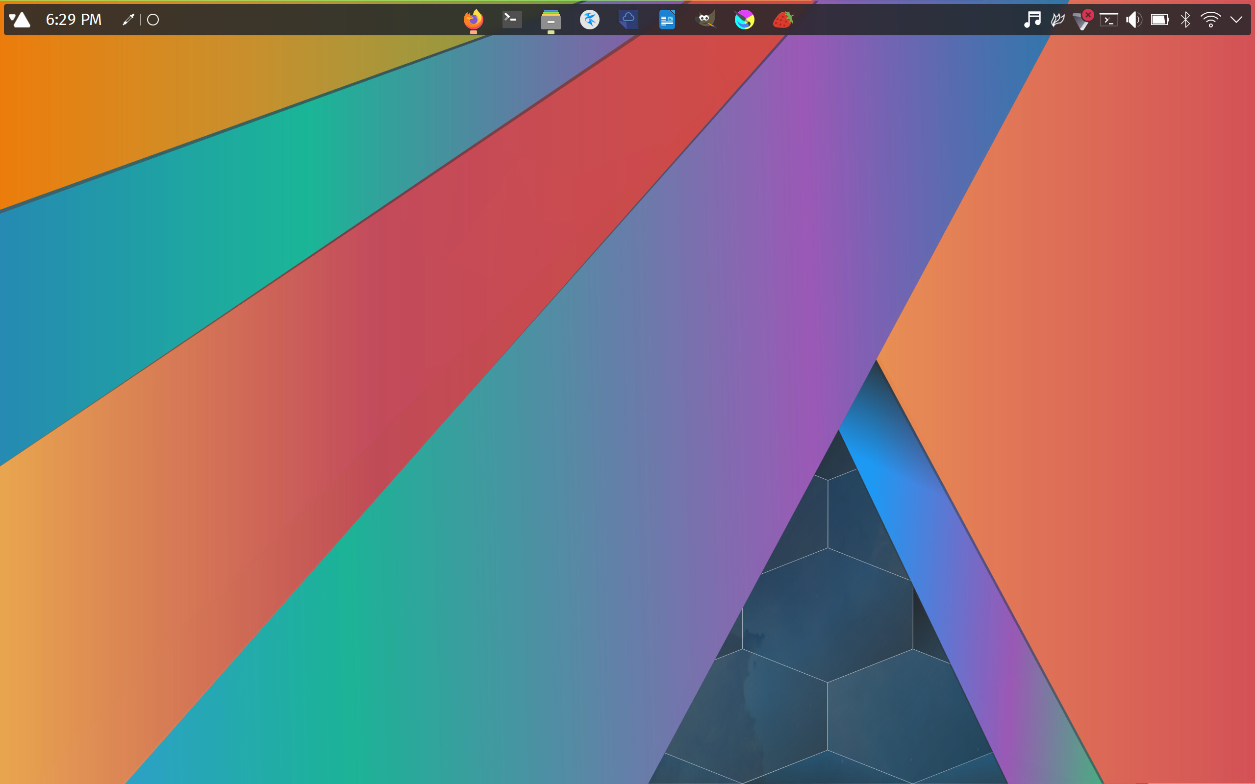
If the logo is only used on the main menu, or possibly some wallpapers and SDDM/Splash backgrounds, would 16x16 pixel icons matter? I know some people make their panels small, but I don’t know anyone would would make it that small. If so, it would be very rare.
My panel is frequently that small, @WilsonEPhillips. it’s consistent with the title bars. I also know one other who does so. I don’t think it’s a strange thing to do, especially on <= 1080p displays.
yes, you never know where it’ll end up
Well, there must be thousands of people that like it your way.
No idea. There might be statistics if it’s tracked in the Feedback KCM.
If their screen size is 14 inch and less, I use a very small Plasma panel for my own laptops and the laptops I maintain for other people.