I am old and can’t see that well anymore, thus is why I asked. ![]()
1 Like
Here’s my idea:
It preserves the angled shape and the three blobs from current logo, and also incorporates the arcs of plasma. Hope you like it.
2 Likes
I like that a lot, @aryan02420. To me, it actually looks the best of all the other proposed ideas, and is probably the most easily scalable.
The “problem” is that this design and other similar above is like Nepomuk logo
https://en.m.wikipedia.org/wiki/NEPOMUK_(software)
1 Like
this one’s great . very versatile and keeps elements of previous logo . needs some polishing thats all.
PowerShell?

My 2c:
I like @biru’s boxy triangles the best for aesthetical reasons, I think it looks futuristic and sharp. But I’m not sure if it embodies the “Plasma” name where Plasma 3 did, and doesn’t much resemble the established Plasma branding.
@aryan02420 has a nice look to it (maybe make the top left ball retract closer) and has a classic feel to it. I think the blobbyness helps sell the “Plasma” terminology.
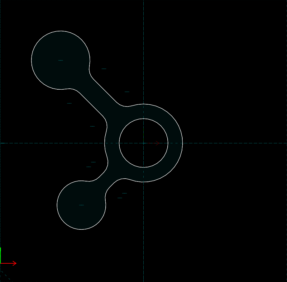
Please whatever you do don’t use the Interplanetary idea from the OP. It’s so boring and lifeless.
2 Likes

really love the tagline on the left. it should be our next campaign!
1 Like
Biru is my favorite logo.
3 Likes
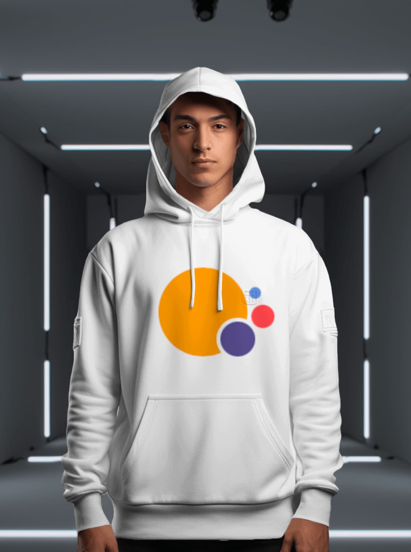
I put together my rendition using inspiration from this graphic:
It was suggested to me to use other colors than initially and I added them here. Mercury is the closest to the sun and has a purple-like hue, while Neptune appears between orange and red, then follows Earth with its distinct blue.
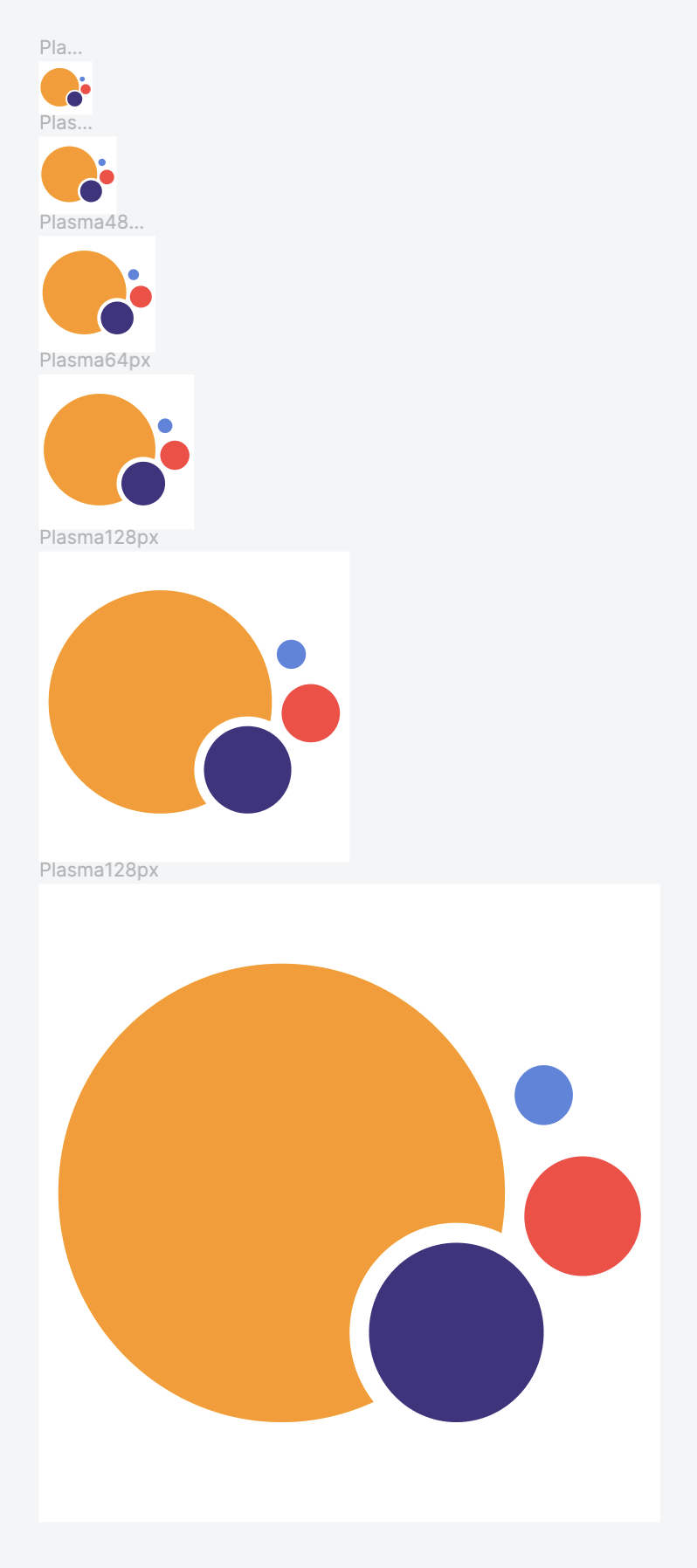
Here they are in SVG format: KDE Collaborative Storage
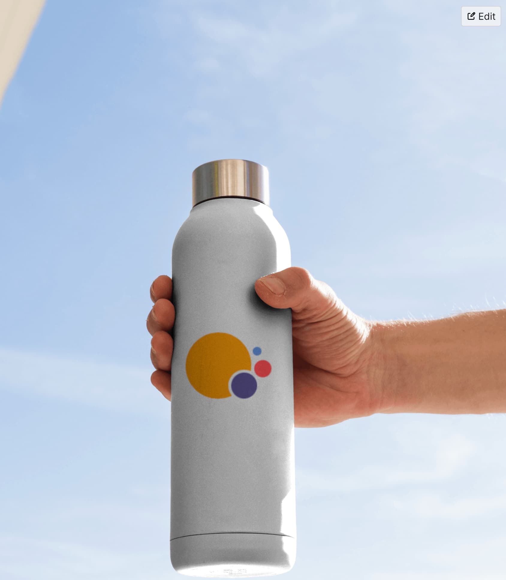
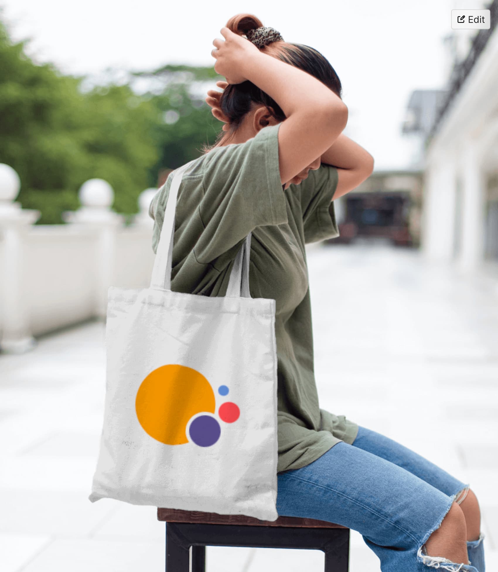
Here are some mockups:


11 Likes
That looks brilliant. I think not using gradients was definitely the way to go, not least because it’s orthodox graphic design nowadays. How did you choose the exact colour palette though, @Anditosan?

I really like this logo! Could look great as an icon on the panel or on a splash screen
6 Likes
I put together a color system some time ago and published it on a blog post. I took colors from there so they would be coordinated with a larger design project I set myself to work on.
4 Likes
As much as I like it, I would want more bold colors for a Plasma branding.
1 Like
I like it better than the original.
1 Like
It looks great, hope to see the rest soon !
2 Likes
I’m warming up to this design. I like the colors.
2 Likes
You know, I have been thinking on this for a long time and while sharper shapes have been proposed, in the back of my head I think, they feel unapproachable, sometimes cryptic. I think the key to a good logo is that it’s a clever interpretation in graphical form of something that connects back to your brand.
4 Likes
Agree, a logo should be aligned with the whole brand design.