- What do we want the logo to feel like?
1.1 Dynamic, friendly, clickable, approachable, simple shapes - What impression do we want to leave on our users when they identify our brand?
2.2 Recognition, easily reproducible, tied to the Plasma name - What are the negative perceptions of the previous logo?
3.3 Sharp, small shapes, scattered
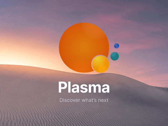
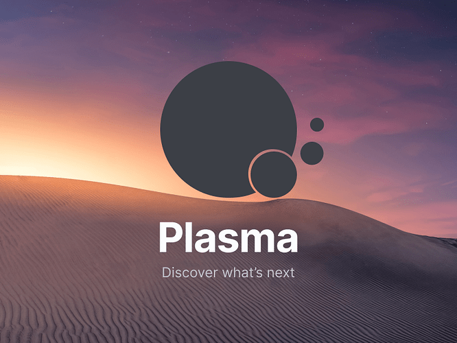
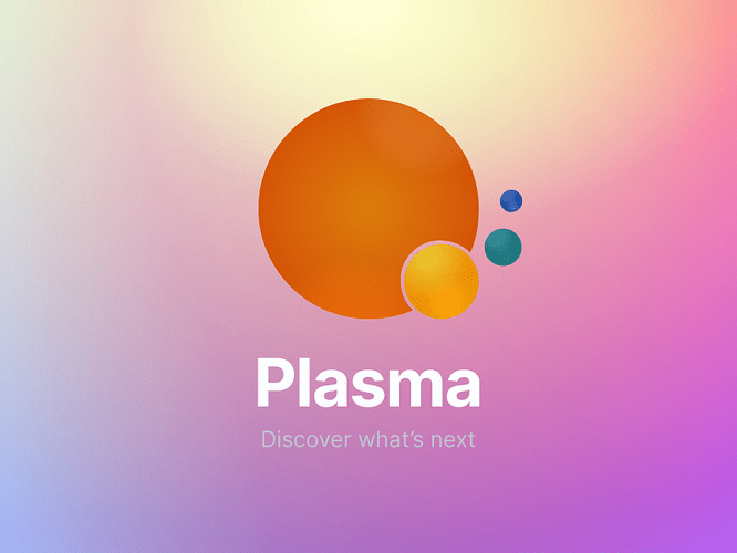
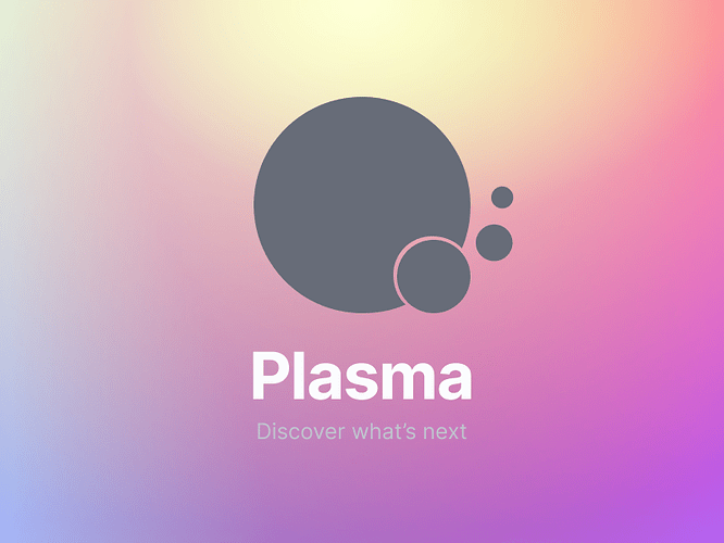
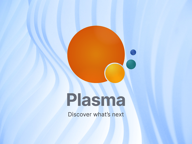
Here is my rendition of this idea. By the way, I proposed a similar logo years ago for KDE 4. Though it had a good reception, it was not selected. Proposing this change right now, I think makes sense. I also noticed that I failed to provide good connection to the main logo. I think we can do that with this iteration.
My inspiration is the sun. As the closest plasma example we have to earth and a life-giving force, it felt like the perfect inspiration. It’s a simple form that evokes easy access, easily repeatable. It contains the 3 dots that inspired the first Plasma logo and have been integrated into the rest of our logos. Put together, it can do for an easy icon. If done well, you could even add a few glow animations on hover that would look super cool. I used a correlated color palette for easy color connection, though I am not married to the colors as others may suggest many different combinations.
Here is my proposal:
