I don't believe that the new Dolphin highlight is an improvement

To me, it appears that we’ve accidentally reimplemented frames in 25.08.0-1.fc42:

Version Selected FS Object Hovered QDockWidget Hovered FS Object
New

Rounded, with a border:

Square, with no border:

Square, with no border:

Old

Square, with no border:

Square, with no border:

Square, with no border:

I’m not generally against the new, bordered style being implemented. It works in the shell plasmoids’ larger lists, and in the more compact QtWidgets QMenus. However, here, I’d say that having the old square selection gain an unrounded, 1 px border would be an improvement. A rounded, blurry border doesn’t look good.

9 Likes

There should be a way to disable it in the themes settings, but it’s currently bugged as discussed here. I’ve created a bug report at @akselmo’s request here. Just have to wait until he has time to work on it.

3 Likes

@bja, I’m not referring to the presence of the focus indicator. That existed beforehand, as an underline. It was an aesthetic annoyance, but I prefer functionality over it, especially as someone who is occasionally forced to navigate via keyboard when their Bluetooth dies.

This post is about the appearance of the selection and focus indicators.

2 Likes

Gotcha, I see what you mean with a closer look at the screenshots.

1 Like

It’s pretty much the same selection style we use in Plasma for desktop files and list items. Has it ever bothered you there?

@ngraham, no, because it’s pixel-perfect there (everywhere else, actually), and the available intra-item padding makes it not appear cramped. Hopefully, the screenshots demonstrate that the rounded border comes incredibly close to the icons in this case.

All I suggest is having it not be rounded in list views that lack intra-item padding (very much like what was done to frames for Plasma 6), and ensure that the border is 1-pixel wide.

2 Likes

So you’re really only talking about in list view, not in grid view?

1 Like

@ngraham, I’d not tried Icons view when I posted this (I rarely use it). After trying it now, the multi-pixel border problem is present there, as is the slight lack of padding:

I presume that you’d agree that the intra-item padding could eat into the existent inter-item margin without any increase in used space, and would help to keep text that renders below the typographic baseline readable.

1 Like

I can confirm the blurred stoke issue (here dolphin vs desktop) and i made a bug report when beta of 25.08 get released Bug 507005

3 Likes

@the-entropyst, thanks for that comparison. It also demonstrates well the difference in padding: how the text is literally at the border in Dolphin. Perhaps, that would look better if the border were merely 1 px, although a 1 px padding might also work.

I do think that following the desktop’s style would be an improvement for icon view.

Is that what happened? I did my updates only to reboot and find my icons further apart. It may be fine for those that like it or need it, bgut need a way to revert it.

@MyUserNameIsUserName, I don’t mean that they literally did so; if switching between such design philosophies were so trivial, switching to a frameless design for Plasma 6 wouldn’t have been such an impressive effort on their part.

Rather, I merely meant that the reasons why frames were abandoned was because their design meant that applications reserved more padding than they needed. However, that was mostly because they needed to ensure that the rounded corner didn’t obscure content, which this implementation does, so they’re not entirely equivalent comparisons.

Regardless, which icons do you refer to? (I presume that you refer to the margin between icons in the Icons View mode being increased…?) If so, we’ll need to identify exactly what’s problematic, how it can be improved, and file an issue about it. Visual design changes generally aren’t optional, because they’re so innate to the application.

OK here’s a good example the window shown has 9 icons across in normal view and 4 across in preview mode. That is normal for me. When I did the update and rebooted in regular icon view it was now 7 across and in icon preview mode 3 across. I ended up resizing the Dolphin window both width and height and editing the application setting to the new size.

@MyUserNameIsUserName, have you ensured that it reproduces in Breeze? Regardless, perhaps I don’t understand, but I don’t quite understand what the problem is. Is it a reduction in overall icon count? I’m not 100% certain that your problem is the same as what this thread discusses.

I made it pretty clear that there is more spacing between the icons now than there was before the update, causing me to have to increase the Dolphin window size both horizontally and vertically to have the same amount of icons viewable both horizontally and vertically. a lot more spacing. Give me a minute and I’ll boot into Reborn where I haven’t done these updates yet and I’ll post images from it before I do the updates there and after I do the updates before I resize the Dolphin window there.

1 Like

Before the updates

After the updates. Before I resized and after I resized.

1 Like

@MyUserNameIsUserName, thanks! Perhaps, we should file an issue about this?

Not the one who you asked for, but on my own, yes, it looks very crowded on the details view.

Especially when one disables the “expandable” option and expects full-width rows to be selected, now there is less padding, and the border feels like a noise on this view.

IMO, on details view, with “expandable” disabled, it makes sense to have the full row width selected.

The new implementation, at least to me, is better suited to views that list items in an itemized manner, such as the grid view, the compact view, or the desktop.

3 Likes

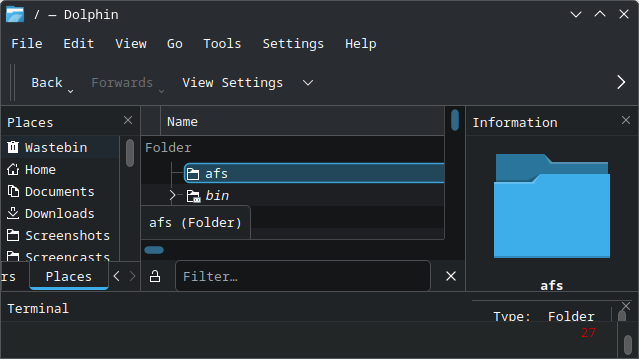
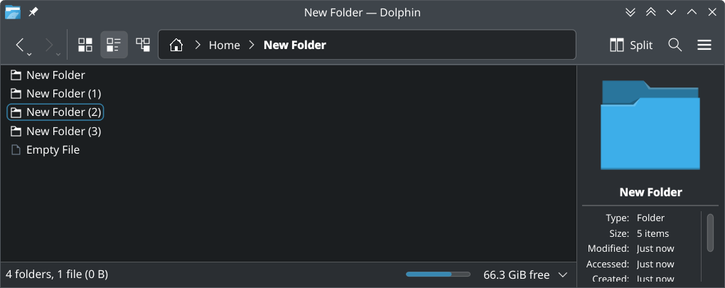
The problem for me is rounded corners which tangent the square content they outline in list view, especially at small sizes. The content is square, if you put rounded corners around it you need additional padding, which is not desirable. It also is strange not to highlight an entire row when the information is laid out in rows. I have no issue with the basic design choice in grid view.

When I say tangent, I am referring to how the outline goes uncomfortable close to the corners of square icons.

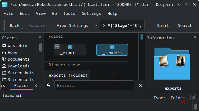
However, as somebody who mostly navigates by keyboard, I don’t understand why we need two different types of selection (the outline (previously underline) and the highlight). It makes it confusing in cases such as selecting files by holding shift and using arrow keys. I constantly mistake one kind of selection for another and try to select multiple files using this method and am confused why it doesn’t work. Another example is knowing which file is being referenced in the info panel, whether it is the selected file or the folder being viewed. When I go up a level and there is an underline/outline around the directory I came from, I frequently forget that the info panel is showing info for the directory and not the selected item. I look to the info panel and get wrong info, or add tags/ratings/comments to the wrong directory.

There should be one kind of selection, the highlight, and if there is some accessibility case I am not aware of where an outline is necessary visually, then the outline too should always be there, with option to disable, probably disabled by default. In some cases you would cause a functional change, e.g. that example going up a level would result in the directory you just came from selected instead of just outlined, and the info panel would show that, but I think that is a lot clearer – there would be a selected item and the info panel would show that, and you could press escape or click blank space to deselect the item and get the info panel to show info about the directory you are viewing.

As far as I understand it the reasoning behind it is to know what file will be selected if you press arrow keys, but I don’t think that is particularly helpful. The moment you press an arrow key it jumps into the other kind of selection anyway and you find out. Also, you know the first item is going to be selected. And, I still think there are better ways of making that clearer visually (the underline was definitely not sufficient), one of which is to just properly select (highlight) in more cases, but also I would say, in list and compact views, an outline around just the name of the files, and paying attention to how any rounded corners look at different sizes, would be preferable.

2 Likes

The new highlight in list view doesn’t align with how list views are highlighted everywhere else.
Dolphin:

image

System Monitor:


Disk manager:

4 Likes