Plasma, Gear and Frameworks are the three main sub-projects developed by KDE but… As of right now, only Plasma have a logo.
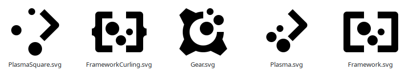
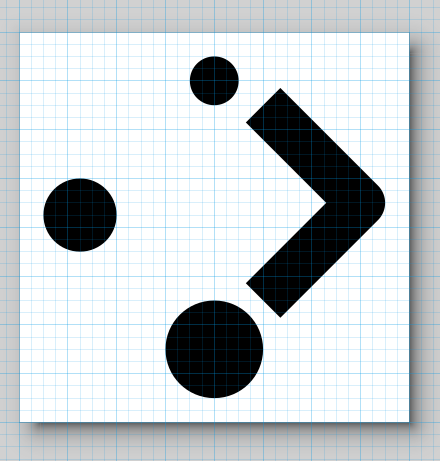
At this point it’s just a silly concept where I played around with shapes and retained as main branding element the “tree dots” that are in the current Plasma logo.
I like the theme/idea of the logo although I would like some separation between Plasma and KDE. The projects are called KDE Gear and KDE frameworks for a reason.
I would probably add more groves to the gear. The Square brackets around Frameworks is not immediately recognizable (too me a bit to realise what they were). Maybe use some other shape. I am also biased towards Curly braces { }
You should also post them in VDG since we had a chat about this yesterday.
Double the amount of teeth on the gear, and make all 3 logos square. Something is wrong with the weight on the first, move the circles around so it makes a square. Logos are difficult, specially when 3 of them must work together. Good idea and I’m sure your concept can work after some iterations, keep it up.
theres maybe a little too much white-space/negative-space, I tried play around a little with the 4 elements myself, but its really hard to line everything up in a square end still look nice, the 3 different sized dots giving me trouble.
IDK, ideally the 3 dots should not line up but be in a triangle but then it wont line up in a square, guess its a reason design services takes long time and co$t a lot…
I thought the ‘gear’ in KDE Gear was in the sense of:
Equipment or paraphernalia
not:
A wheel, wheel segment, or bar with grooves engraved on the outer circumference, such that two such devices can interlock and convey motion from one to the other.
I would think of KDE Gear as a suitcase or box containing various items that might be useful, but maybe it’s fine to use a different meaning of the same word. I’m no expert on branding.
I really dont know but is not the existing logo a machine gear? Why should that be gear as in stuff/things/equipment? Maybe I misunderstand something. I do not know any of the history behind the organistaion or the branding.
The KDE logo has a gear, but I’m not aware that KDE Gear has a logo currently. I’m not sure where such an icon would be used, and maybe it’s fine to have a gear. Just thought I would point out the different meanings of the word.
nice, I like the light blue + white Breeze styled logo with cogwheel and “F”. It is plain, and easy recognizable for anyone that ever used some KDE stuff. And it should be easy to just switch out the letter for other related products/projects (and maybe each project get its own 1 or 2 colors). But the colors are maybe more “modern/up2date” on the hammer/screwdriver variants. If possible, the logo and it colors should also be easy to read in black/white/grey/monotone,( most 1 color+ white or black logos are)
So; my +1 vote goes for the simple breeze style.
edit: and please just use the plain “F”, better to keep it simple and also keep in mind that it will often be displayed as a small icon. I do not think the “F” is harsh as someone mentioned. It is very good as is. or in some minor variation I guess.
Why do you want to replace the “old” Plasma logo? Sorry to say this, but it has much better proportions and the 3 dots stay in a nice angle, which also kinda reminds of an abstract hand or paw or the color version of an abstract painting design. Your design breaks the flow of the dots and just give no nice shape. It is a bit better on your Framework and Gear design, since dots do not have a lot of space.