These looks great, OP!
(yes I know they’re black on transparent)
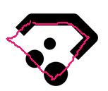
![]() Luckily, he posted them again, on post #6. The last three are the original ones.
Luckily, he posted them again, on post #6. The last three are the original ones.
Yes I’m aware, I replied because I thought there was a useful lesson in this for a would-be UI designer.
KDE Gear don’t have a logo AFAIK. I juste find quite nice to have some skeumorphism
Thanks ![]() i was too lasy to make something clean
i was too lasy to make something clean
i like these concepts actually! granted, i’m in agreement that the proportions of the current Plasma logo, but i could agree with a potential line thickness/dot width adjustment to match your Frameworks/Gear concepts while keeping the current positioning, but i really like the other two logos.
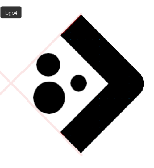
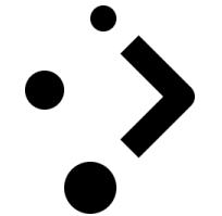
out of your concepts for the Plasma logo itself my favorite would have to be the one with the diamond-shape with the three dots in the bound of the Arrow, but that’s just me
It is not just you. There is a “flow” in this design (sorry, hand drawn):
So it catches humans easier than some other designs.
Ah I see. That was out of my view.
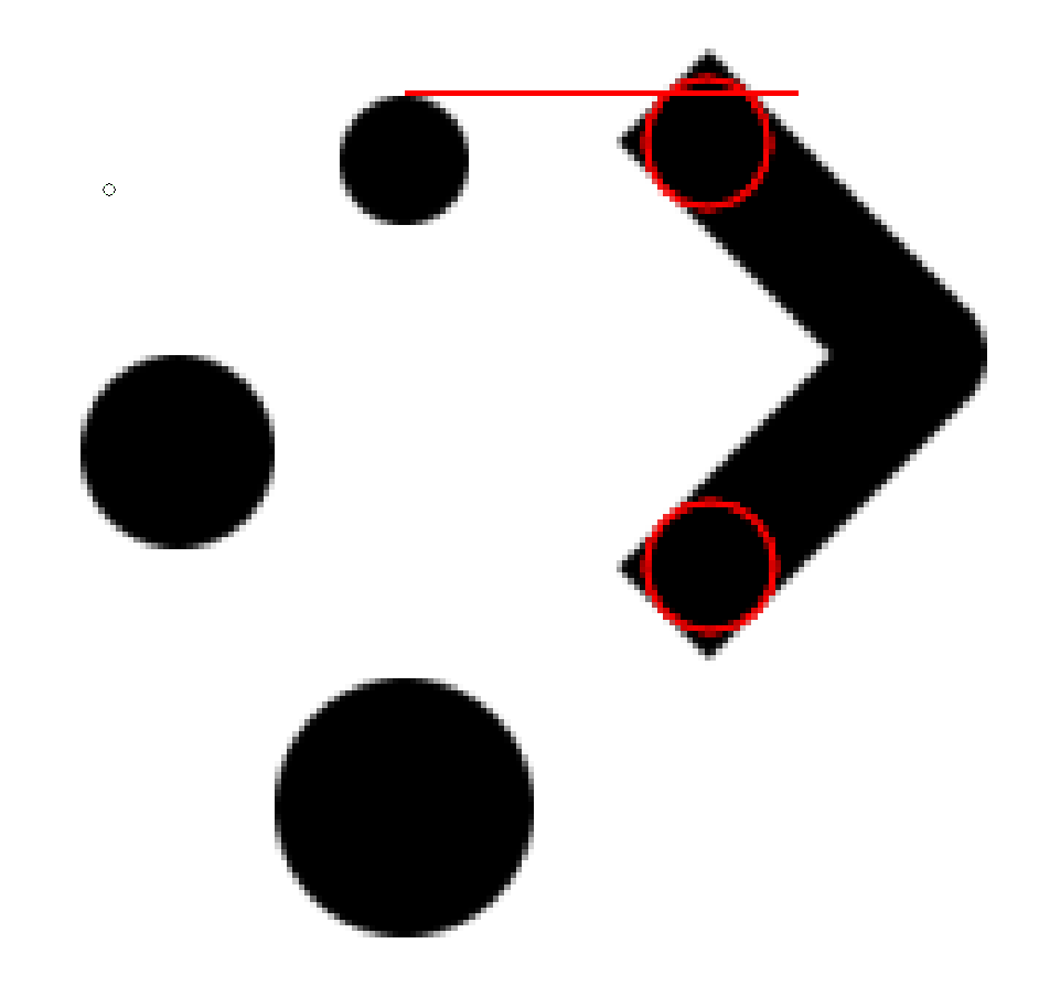
I hope you don’t mind my saying so, and maybe I’m missing something, but… The alignment (or lack of) of these dots is weird to me sometimes. Just to get one quick example:
They’re just kinda not lined up with anything.
This is intentional. It make thing feels more organic/”alive” and it’s also how the current logo look like
That’s correct. But the original had a “single curved line” between dots (see my avatar to understand what I try to say). The middle dot on your design is that far outside, that the picture becomes more a square, and with it the “curve” is lost. Without that I understand @pallaswept’s opinion. Now the “flow” is around the square and so the offset of the dots (what the picture shows) makes a weird look. It is also the reason for my first post.
I like that you are experimenting with it, but I think you need to find out where are the invisible lines and weight (average color densities across the picture) on your designs to get a feeling why something works good or not. I’m no expert myself, but that are some basics to help understanding why people feel one or another way. Some of the designs in this thread are good this way, so this is no critic to all of your work, but hopefully something that helps.
Thanks for the feedback. So i maked it a lot more like the current logo :
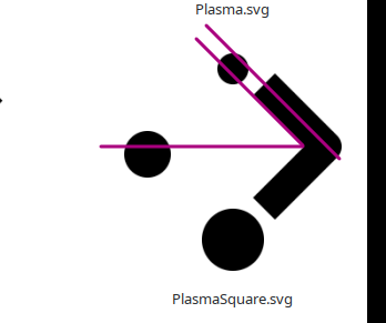
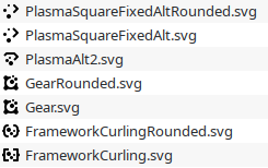
Also here the svgs if you want to have a closer look :
![]()
![]()
Ooh, now THESE are good- REALLY good. The second especially. The bottom of the arrow being aligned with the center of the larger dot looks much nicer, combined with the bottom and top dots being aligned. Super satisfying to look at, reads well, reads as the letter P (which i assume is the point of the plasma logo) a lot better than the current one IMO.
If the second replaced the current plasma logo immediately i’d already be pretty happy, though i’m sure it could be improved with some testing for readability or sizing in certain locations.
Maybe adjust the distance between the dots so that the top edge of the smallest dot is aligned with the top point of the arrow? That’d be my only active suggestion.
Perhaps rounding off the arrow backs and point in a matching circular radius and adjusting the dots to align the top dot with the top edge of the arrow back’s curve radius might be worth experimenting with. I actually think that could flow nicely, like the dots flowing up to the top and swirling around to form the arrow- somewhat evoking the material/texture of plasma itself.
Edit: Upon further inspection the arrow is not quite aligned with the center of the large dot, though it is aligned with the edge of it which still looks quite nice.
I’m still curious to see how it’d look with the circular-radius arrow backs and a matching tip radius. I think that’d look quite nice.
Thank you so much for your feedback !
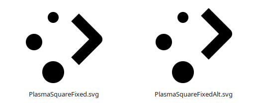
Okay here an attempt to align both the big and the tiny dots :
It’s break the harmony (at least i feel it like that)
I don’t understant this point. Could you precise it a litle bit or add ilustration ?
Oh, not what i actually intended; i don’t have the tools or knowledge to mess with SVG type stuff but this is an (admittedly shoddy) example of both of the things i meant;
The flat line shows that the top of that dot isn’t level with the top of the Arrow, and the second point was to suggest rounding off the backs of the Arrow in a circular radius to match the corner radius of the dots.
Try mocking something up on that idea? (Though, if you’re gonna try both i’d suggest lining up the top dot with the top of the arrow after rounding off the arrow corner radius)
Edit: i’d also suggest keeping the outside of the arrow lined up with the outside of the big dot, instead of centering it like you did with the both-dots-aligned option
I really like this one. Another possible variation: Mirror the dots on the vertical axis, so the ‘point’ is on the left? Or is that too ‘on the nose?’
I really, really like this, actually. I’d be all for this look replacing the current one, maybe save for some testing for readability and whatnot.
So here the current state of the thing :
I’d say it’s starting too look really good
Here the Rounded Plasma variant so you can try it on start button :
![]()
And before i forget, here how it look at very smal size (16px) :