It complicates things a lot. You, as a user who made the task to copy file, already know your context, and always can examine your files from where they are manually.
Think, you are talking about automatic opening text files side by side. But what about other formats (even images)? Lets say, .blend files. Do you want to open two Blender instances? What if the source is from the archive? Do you want to overwrite the file inside archive? What if archive has a password? Even then, what will you do after you make changes to file? You need to reopen dialog, to recalculate the size for example. And so on…
So, I think it is better to not have “open source” and “open destination” buttons at all.
I agree.
@skyfishgoo you are basically describing the current behavior, but with addition of showing the difference in timestamps.
I fully agree.
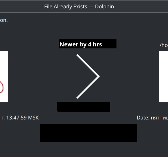
I however, do not understand the point to place “Newer by 4 hrs” in the path row, rather than in the date row.
It complicates things a lot. You, as a user who made the task to copy file, already know your context, and always can examine your files from where they are manually.
Yes. I, as a user who made the task to copy file, already know my context, and always can find the size and date of my files from where they are manually.
Think, you are talking about automatic opening text files side by side. But what about other formats (even images)? Lets say, .blend files. Do you want to open two Blender instances?
No, I’m not talking about anything “side by side” at all. I’m talking about two buttons each opens a file just as if I click it in Dolphin. When I click a .blend file in Dolphin, do I want to open a Blender instance? Of course I do.
What if the source is from the archive? Do you want to overwrite the file inside archive?
“Open in external app” a file in Ark doesn’t “overwrite the file”.
What if archive has a password?
To extract files from Ark and bring a file conflict dialog, I need to enter the password first.
Even then, what will you do after you make changes to file?
I’d merge both files into the destination file and click “skip”.
clean up the verbiage to eliminate unnecessary clutter
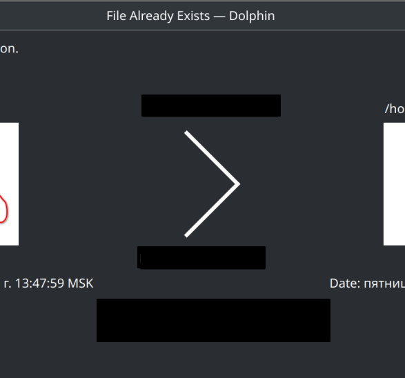
align the sense language with the arrow direction (from > to)
display difference values in appropriate units
provide a visual cue as to the differences
allow me to elaborate on each point by way of answering your question…
remove the text “Differences” and " The files are different" as these statements are redundant and add no value for the user, thus they only contribute to the clutter.
remove the text “The destination is” and change the sense of “smaller” or “larger” so that it aligns with the direction of travel from source to destination as well as the direction of the arrow (here i assume the direction depends on the RTL or LTR language choice)
the difference calculations for time and size should be no more than 1 significant digit for ease of reading at a glance and the units should scale with the magnitude of the difference (sec vs days for time and B vs KiB for size) so that the user immediately knows the scale of the difference.
and finally, to answer your question, the addition of place holders for each difference calculation provides a consistent and easily grokked UX for the user to tell at a glance the state of the differences between the two files.
by separating them above and below the arrow we reserve a visual flag (semaphore) that will only light up when there are differences between the files, thus eliminating the need for the words “the files are different” from the interface.
this would be the display if the files were identical, note the complete lack of any difference language and that no flags are shown…
in this case skip should be the highlighted default action to facilitate the obvious choice.
when the files are the same size but have different timestamps, we only need to display the time difference so the user can decide if whatever triggered the time difference might be important to preserve or overwrite (achieve maybe?)…
then we get to the last case when the files are different in both time and size so both flags are shown and the sense language can then guide the user in how to respond…
in this case overwrite should be the highlighted default action as well.
in conclusion
by visually separating the flags for time and size to be above and below the arrow we give the user a consistent visual cue that intuitively guides the user in their decision and facilitates faster disposal of this dialog.
Probably most of the time, the user only cares about which file is newer or larger, but not how much newer or larger it is. These strategies might be quite common:
skip all older files
accept all newer files
accept all larger files
But probably things like “if the source is 1KB larger, do A; if it’s 1MB larger, do B” is rare enough, that we can just get rid of the calculation, so there’s space to put large and clear “newer” “older” “larger” “smaller” labels on the files.
i mean correct me if i’m wrong, but wouldn’t you still have to do the calculation in order to even be able to say Larger | Smaller, Newer | Older?
might as well throw the number up there if you are doing the math anyway, would be my take.
and i might want to know if it’s just a few seconds vs years so i know if it’s safe to ignore that last save of the file or if i’m about to overwrite a year’s worth of work
Strictly speaking, no, in the sense of programming, one is comparison, the other is subtraction. But that’s not the point.
Anyway, if you want to highlight the difference, either “larger” or “1MB larger”, then instead of “the source is 1MB larger than the destination”, or “1MB larger” on top of an arrow, probably a more unambiguous and concise way is to put it on the source side. E.g. Size: 10MB (larger by 1MB). And if it’s same to the destination, you can just say “Size: same”.
So you want the layout to stay as it currently is. So basically do not move anything?
Don’t you think the idea of saying the difference near the destination is interesting? I also wanted to discuss such idea. It will reduce unnecessary words.
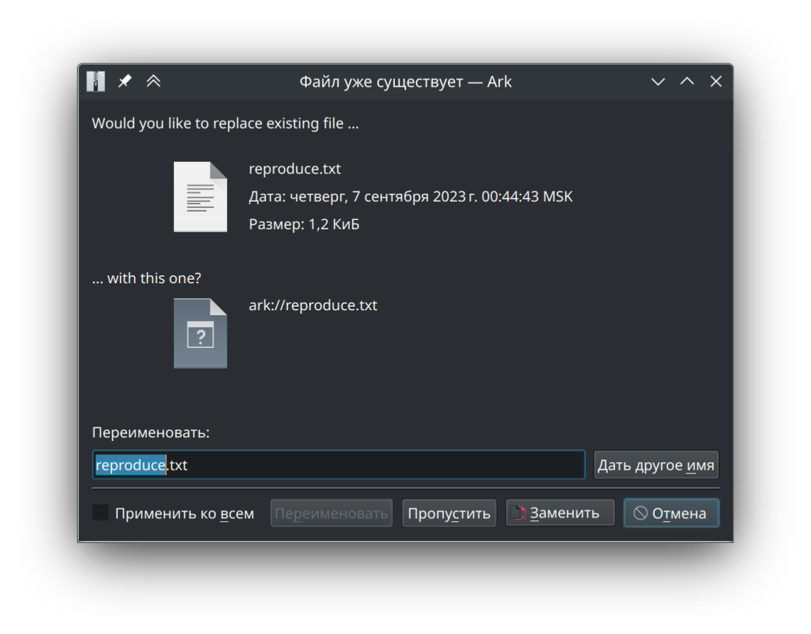
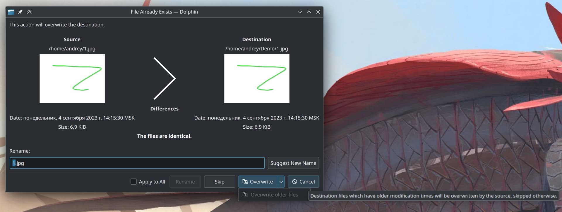
Here, the date and size of source is not displayed (because not yet implemented for archive files).
Also note that here the destination is above the source.
I see now, I get to the situation where those links are actually useful. I moved one folder to another location, and unexpected conflicts. Then when I saw this dialog, I wanted to open both for examining, and it was inconvenient to go examining manually (many files inside, not on top level).
I however do not think we need buttons. We can make the paths to be links, or even better - the icons themselves to be links (like how you click icons in Dolphin).
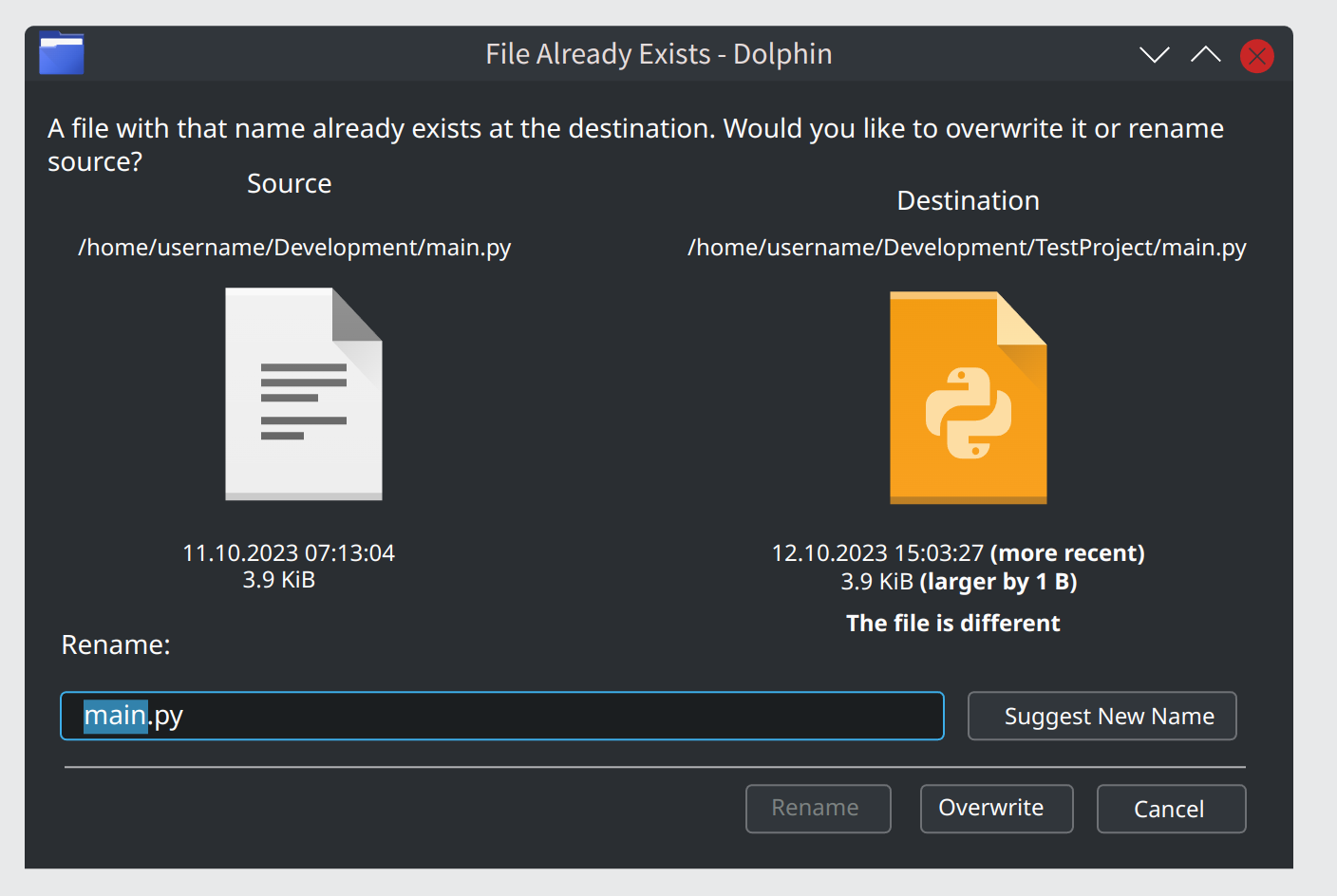
In this case, as there is already a difference in size, the file is obviously different, so we can omit “The file is different”. I wrote that to demonstrate where that label can be resided in case of no difference in size (while modification date is not important, as file hash sum may be the same).
My gripe with the current dialogue is, the icons are enormous, and they take all the attention. Typography is not great, and the text are scattered all over the place, causing constant eye scanning.
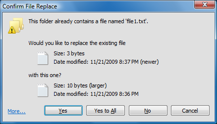
Windows XP example above is the peak design IMHO. Clear layout of information, that follows a top to bottom direction, with icons that do not steal attention. The spacing on the mockup that is based on it is still a bit off though.
Also, just a small nitpick, a toggle does not really apply here for the “Apply to all” checkbox, toggles should be used for immediately applying settings, like turning Wi-Fi on/off.
For example, on “Skip” button there would be a dropdown “Skip All” button. For the current “Overwrite” and “Overwrite older files”, there will be additional “Overwrite All” and “Overwrite All older files”.
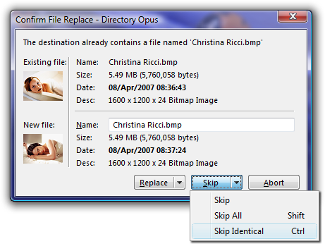
The spacing before Переименовать is too much, and there is not enough padding before “Would you like to replace existing file”.
The toggle comment was for a mockup above, it’s a visual distinction. However, it gives us a chance to re-examine what users mostly want to do when invoking this action:
User wants to copy one file to another, wants to replace the destination file. We ask the user, whether they want to replace the file there.
Possible actions: Yes, No, Cancel
Depending on the wording, we eliminated the need to explicitly state verbs in button text.
User wants to repeat step 1 with two files.
Possible actions: Yes, Yes to All, No, Cancel
Adding a second generic button eliminated the need to include a checkbox, and possible confusion for the user. We still use basic phrases like Yes and No, freeing further brain CPU time. Something like Skip All does not make sense, it’s the same thing as Cancel.
User wants to repeat step 2, but wants to keep both files, increasing the total destination file count to 4.
We can make the destination file name highlighted for inline rename, letting user know, that they can rename and proceed with Yes. Current dedicated file name text field adds great visual clutter, and possibly rarely used.
Clicking No would automatically add a suffix to the copied files as usual.
Yeah, on this screenshot yes. I have planned to add verdict lines there (like “bigger by 2 B”). But in case there are no any, the space should be reduced.
Ok, thanks. Will fix.
Sorry, I did not understand your statement about “toggle”.
Do you want the default action (highlighted button) to be changed on next conflict if the user had choosen some non-default button on previous?
But we also display the path. We would need to keep the path still. It may look ugly (or you may provide a good mockup?). However, currently, it is ambiguous which exact file you are going to rename.
Also, the Replace button assumes “replace destination”, while Rename button assumes “rename source”.
i agree with the source as the reference because that is what you were acting on when this dialog was generated.
so all relative comparisons should be in sense of the source relative to the destination (newer|older, larger|smaller).
however, i still argue these comparisons should be placed in the middle to relieve the eye from going back and forth in order to figure out the differences between the two items.
the space in between is the natural comparison landscape and feels intuitive.