We could add another line that indicates the path. Still would take less screen estate than the current.
How would it be ambiguous? Don’t we go one by one then? About the rename, if the file name would be changed, the “Rename” text would ba active on the button, or two separate buttons of “Overwrite” and “Rename” would alternate depending on the name change. Using a Yes would be simpler, but apparently that would be no bueno.
I’m switching off for tonight, will check back tomorrow!
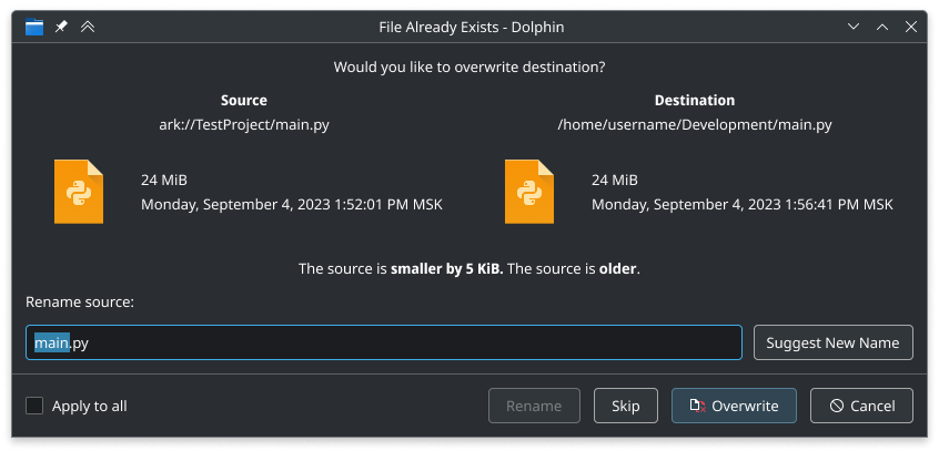
Since you removed the “source” and “destination” labels, now the user probably doesn’t understand what “the source” is. (Probably “The second file”?)
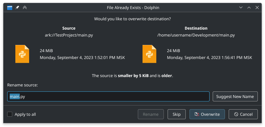
The two “the source is” lines seems redundant. You can say “… is older and smaller…”.
The “Files are different” line is redundant, as the line above already made that clear.
BTW, I find the current horizontal layout a bit confusing, when dragging a file from the right pane to the left pane in Dolphin. The order of “source” and “destination” in the dialog are just the opposite of which they are in Dolphin, so I need some mental twist here. (Yes, the huge arrow helps a bit.) This is a case for the vertical layout.
This is true, and this is counter argument for skyfishgoo willing to have verdicts in the middle.
That is true, I know. I only made that for demonstration, because otherwise I would need to show several mockups at once. In this case it is redundant and will not be shown.
If you drag the file from right pane to the left, it will not change the order in dialog
We can make the order natural (the source to destination means from top to bottom) with the wording: “Would you like this file … to replace existing file …”.
We are going around, trying to remove the arrow, and now we are again talking to add it back? Something went wrong.
Here the source is going before destination, as normal human expects. (However, this may confuse windows xp users).
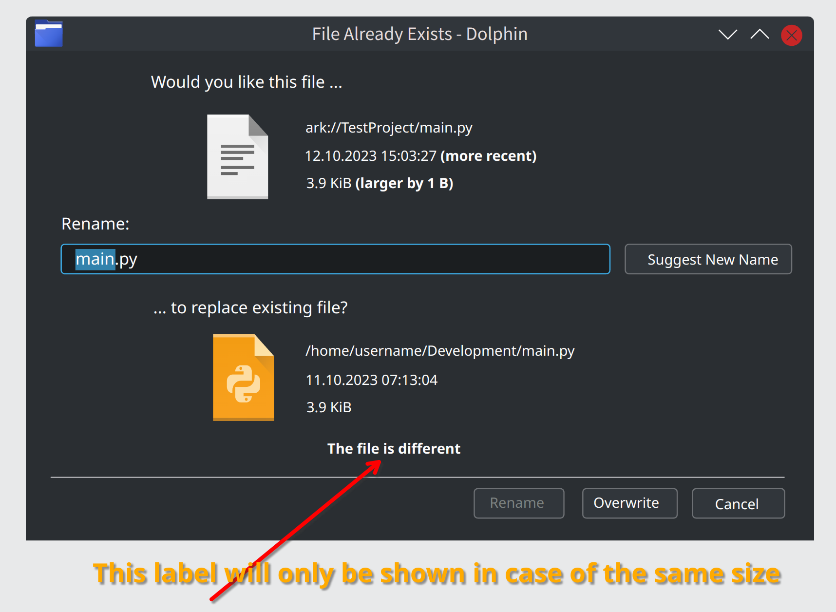
I placed rename field in the source. It clarifies that the rename is going to apply for the source file (and not to the rename destination).
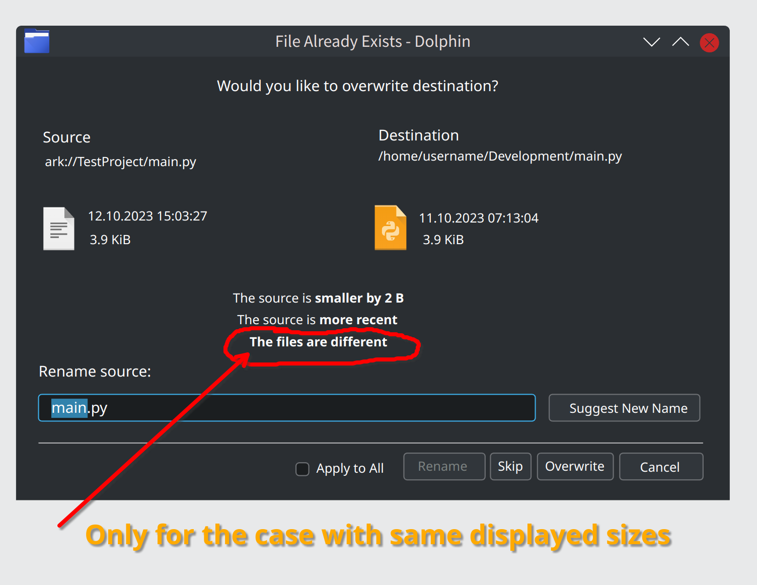
I placed verdicts in the source, this avoids problem of duplicating “the source file is” twice (as in proposal 04 above).
Here I have discarded the idea of showing the common name in the middle (it was removed from Source and Dest). This solves several problems. First - it looked confusing that they were paths (not end filenames). Even more if we potentially make the icons an active links.
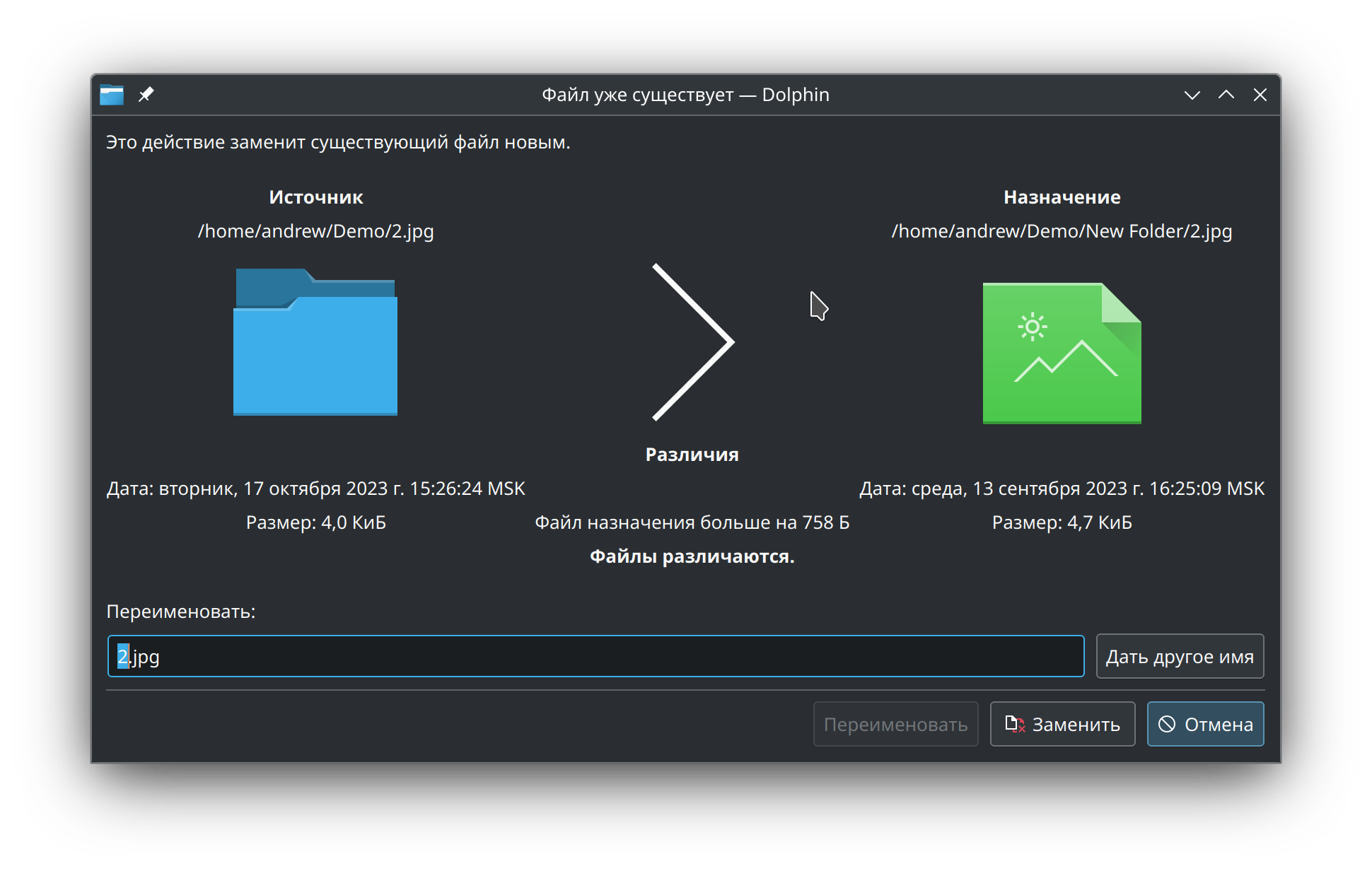
What if we have two folders? What will be in that bubble? Nothing. And how we distinguish they are actually folders, and not files?
Also, what if user has a folder named the same as file in the destination? I.e. folder named “2.jpg”, or oppositely, file named like folder “2” (no extension).
With current dialog there is less confusion.
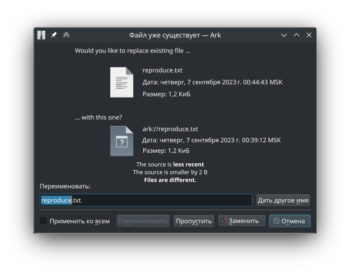
Also, I did not use “A file with that name already exists at the destination”, because we could reuse the text for folders, which are not “files” (for the user) and I did not want to use “item”. For folders and for files the window title will be different (“File Already Exists”, “Folder Already Exists”).
Also, I clarified the rename field title (so user knows what he is renaming).
Also, In this case I made verdicts in the middle, as skyfishgoo wished. And written them relative to source.
RFC.
i think we just watched the development cycle that evolved the old XP style dialog to one we currently have, which needs a few tweaks, but is still a vast improvement over the XP style.
This design would work with smaller pictures, and text alongside, as the example produced in the post. As it’s a dialog, the actions should go at the very bottom, rather than being split along the middle and bottom.
Yeah, I also think that. I have made a more polished variant of the proposal 01.
The changes:
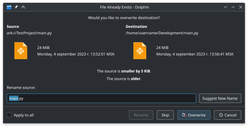
Returned the conflicting file name to the Source and Destination paths (as said above, to reduce confusion).
Used actually a question sentence in the title, rather than a statement. That statement was vague (it said “This action will overwrite destination”, but dialog allowed to rename source). With question, user may faster understand what is the problem. We do not use “destination file”, because we may reuse this title for the folders as well.
Used a smaller size for icons/previews. (*), so it does not steal the attention.
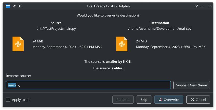
Formatted date as in real en_US locale, to show how it will actually look.
Used verdicts in the center, to immediately take user’s attention.
The Apply to All checkbox moved to left
Used “Rename Source” rather than “Rename”, to clarify that this action will apply to source file rather than to destination file.
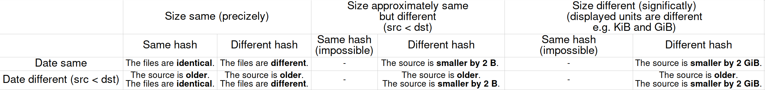
Case A: File sizes are different, but their displayed measure units are higher than the amount of difference.
The difference is written in verdict.
As there is already a verdict about different sizes, it is obvious to user that they are different, so the verdict “The files are different/identical” is not shown.
Case B: File sizes are the same, but their contents (hash sums) are different.
There is a verdict “The files are different/identical” (note, this does not care if dates are different, because contents is being compared), (note that is is not shown for folders).
If there is no difference in date, the corresponding verdict is not shown.
What do you think of free space to the left and to the right of the centered verdicts (especially when there are two lines)? Is it ok, or is it ugly? I consider this ok. If there are objections, we may place them in a single line.
Notes:
Icon for image may not be available, compared to the file with available preview.
(*) - I used size 96. It is not currently in stdSizes enum, but we can add it there.
As for me, looks cute.
This is better than the previous one, but it looks to my eye as if everything’s scattered around, and the text stands too small among the width of the window. This is my subjective opinion though.
Just for the sake of trying, what about a top to bottom layout, and less padding on the middle section?
Now that I had a second look, I think the latest proposal looks good. The verdicts on the same line looks definitely better. My only note would be avoiding string concatenation while building the string though, it is not ideal when translating.
The icon of the original was nice though, it made the dialog very distinct. If you’re familiar with the dialog the huge icon immediately tells you what the issue is. "Oh it’s about duplicates. Yeah, yeah, it’s fine. Hits OK button - Now you make me read. And think.
Since the dialog can popup out of nowhere on a longer operation it would be nice to have “What application” and “What is the issue” very prominently as the first item before proposing a solution. Something like “Dolphin found a file with the same name.”
The window title already has an application name (in this case “… - Dolphin”). Note, that this dialog in not only used for conflicts in dolphin to dolphin, but also for example, from Ark to Dolphin.
Ultra-level nitpick: File Already Exists — Dolphin. It should be an em dash normally, but I’m not sure if it’s inherent. Aside from that all very nice.